- User Interfaces
- Other User Interfaces
- QtPyVCP
- Add setting to toggle display of one or two file managers in Probe Basic
Add setting to toggle display of one or two file managers in Probe Basic
- Unlogic
- Offline
- Elite Member
-

Less
More
- Posts: 240
- Thank you received: 120
17 Apr 2024 07:46 #298414
by Unlogic
Add setting to toggle display of one or two file managers in Probe Basic was created by Unlogic
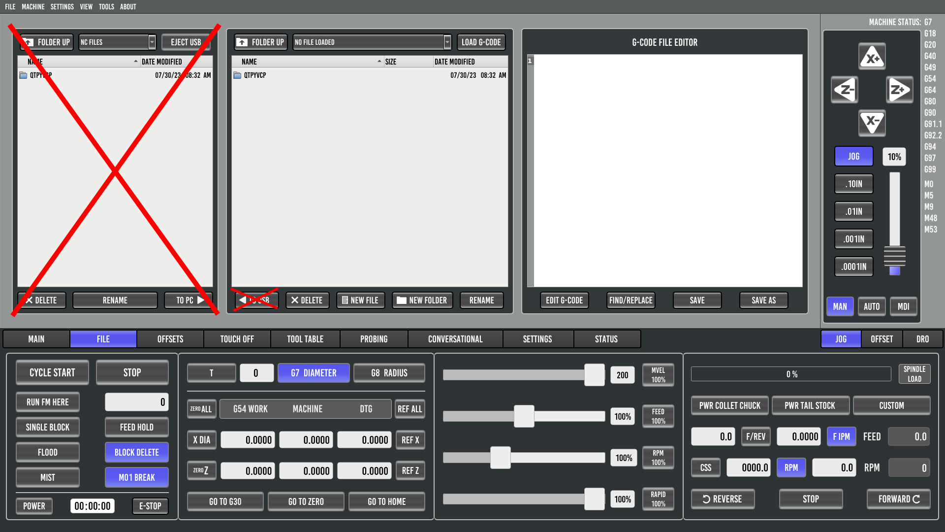
I recently came across this video on YouTube where author has modified the ProbeBasic UI to hide one of the two file managers.
Gave this some thought and I realize that their are two distinct use cases for the File tab in ProbeBasic.
The use case which ProbeBasic currently seems to be designed for is the use of USB-drives and similar physical media to copy the files to and from the CNC machine in question. In this case two file managers is great as it simplifies the copying/moving of files.
The second use case is when a network share is used to load the files from. In this case the second file manager is of no use as no files are copied or moved. In this case having one larger file manager instead is very helpful as it allows for more information to be displayed.
There is no right or wrong here as both use cases are valid and fairly common. But maybe a configuration setting could added to toggle the display of one or two file managers?
If the the setting is set to display only one file manager the elements crossed out on the screenshot above are hidden and the remaining file manager is enlarged to fill the whole screen.
Attachments:
Please Log in or Create an account to join the conversation.
- Lcvette
-

- Offline
- Moderator
-

Less
More
- Posts: 1623
- Thank you received: 755
17 Apr 2024 15:06 #298454
by Lcvette
Replied by Lcvette on topic Add setting to toggle display of one or two file managers in Probe Basic
I have considered this before, but i cannot find a good reason to do so as there is plenty of room for the file display and the additional space could not be utilized for something else since it would still be a placeholder for the second file window.
I utilize syncthing which auto updates my programs to the defined shared directly on posting from fusion360 and rarely use the usb window so i can see your point of argument. but there have been times where my internet has been out that i was glad to have the usb transfer ease, especially when proofing out a new part run that requires some tweaks to get dialed in for production.
That said lets see what others think, if im in the minority I will add it to the list of things to do.
Please Log in or Create an account to join the conversation.
- Unlogic
- Offline
- Elite Member
-

Less
More
- Posts: 240
- Thank you received: 120
18 Apr 2024 13:35 #298557
by Unlogic
Replied by Unlogic on topic Add setting to toggle display of one or two file managers in Probe Basic
Thanks for such a quick reply Lcvette.
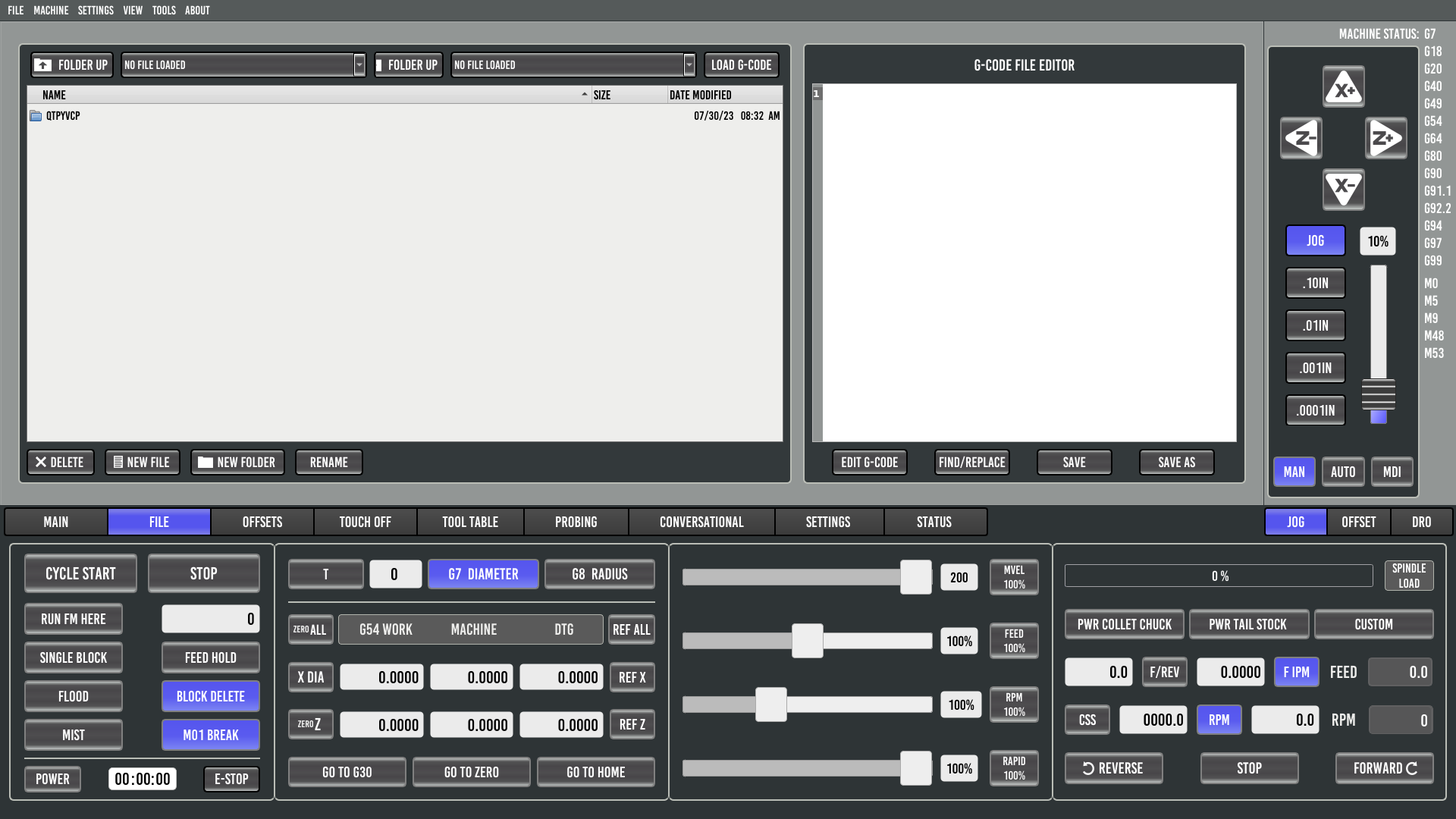
My idea was to enlarge the remaining file editor when USB file manager is hidden or removed.
It would help greatly with long file and folder names in the g-code file library which grows with each day.
I made a crude screenshot of how I thought it might look.
However I realize the this approach would require some logic based layout changes depending on the value of the setting.
I have worked with lot's of programming languages over the past 20 years but never anything related to QT so I have no idea how much work this would be implement. However if you like the idea I'd be willing to give it a try and get back to you with a pull request if/when I get it working.
Attachments:
The following user(s) said Thank You: spumco
Please Log in or Create an account to join the conversation.
- Lcvette
-

- Offline
- Moderator
-

Less
More
- Posts: 1623
- Thank you received: 755
18 Apr 2024 21:25 #298577
by Lcvette
Replied by Lcvette on topic Add setting to toggle display of one or two file managers in Probe Basic
sure, i wouldn't not implement it 
Please Log in or Create an account to join the conversation.
- spumco
- Offline
- Platinum Member
-

Less
More
- Posts: 2073
- Thank you received: 860
19 Apr 2024 02:14 #298587
by spumco
Replied by spumco on topic Add setting to toggle display of one or two file managers in Probe Basic
OP:
While you're having a go at it, my preference would be to have adjustable windows with width retained between sessions.
In my case, I'd prefer to have a wider gcode editing window. I have relatively small monitors and would like to increase the font size for readability. However, it drives me nuts when gcode word-wraps to another line... I want one line of code to be on one line. Increasing the font size is a no-go with the current windows as longer lines will start to wrap.
I believe Gmoccapy would be an example of what I'm describing. The gcode window in auto mode is tiny, but the user can grab the separator between the gcode and backplot and make the gcode wider.
In the case of Probe Basic, this wouldn't really work with all three file windows visible... but if you had a user-selectable two-window layout now it becomes plausible to make the gcode editor window - or the file selector window - wider. Want either window wider? Grab the separator and drag it.
Please Log in or Create an account to join the conversation.
- Lcvette
-

- Offline
- Moderator
-

Less
More
- Posts: 1623
- Thank you received: 755
19 Apr 2024 03:34 #298591
by Lcvette
Replied by Lcvette on topic Add setting to toggle display of one or two file managers in Probe Basic
I took a look at it and it would require some doing, it's not a simple qt designer setting as the file managers are a unique custom widget with each column defined separately. The widget is a qtpyvcp widget so any adjusting will be global to any ui's using qtpyvcp. Not impossible but not a simple fix, and a little further away from immediate updates.
If you are to take this on, I would suggest defining adjustability to the column properties first, then placing the USB file window in a tab widget and adding the hide away property, from there it will require a few settings in the properties editor to the other frames holding the editor and main file tab to define their Max stretch sizes. Then hiding or retrieving the USB is as simple as clicking a side window tab.
If you are to take this on, I would suggest defining adjustability to the column properties first, then placing the USB file window in a tab widget and adding the hide away property, from there it will require a few settings in the properties editor to the other frames holding the editor and main file tab to define their Max stretch sizes. Then hiding or retrieving the USB is as simple as clicking a side window tab.
Please Log in or Create an account to join the conversation.
- rodw
-

- Offline
- Platinum Member
-

Less
More
- Posts: 11891
- Thank you received: 4037
19 Apr 2024 21:38 #298675
by rodw
Replied by rodw on topic Add setting to toggle display of one or two file managers in Probe Basic
You don't need access to network drives. Far easier to install SAMBA and map a share straight to the nc_files folder and set your CAM up tompost files direct to that folder.
Please Log in or Create an account to join the conversation.
- Jensner
- Offline
- Premium Member
-

Less
More
- Posts: 151
- Thank you received: 28
20 Oct 2024 15:46 #312689
by Jensner
Replied by Jensner on topic Add setting to toggle display of one or two file managers in Probe Basic
I would also like it, if the there were just 2 larger windows for the code and the files instead of 3.
I never use the left window becouse i did like @rodw said and use a shared network-folder as workfolder.
So i can export my file directly from fusion and have it in my Probe Basic. (with one litle problem, i have to go into a folder and back, after this the new file is there - sadly there is no F5 or Fileupdate-funktion or i don`t know..
Further more, for me it would be much better, becouse me Filenames are very long, becouse i write some important infos, sortnumbers and Version into the filename. This leeds to that i can`t read the full filename at the Fileexplorer.
Best regards
Jens
Please Log in or Create an account to join the conversation.
- Lcvette
-

- Offline
- Moderator
-

Less
More
- Posts: 1623
- Thank you received: 755
20 Oct 2024 16:30 #312695
by Lcvette
Replied by Lcvette on topic Add setting to toggle display of one or two file managers in Probe Basic
I use the second window frequently for moving files around without needing to exit full screen.
That said, If you guys find it important enough to put the time in to make the updates to the ui functionality and want to submit a pull request I will gladly review and accept into the main branch.
For me I have a list of more pressing items that I have on my plate that I need to carve out and allocate time for. But don't be shy to submit pull requests for features that make it better and more universally useful, the more folks puttig time in the more gets done! And it's appreciated!
Thanks guys,
Chris
Please Log in or Create an account to join the conversation.
- Jensner
- Offline
- Premium Member
-

Less
More
- Posts: 151
- Thank you received: 28
21 Oct 2024 09:26 - 21 Oct 2024 11:52 #312726
by Jensner
Replied by Jensner on topic Add setting to toggle display of one or two file managers in Probe Basic
I think this topic revolves around “comfortability” and is not something that is urgent right now. For this reason, I don't think anything needs to be moved here.
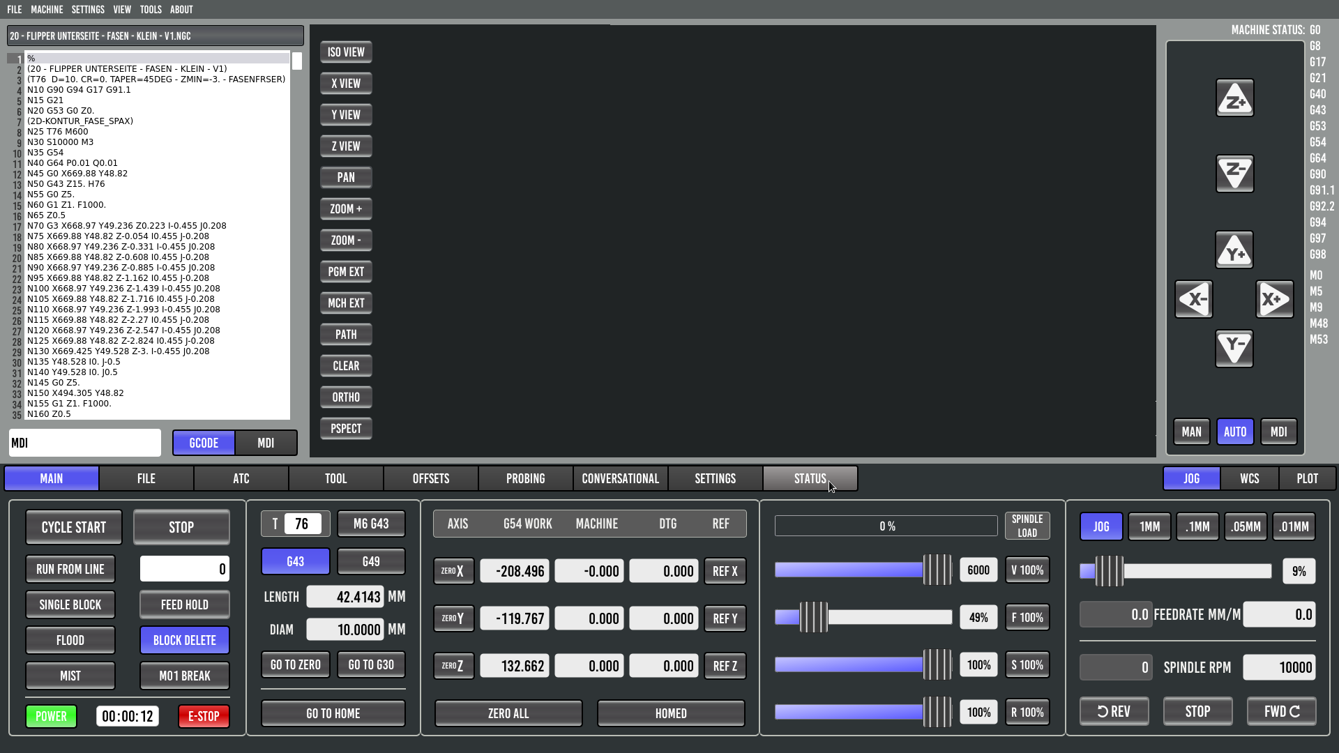
But while we're on the subject of the window layout. Is there a possibility, via the Custom_config.yml or custom_probebasic.py, to make the code window a little narrower and the preview window wider, e.g. in the main mask?
Something like this:
But while we're on the subject of the window layout. Is there a possibility, via the Custom_config.yml or custom_probebasic.py, to make the code window a little narrower and the preview window wider, e.g. in the main mask?
Something like this:
Attachments:
Last edit: 21 Oct 2024 11:52 by Jensner.
Please Log in or Create an account to join the conversation.
Moderators: KCJ, Lcvette
- User Interfaces
- Other User Interfaces
- QtPyVCP
- Add setting to toggle display of one or two file managers in Probe Basic
Time to create page: 0.141 seconds


