Introduction: ArtSoft / Mach3 forum drove me here
- Etaoin
-
 Topic Author
- Offline
- Junior Member
-

Less
More
- Posts: 20
- Thank you received: 3
25 Jan 2021 20:13 - 25 Jan 2021 20:50 #196552
by Etaoin
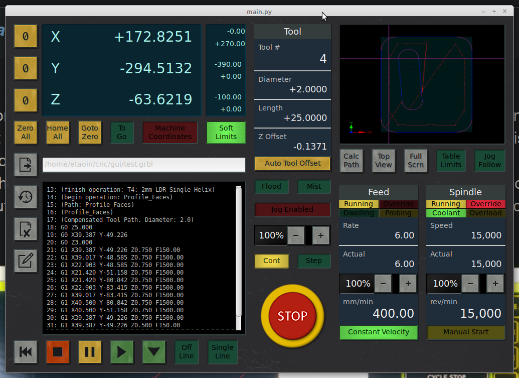
The demo stretches nicely on my 1366x768 laptop screen; the expanded elements all make sense. I very much doubt it would look presentable at 1920x1080 unless you lower the DPI substantially, and then the low resolution of the bitmaps would become obvious. A proper implementation would probably have to use a different skin for such a large screen - my target is a 10-12" XGA touch screen. Perhaps you could give it a whirl and post a screengrab here? It will maximise when you click the maximise button.
Edit: This reply pushed us to page 2; please see previous page for my reply to @andypugh, which is relevant for anyone who'd like to give my mock-up a try.
Replied by Etaoin on topic Introduction: ArtSoft / Mach3 forum drove me here
what about HD?
The demo stretches nicely on my 1366x768 laptop screen; the expanded elements all make sense. I very much doubt it would look presentable at 1920x1080 unless you lower the DPI substantially, and then the low resolution of the bitmaps would become obvious. A proper implementation would probably have to use a different skin for such a large screen - my target is a 10-12" XGA touch screen. Perhaps you could give it a whirl and post a screengrab here? It will maximise when you click the maximise button.
Edit: This reply pushed us to page 2; please see previous page for my reply to @andypugh, which is relevant for anyone who'd like to give my mock-up a try.
Last edit: 25 Jan 2021 20:50 by Etaoin.
Please Log in or Create an account to join the conversation.
- andypugh
-

- Offline
- Moderator
-

Less
More
- Posts: 19875
- Thank you received: 4642
25 Jan 2021 20:16 #196553
by andypugh
If you start with Gscreen and put your UI on top then I think you will have a fully fledged UI for linuxCNC.
(But, at the moment, the LinuxCNC interaction widgets are stuck in GTK2, hence the 3.8.6 version being distributed)
Replied by andypugh on topic Introduction: ArtSoft / Mach3 forum drove me here
> glade 3.8.6
I used Glade 3.22.1, which was what the Devuan repo shipped. Not that it matters; the goal was not to make a fully fledged UI for LinuxCNC, but to explore the GTK widgets and how they can be used for a touch screen friendly CNC user interface..
If you start with Gscreen and put your UI on top then I think you will have a fully fledged UI for linuxCNC.
(But, at the moment, the LinuxCNC interaction widgets are stuck in GTK2, hence the 3.8.6 version being distributed)
Please Log in or Create an account to join the conversation.
- Etaoin
-
Topic Author
- Offline
- Junior Member
-
Less
More
- Posts: 20
- Thank you received: 3
25 Jan 2021 20:21 - 25 Jan 2021 20:40 #196554
by Etaoin
Aha, good to know! I only used a few basic GTK widgets; grid, button, togglebutton, radiobutton, checkbutton, spinbutton, entry, scrolledwindow, separator, aspectframe, and label - all of which I'm pretty sure will behave similarly in GTK2. Maybe some of the used signals are new to GTK3, but all that would have to be rewritten for LinuxCNC anyway.
Edit: I really wish there was an easy way to get the +/- buttons to render either side of the spinbutton value - this happens in the vertical orientation, but horizontally they're stuck at the end. The best I could do was to add a bit of space between them, but it's definitely not great for a touch interface. And I wanted to use horizontal spinbuttons because they handily double as a separator, saving precious space; the vertical option proved difficult to fit neatly.
This much I have learned: designing such a complex interface for an XGA touch screen is hard. Every pixel counts, quite literally. Look at the cut off percentage sign of the continuous jog rate for an example of where it became a bridge too far. The lack of a "mm" unit for the stepped jog rate is another compromise, as indeed is the "Cont" label on the continuous jog select button. I'm a stubborn bastard though.
Replied by Etaoin on topic Introduction: ArtSoft / Mach3 forum drove me here
If you start with Gscreen and put your UI on top then I think you will have a fully fledged UI for linuxCNC. (But, at the moment, the LinuxCNC interaction widgets are stuck in GTK2, hence the 3.8.6 version being distributed)
Aha, good to know! I only used a few basic GTK widgets; grid, button, togglebutton, radiobutton, checkbutton, spinbutton, entry, scrolledwindow, separator, aspectframe, and label - all of which I'm pretty sure will behave similarly in GTK2. Maybe some of the used signals are new to GTK3, but all that would have to be rewritten for LinuxCNC anyway.
Edit: I really wish there was an easy way to get the +/- buttons to render either side of the spinbutton value - this happens in the vertical orientation, but horizontally they're stuck at the end. The best I could do was to add a bit of space between them, but it's definitely not great for a touch interface. And I wanted to use horizontal spinbuttons because they handily double as a separator, saving precious space; the vertical option proved difficult to fit neatly.
This much I have learned: designing such a complex interface for an XGA touch screen is hard. Every pixel counts, quite literally. Look at the cut off percentage sign of the continuous jog rate for an example of where it became a bridge too far. The lack of a "mm" unit for the stepped jog rate is another compromise, as indeed is the "Cont" label on the continuous jog select button. I'm a stubborn bastard though.
Last edit: 25 Jan 2021 20:40 by Etaoin.
Please Log in or Create an account to join the conversation.
- tommylight
-
- Offline
- Moderator
-
Less
More
- Posts: 21695
- Thank you received: 7415
25 Jan 2021 21:35 #196562
by tommylight
Replied by tommylight on topic Introduction: ArtSoft / Mach3 forum drove me here
On Mint 20 it required installing pygame, with
pip3 install pygame
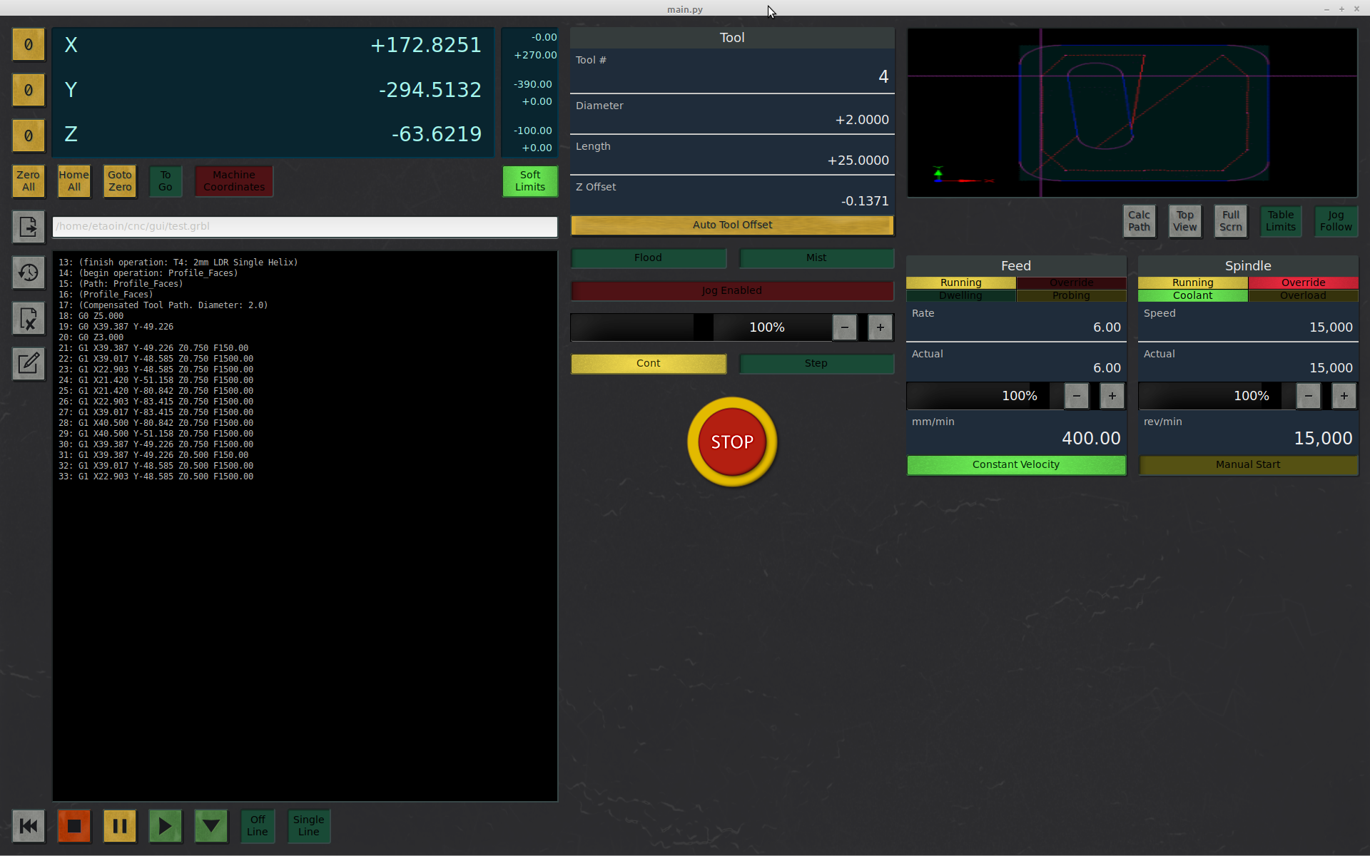
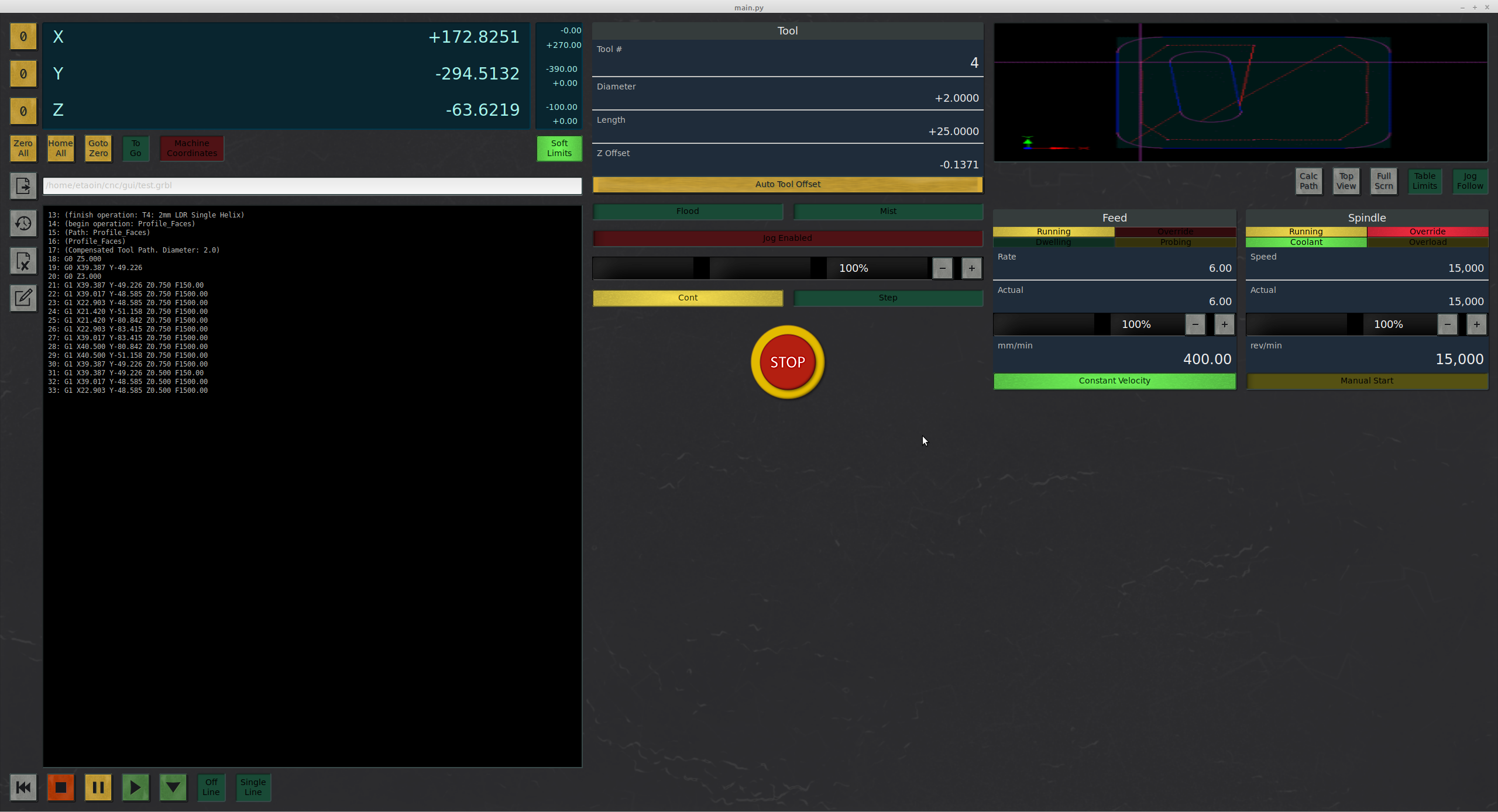
And here are the results, in normal size, 1920X1200 and 2560X1440
pip3 install pygame
And here are the results, in normal size, 1920X1200 and 2560X1440
Attachments:
The following user(s) said Thank You: Etaoin
Please Log in or Create an account to join the conversation.
- Etaoin
-
Topic Author
- Offline
- Junior Member
-
Less
More
- Posts: 20
- Thank you received: 3
26 Jan 2021 01:03 - 26 Jan 2021 01:25 #196589
by Etaoin

Well, that went as well as could be expected! The "normal size" grab looks pretty accurate; background colour on active file name is missing (should be black, not white) and the font size on the annunciator blocks is a bit big - other than that it's quite good. But yeah, when the resolution goes up it becomes unusable, and laughably so. If I was to spend time in implementing this GUI for LinuxCNC I'd have to either learn how to make GTK widgets scale with resolution, or accept that it would only be usable on small screens. I think the latter approach would make more sense, since you could easily show a lot more information on a 32" 2560X1440 screen than a 10" 1024x768 - I struggle to see how sensible use could be made of both with the same UI. It's not just the optional elements you can include as the space grows; it's the logic to drive them, and how they interact with other controls; why burden the XGA codebase with methods and data which it cannot show? I would be interested to know how others feel about this apparent dichotomy.
Edit: Any thoughts on widget appearance/behaviour/response - over the top or usefully tactile? I'm normally on a "full flat" diet when it comes to UI design, and skeuomorphisms always seemed a bit ridiculous to me (why make something look like a real world object when it is nothing like one?). But because it's meant to control mechanical machinery, and on a touch screen as well, it somehow seemed appropriate to emulate the appearance of actual hardware - even down to the smudged keytops and scratched panels...
Replied by Etaoin on topic Introduction: ArtSoft / Mach3 forum drove me here
And here are the results, in normal size, 1920X1200 and 2560X1440
Well, that went as well as could be expected! The "normal size" grab looks pretty accurate; background colour on active file name is missing (should be black, not white) and the font size on the annunciator blocks is a bit big - other than that it's quite good. But yeah, when the resolution goes up it becomes unusable, and laughably so. If I was to spend time in implementing this GUI for LinuxCNC I'd have to either learn how to make GTK widgets scale with resolution, or accept that it would only be usable on small screens. I think the latter approach would make more sense, since you could easily show a lot more information on a 32" 2560X1440 screen than a 10" 1024x768 - I struggle to see how sensible use could be made of both with the same UI. It's not just the optional elements you can include as the space grows; it's the logic to drive them, and how they interact with other controls; why burden the XGA codebase with methods and data which it cannot show? I would be interested to know how others feel about this apparent dichotomy.
Edit: Any thoughts on widget appearance/behaviour/response - over the top or usefully tactile? I'm normally on a "full flat" diet when it comes to UI design, and skeuomorphisms always seemed a bit ridiculous to me (why make something look like a real world object when it is nothing like one?). But because it's meant to control mechanical machinery, and on a touch screen as well, it somehow seemed appropriate to emulate the appearance of actual hardware - even down to the smudged keytops and scratched panels...
Last edit: 26 Jan 2021 01:25 by Etaoin.
The following user(s) said Thank You: tommylight
Please Log in or Create an account to join the conversation.
- tommylight
-
- Offline
- Moderator
-
Less
More
- Posts: 21695
- Thank you received: 7415
26 Jan 2021 01:13 #196590
by tommylight
Replied by tommylight on topic Introduction: ArtSoft / Mach3 forum drove me here
Since i got old and the eyes are on the way out, i tend to get 24" screens with FHD+ resolution, hence the above 1920X1200 res.
Also they are cheap, in the "cnc machine" cost, 60 to 100 Euro does not change much.
But since there are plenty that will find even that to much for any number of reasons ( eg. buying food ), i still see it reasonable to keep the lower resolutions.
Also they are cheap, in the "cnc machine" cost, 60 to 100 Euro does not change much.
But since there are plenty that will find even that to much for any number of reasons ( eg. buying food ), i still see it reasonable to keep the lower resolutions.
Please Log in or Create an account to join the conversation.
- tommylight
-
- Offline
- Moderator
-
Less
More
- Posts: 21695
- Thank you received: 7415
26 Jan 2021 01:15 #196591
by tommylight
")
Replied by tommylight on topic Introduction: ArtSoft / Mach3 forum drove me here
BTW, i loved the soft and tender screeching of the e-stop button !Edit: Any thoughts on widget behaviour/response - over the top or usefully tactile?
The following user(s) said Thank You: Etaoin
Please Log in or Create an account to join the conversation.
- rodw
-

- Offline
- Platinum Member
-

Less
More
- Posts: 11986
- Thank you received: 4083
26 Jan 2021 03:23 #196600
by rodw
Replied by rodw on topic Introduction: ArtSoft / Mach3 forum drove me here
I like the use of colour and how unimportant things are played down until they become important.
The specific instrumentation font is very interesting. Perhaps we should use it more widely.
Comprehension is so tightly related to font design and few people understand that.
Eg back in the print on paper days Wheldon found that Serif fonts (eg Times) resulted in 75% of readers achieving good comprehension while sans serif fonts (eg Arial) only achieved 12% good comprehension. I think this is why Ferrari et al found that we read 50% slower on screen based medium and comprehend 50% less.... Becasue screens of the day were incapable of rendering the serifs.
I get frustrated with screens becasue they blindly reduce standard fonts to the same number of pixels instead of adding some intelligence to the equation and increase the pixel count of standard elements in a similar way to 300 dpi, 600dpi, 1200 dpi and 2400 dpi output devices manage to do it on paper...
The following user(s) said Thank You: Etaoin
Please Log in or Create an account to join the conversation.
- Etaoin
-
Topic Author
- Offline
- Junior Member
-
Less
More
- Posts: 20
- Thank you received: 3
26 Jan 2021 13:53 - 26 Jan 2021 13:54 #196613
by Etaoin
Thank you - I do like a bit of " blinkenlights ", but it's a fine line before it gets distracting. With the toggles, my thinking is you will know where they are, so the text does not need to stand out in the "off" mode. This is certainly true of the annunciators, which are not clickable.
Yes, I really like B612 - I've used it for other design mock-ups in the past, and it always renders very neatly. I figure if it's good enough for airliner cockpit instruments then it should be good enough for me...
Replied by Etaoin on topic Introduction: ArtSoft / Mach3 forum drove me here
I like the use of colour and how unimportant things are played down until they become important.
Thank you - I do like a bit of " blinkenlights ", but it's a fine line before it gets distracting. With the toggles, my thinking is you will know where they are, so the text does not need to stand out in the "off" mode. This is certainly true of the annunciators, which are not clickable.
The specific instrumentation font is very interesting. Perhaps we should use it more widely. Comprehension is so tightly related to font design and few people understand that.
Yes, I really like B612 - I've used it for other design mock-ups in the past, and it always renders very neatly. I figure if it's good enough for airliner cockpit instruments then it should be good enough for me...
Last edit: 26 Jan 2021 13:54 by Etaoin.
The following user(s) said Thank You: rodw
Please Log in or Create an account to join the conversation.
- robertspark
- Offline
- Platinum Member
-
Less
More
- Posts: 915
- Thank you received: 216
26 Jan 2021 17:20 #196639
by robertspark
Replied by robertspark on topic Introduction: ArtSoft / Mach3 forum drove me here
Please Log in or Create an account to join the conversation.
Time to create page: 0.201 seconds