Gscreen - a GTK / Glade / Python based screen
- BigJohnT
-

- Offline
- Administrator
-

Less
More
- Posts: 3990
- Thank you received: 994
10 Dec 2012 06:14 #27476
by BigJohnT
Replied by BigJohnT on topic Gscreen - a GTK / Glade / Python based screen
I've been hiding mine, it's one click. When working on the GUI in Glade you need them to navigate.
John
John
Please Log in or Create an account to join the conversation.
- cmorley
- Offline
- Moderator
-

Less
More
- Posts: 7306
- Thank you received: 2138
10 Dec 2012 08:43 #27484
by cmorley
Replied by cmorley on topic Gscreen - a GTK / Glade / Python based screen
Yes I had the same problem so in the end i just left them showing.
Chris M
Chris M
Please Log in or Create an account to join the conversation.
- tjamscad
- Offline
- Elite Member
-

Less
More
- Posts: 238
- Thank you received: 1
10 Dec 2012 20:23 - 10 Dec 2012 23:26 #27504
by tjamscad
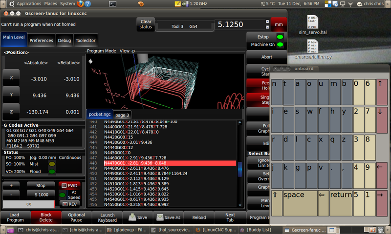
The blue lettering in the progrham area is really hard to read. Perhaps a different shade or different color. What is the play,pause and skip buttons for? Estop should be red not green and machine on should be green not red.
Replied by tjamscad on topic Gscreen - a GTK / Glade / Python based screen
I have keyboard so it pop open and closed. I still need to change the layout and colors.
The DRO is for Fanuc style not sure if thats an improvement or not.
I'm thinking I could put the G and M code as a vertical list under the DRO - again more Fanuc style.
I see I could spend a lot of time making screens for people
Chris M
The blue lettering in the progrham area is really hard to read. Perhaps a different shade or different color. What is the play,pause and skip buttons for? Estop should be red not green and machine on should be green not red.
Last edit: 10 Dec 2012 23:26 by tjamscad.
Please Log in or Create an account to join the conversation.
- BigJohnT
-

- Offline
- Administrator
-

Less
More
- Posts: 3990
- Thank you received: 994
10 Dec 2012 21:07 #27511
by BigJohnT
What size screen are you making? I started with 800 x 600 but after some research the 15" 1024 x 768 touch screen was close in price to the smaller screen. I ordered an ELO 1515L to replace the 19" screen on the BP. I'll move the 19" screen to the CHNC where it fits better.
John
Replied by BigJohnT on topic Gscreen - a GTK / Glade / Python based screen
Vertical screen space is at a premium that's why I haven't.
What size screen are you making? I started with 800 x 600 but after some research the 15" 1024 x 768 touch screen was close in price to the smaller screen. I ordered an ELO 1515L to replace the 19" screen on the BP. I'll move the 19" screen to the CHNC where it fits better.
John
Please Log in or Create an account to join the conversation.
- cmorley
- Offline
- Moderator
-

Less
More
- Posts: 7306
- Thank you received: 2138
11 Dec 2012 03:14 #27531
by cmorley
Yes the blue lettering Is the choice of the Gcode text editor and I agree it's hard to read.
I haven't looked at how to change that but the background can be changed in the theme.
Themes are another deep well to dig into. They change the look and feel of the widgets.
They are very powerful but of course that means they are a lot to learn.
That particular theme is one I modified for red buttons. I just never finished it.
The play pause etc are icons for running the program, I have since changed them to regular text. cycle start. abort,feed hold, and single step
In that pic the Estop button was not connected - when connected, is Estop is clear it's green and when machine is on it's green otherwise it's red.
I could have the LEDs be dark or they could blink when estopped... the text could change - in fact the machine on changes to machine off.
I tried the blicking LED - I like that.
Replied by cmorley on topic Gscreen - a GTK / Glade / Python based screen
The blue lettering in the progrham area is really hard to read. Perhaps a different shade or different color. What is the play,pause and skip buttons for? Estop should be red not green and machine on should be green not red.
Yes the blue lettering Is the choice of the Gcode text editor and I agree it's hard to read.
I haven't looked at how to change that but the background can be changed in the theme.
Themes are another deep well to dig into. They change the look and feel of the widgets.
They are very powerful but of course that means they are a lot to learn.
That particular theme is one I modified for red buttons. I just never finished it.
The play pause etc are icons for running the program, I have since changed them to regular text. cycle start. abort,feed hold, and single step
In that pic the Estop button was not connected - when connected, is Estop is clear it's green and when machine is on it's green otherwise it's red.
I could have the LEDs be dark or they could blink when estopped... the text could change - in fact the machine on changes to machine off.
I tried the blicking LED - I like that.
Please Log in or Create an account to join the conversation.
- andypugh
-

- Offline
- Moderator
-

Less
More
- Posts: 19852
- Thank you received: 4634
11 Dec 2012 03:28 - 11 Dec 2012 03:29 #27532
by andypugh
There is a better G-code syntax highlighter here:
www.cnc-club.ru/forum/viewtopic.php?f=33&t=80
Replied by andypugh on topic Gscreen - a GTK / Glade / Python based screen
The syntax highlighting is also rather eccentric.Yes the blue lettering Is the choice of the Gcode text editor and I agree it's hard to read.
I haven't looked at how to change that but the background can be changed in the theme.
There is a better G-code syntax highlighter here:
www.cnc-club.ru/forum/viewtopic.php?f=33&t=80
Last edit: 11 Dec 2012 03:29 by andypugh.
Please Log in or Create an account to join the conversation.
- tjamscad
- Offline
- Elite Member
-

Less
More
- Posts: 238
- Thank you received: 1
11 Dec 2012 05:11 #27538
by tjamscad
Replied by tjamscad on topic Gscreen - a GTK / Glade / Python based screen
Chris,
Have you taken any new screen shots lately? I see that you are making updates it seems almost daily.
Have you taken any new screen shots lately? I see that you are making updates it seems almost daily.
Please Log in or Create an account to join the conversation.
- cmorley
- Offline
- Moderator
-

Less
More
- Posts: 7306
- Thank you received: 2138
11 Dec 2012 05:16 #27539
by cmorley
Replied by cmorley on topic Gscreen - a GTK / Glade / Python based screen
Thanks Andy I will have to teach the HAL widget to allow other schemes.
Please Log in or Create an account to join the conversation.
- cmorley
- Offline
- Moderator
-

Less
More
- Posts: 7306
- Thank you received: 2138
13 Dec 2012 10:15 #27656
by cmorley
Replied by cmorley on topic Gscreen - a GTK / Glade / Python based screen
Not much has changed. I can change the layout/color of the onboard screen but haven't got it to embed inside the main screen - It may be easier to just let it pop on top (there is a button to launch/hide it.)
The LED blinks on estop - really gets your attention.
Text instead of some of the icons.
This is a custom screen the stock Gscreen has not changed in awhile.
I think it's to the point where someone needs to use it and find what works and what doesn't.
I am working on adding more options for real controls which is proving to be a bit of a pain deciding how.
What controls do most of your machine have or more importantly wanted.
there are so many options.
One could use the one MPG wheel for jogging and setting overrides.
Or use a rotary switch for overrides
or if you have analog inputs then a potentiometer for overrides.
For Gscreen I would think removing the soft buttons for these options if hardware buttons are used would be desirable.
Tjamscad are you going to try using linuxcnc's master version so you can try out Gscreen?
Please Log in or Create an account to join the conversation.
- cncbasher
- Offline
- Moderator
-

Less
More
- Posts: 1021
- Thank you received: 202
13 Dec 2012 16:39 #27658
by cncbasher
Replied by cncbasher on topic Gscreen - a GTK / Glade / Python based screen
Chris,
yes thinking over this , removing soft buttons if their are real controls would help .but seems complicated to handle and keep the layout reasonable .
I was also looking at say using an MPG and say one real button as a select ... i.e select x axis .. spindle etc .. ..press select button then rotate MPG to select override or value required , then press select again to store and use value
if that makes sense ..
real switches i'd say similar to touchy .. Cycle start , Abort , single step and Jog + - ( per axis )
and perhaps Johns Multiple sequence run pause code
Please Log in or Create an account to join the conversation.
Time to create page: 0.228 seconds


