Poor Boy GUI
- gww250
- Offline
- Senior Member
-

Less
More
- Posts: 61
- Thank you received: 0
30 Jan 2014 20:47 #43331
by gww250
Replied by gww250 on topic Poor Boy GUI
I'll make a list of what I've found so far later on today or tonight.
Please Log in or Create an account to join the conversation.
- jmelson
- Offline
- Moderator
-

Less
More
- Posts: 817
- Thank you received: 157
31 Jan 2014 00:50 - 31 Jan 2014 00:50 #43340
by jmelson
control stuff on another page/tab? Otherwise, what does this GUI provide
that others don't?
Jon
Replied by jmelson on topic Poor Boy GUI
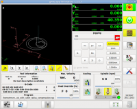
WOW, that's a BUSY screen! Wouldn't it be better to put a bunch of that on/offTrying to upload a screenshot.
control stuff on another page/tab? Otherwise, what does this GUI provide
that others don't?
Jon
Last edit: 31 Jan 2014 00:50 by jmelson.
Please Log in or Create an account to join the conversation.
- newbynobi
-

- Offline
- Platinum Member
-

Less
More
- Posts: 2082
- Thank you received: 413
31 Jan 2014 02:23 #43344
by newbynobi
Replied by newbynobi on topic Poor Boy GUI
@gww250,
what is wrong with gmoccapy for your purpose?
Gmoccapy offers following layouts combined with only one "surface"
- 3 axis mill
- 4 axis mill
- lathe
- plasma
What layout do you miss?
Marius asked me to include plasma, so I did that, what do you need for your laser?
It should be easy to change plasma to fit an laser.
Or do you do that just to learn more, if so, keep on going.
With the color buttons, please see gmoccapy code or also the Combi_DRO code, both do handle with colors. If you need help, please submit more detailed infos.
Norbert
Norbert
Please Log in or Create an account to join the conversation.
- gww250
- Offline
- Senior Member
-

Less
More
- Posts: 61
- Thank you received: 0
31 Jan 2014 02:43 #43346
by gww250
Replied by gww250 on topic Poor Boy GUI
Most of the buttons on the right just send signals to the various laser relays and solenoids but thy also provide feedback, via color states so they need to be visible. On most OEM systems many of these buttons are illuminated switches in an enclosure that sits under the computer monitor. Even the big guys are dumping that approach and putting them in the display nowadays. This gui is simple compared to what you find on an Amada or Mitsubishi machine and most people can use in with just a few minutes of familiarization. It's kind of like playing a musical instrument. After a while you don't even look at the keys since your hand gets trained somehow. Most of the time i use keyboard shortcuts but that just my particular style. We have a remote (cabled) pendant on one of mills runing linuxcnc and this used more often than not after all of the startup functions have been performed.
Personally I hate tabs and secondary screens and scroll windows. I like to see everything at one time. My partners are just the opposite and only want to see the jog buttons and dro.
As to benefits or merits of the gui design, it's just an improvement over what we currently have and like to use. Every operator has unique preferences so in the perfect world we'd have a gui for every individual technician.
I've played around with Gscreen and Touchy over the past few weeks and like both of them. The nice thing about developing gui's for people to try is that it provides a broader range of experience and that in turn results in more and better gui's coming from other people.
Linuxcnc is a great package but the Axis interface isn't one of the best around. Even on the Axis we're using now on two mills we've added Glade panels.
So to make a long story short I'm not making any claims that this gui is any better than any other, it's just a gui and we'll probably build several different versions before it gets finalized. I doubt anybody will use it except our in-house operators.
I was just showing it off so folks on here could see what their help and inspiration allowed me to produce.
Please Log in or Create an account to join the conversation.
- gww250
- Offline
- Senior Member
-

Less
More
- Posts: 61
- Thank you received: 0
31 Jan 2014 02:50 #43347
by gww250
Replied by gww250 on topic Poor Boy GUI
Norbert, I've been studying gmoccapy for several weeks. I loaded it up and like the look and feel of the package. When we get to working on the plasma version I was going to call on you. We developed this particular layout because all of our operators like the old interface we already have so we want to stay with it.
I personally think building the software control structure for a plasma machine will be much harder than for the laser. Laser heads typically have their own standalone equivalent of theTHC built into a subprocessor on the cutting head so all we do initiate the auto focus feature then the subprocessor takes over to control standoff, collision avoidance, etc., etc.
I personally think building the software control structure for a plasma machine will be much harder than for the laser. Laser heads typically have their own standalone equivalent of theTHC built into a subprocessor on the cutting head so all we do initiate the auto focus feature then the subprocessor takes over to control standoff, collision avoidance, etc., etc.
Please Log in or Create an account to join the conversation.
- gww250
- Offline
- Senior Member
-

Less
More
- Posts: 61
- Thank you received: 0
31 Jan 2014 03:35 #43348
by gww250
Replied by gww250 on topic Poor Boy GUI
Forgot to mention that a huge impetus for us switching over to Linuxcnc is so that we can completely purge the shop of anything with a 'Windows' logo on it.
Please Log in or Create an account to join the conversation.
- BigJohnT
-

- Offline
- Administrator
-

Less
More
- Posts: 7000
- Thank you received: 1175
31 Jan 2014 20:13 #43368
by BigJohnT
The interesting thing about GUI's is everyone that designs one thinks theirs is perfect or nearly so. What this means is no one GUI is perfect for everyone as you noticed.
What LinuxCNC needs is a drag and drop GUI builder so everyone can just build the perfect (for them) GUI. I'm not sure how one would do that at this point. I even thought about a GUI framework that if you followed the correct naming convention and used Glade to build your GUI it would just work... but I've not got that far yet.
JT
Replied by BigJohnT on topic Poor Boy GUI
So to make a long story short I'm not making any claims that this gui is any better than any other, it's just a gui and we'll probably build several different versions before it gets finalized. I doubt anybody will use it except our in-house operators.
I was just showing it off so folks on here could see what their help and inspiration allowed me to produce.
The interesting thing about GUI's is everyone that designs one thinks theirs is perfect or nearly so. What this means is no one GUI is perfect for everyone as you noticed.
What LinuxCNC needs is a drag and drop GUI builder so everyone can just build the perfect (for them) GUI. I'm not sure how one would do that at this point. I even thought about a GUI framework that if you followed the correct naming convention and used Glade to build your GUI it would just work... but I've not got that far yet.
JT
Please Log in or Create an account to join the conversation.
- cmorley
- Offline
- Moderator
-

Less
More
- Posts: 7922
- Thank you received: 2148
01 Feb 2014 10:50 #43388
by cmorley
This is what Gscreen does. Feel free to join me to improve it.
Chris M
Replied by cmorley on topic Poor Boy GUI
What LinuxCNC needs is a drag and drop GUI builder so everyone can just build the perfect (for them) GUI. I'm not sure how one would do that at this point. I even thought about a GUI framework that if you followed the correct naming convention and used Glade to build your GUI it would just work... but I've not got that far yet.
JT
This is what Gscreen does. Feel free to join me to improve it.
Chris M
Please Log in or Create an account to join the conversation.
- BigJohnT
-

- Offline
- Administrator
-

Less
More
- Posts: 7000
- Thank you received: 1175
01 Feb 2014 19:54 #43397
by BigJohnT
I didn't realize that Gscreen did that... JT goes wandering off looking for it.
JT
Replied by BigJohnT on topic Poor Boy GUI
What LinuxCNC needs is a drag and drop GUI builder so everyone can just build the perfect (for them) GUI. I'm not sure how one would do that at this point. I even thought about a GUI framework that if you followed the correct naming convention and used Glade to build your GUI it would just work... but I've not got that far yet.
JT
This is what Gscreen does. Feel free to join me to improve it.
Chris M
I didn't realize that Gscreen did that... JT goes wandering off looking for it.
JT
Please Log in or Create an account to join the conversation.
- newbynobi
-

- Offline
- Platinum Member
-

Less
More
- Posts: 2082
- Thank you received: 413
02 Feb 2014 04:51 - 02 Feb 2014 04:59 #43411
by newbynobi
Replied by newbynobi on topic Poor Boy GUI
@JT
Gscreen is not doing exactly that at this time, but does support several features to create a gui. Please take in mind, that gscreen is a very young component and there is plenty room for improvments.
IMHO the way should go to optimized glade linuxcnc widgets and one core library taking care of mantaining all consistent..
But we are far away from this!! Just look on the line number problem, it is not posible to mantain the gremlin preview and sourceview at the same state. If the tool is working on line 30, the sourceview will highlight line 56.
The tool handling is far away from beeing optimal, i just mention tool wear, real tool cut length and more.
So there is a lot of work, even in the very deep internals.
So please give us a hand to get rid of one of the many problems:-)
Norbert
Last edit: 02 Feb 2014 04:59 by newbynobi.
Please Log in or Create an account to join the conversation.
Time to create page: 0.209 seconds
