Another GUI project underway
31 Jul 2018 06:56 #115207
by Lcvette
Another GUI project underway was created by Lcvette
Hello all,
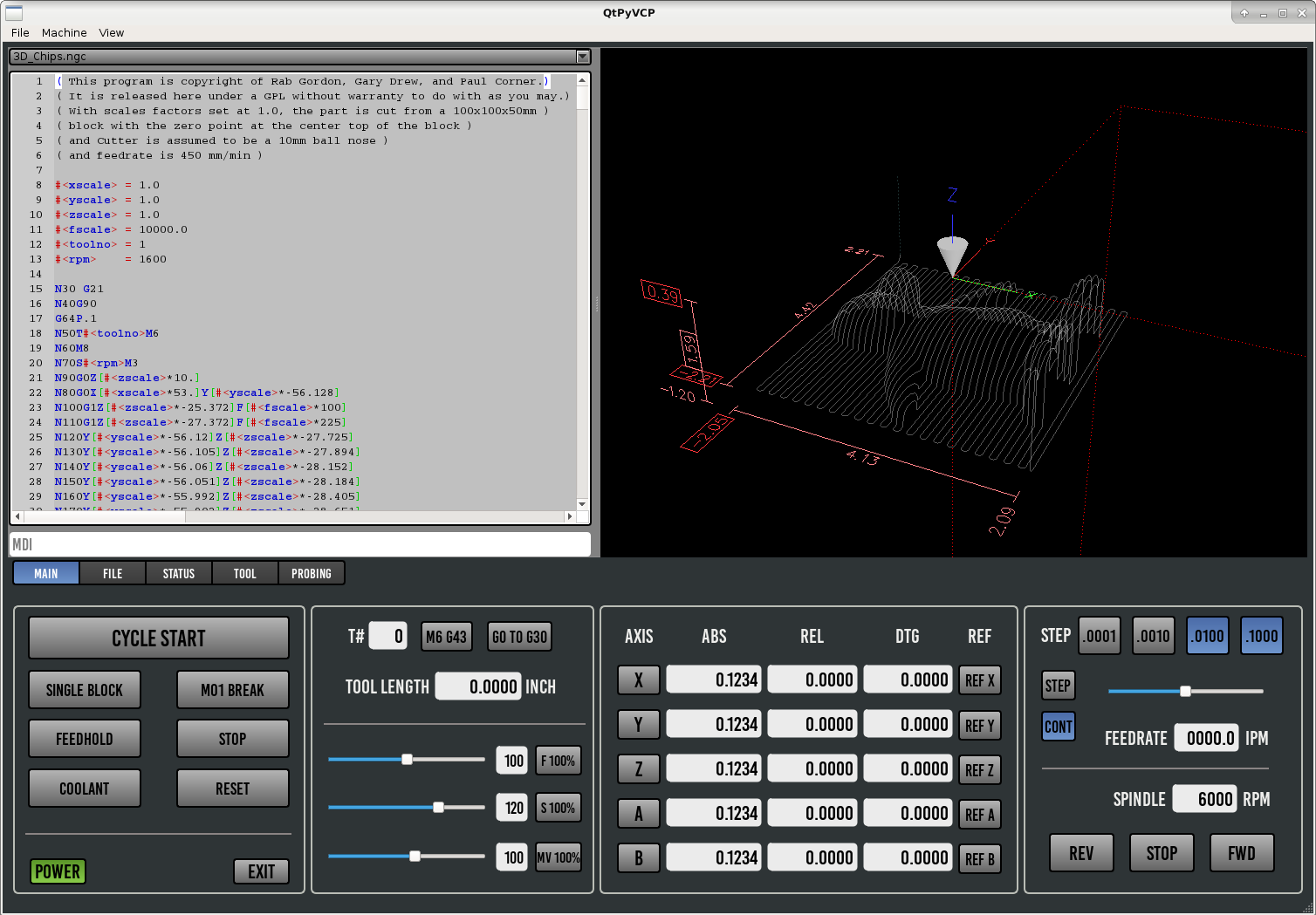
I was fortunate enough to meet and befriend a few very talented and patient fellow board and IRC members who were kind enough to help me start to learn a little bit about GUI's and coding.. (a very little bit to date admittedly). They are Hazzy and TurBoss. We have been tinkering on a screen design and some probing routines, and figured we would throw then out into the world and get some feedback. The start was to use a similar approach as pathpilot as that seemed like a popular interface often referred to by many people. But as we got into it we made a few minor changes in the layout. Below is a rough example, nothing final, still a working rough draft done in QTDesigner and built on top of one of cmorleys earlier designs. Currently all buttons and sliders are in stock form but we hope to dress some things up a little nicer to bring out some more personality. We are aiming for a clean streamlined interface. So please let us know your constructive criticism. Look forward to hearing your thoughts and ideas, things you like, things you don't. Everyone's tastes are different, so we understand it's not going to be everyone's cup of tea, just please keep it cordial and polite.
Thanks!
Chris (and thanks to the hard work of Hazzy, TurBoss and Cmorley for making this possible so far!)
The following user(s) said Thank You: tommylight, tivoi, emilvv, Daneel, CNCCustoms, KCJ, MarcoGaspar, davidshore, COFHAL, jay.perez1 and 2 other people also said thanks.
Please Log in or Create an account to join the conversation.
31 Jul 2018 07:51 #115209
by RotarySMP
Replied by RotarySMP on topic Another GUI project underway
My 0.02c...
This looks very similar to the Blender style GUI BrendaEM is doing...
forum.linuxcnc.org/41-guis/34572-a-wides...yle-interface#110805
When did the trend to dark grey CNC controller screens catch on? I don't like the arcade game garish colours of many Mach 3 screen, and think Gmoccapy could be tuned done a little on some of the clip art and colours, but never got the trend to dark grey visuals either.
I think Gmoccapy is nearly perfect with the soft keys and the way Norbert implemented shuttling through ABS/REL/DTG rather than triplicating this information on screen.
I really like the green/white background for the program/MDI overview they are proposing for the Blender GUI, as that makes it more readable. And the tool library graphics are real eye candy. Hope that gets ported to GmoccaPy.
forum.linuxcnc.org/41-guis/34572-a-wides...ace?start=310#115103
With the move to bigger screens, there is a trend to information overkill on some GUI proposals.
Mark
The following user(s) said Thank You: Lcvette
Please Log in or Create an account to join the conversation.
- tommylight
-
- Away
- Moderator
-

Less
More
- Posts: 19204
- Thank you received: 6437
31 Jul 2018 08:25 #115210
by tommylight
Replied by tommylight on topic Another GUI project underway
If i remember correctly, i read somewhere that Tormach will not let Linuxcnc users use their graphics and wizards.
I like the design as it is much easier to understand what is going on for new users, and i do agree that having 3 types of DRO there is to much. I also do like darker themes as having to look at a bright screens all day is not easy on the eyes.
As for me personally, i like to have everything on screen, even what is going on with the electronics as you can see from the image below.
Again i do like it a lot !
Please Log in or Create an account to join the conversation.
31 Jul 2018 09:36 #115215
by cmorley
Replied by cmorley on topic Another GUI project underway
Chris:
It's a very nice take on tormach's screen.
Are you using Kurt's pyqtvcp branch or my qtvcp branch?
Keep up the good work!
Mark:
The color of the screens are pretty easy to change anyways.
It's a very nice take on tormach's screen.
Are you using Kurt's pyqtvcp branch or my qtvcp branch?
Keep up the good work!
Mark:
The color of the screens are pretty easy to change anyways.
The following user(s) said Thank You: Lcvette
Please Log in or Create an account to join the conversation.
- InMyDarkestHour
-
- Offline
- User is blocked
-

Less
More
- Posts: 701
- Thank you received: 111
31 Jul 2018 10:57 #115216
by InMyDarkestHour
Replied by InMyDarkestHour on topic Another GUI project underway
I like it, nice & clean, seems less cluttered.
Nice job.
Nice job.
The following user(s) said Thank You: Lcvette
Please Log in or Create an account to join the conversation.
31 Jul 2018 12:45 #115223
by andypugh
Replied by andypugh on topic Another GUI project underway
I like having all the different bits of info there all the time (Touchy does the same thing)
I don't want to have to poke the screen to check that DTG makes sense.
I don't want to have to poke the screen to check that DTG makes sense.
The following user(s) said Thank You: Lcvette
Please Log in or Create an account to join the conversation.
31 Jul 2018 14:57 #115235
by KCJ
Replied by KCJ on topic Another GUI project underway
Thank you for posting this Lcvette!
cmorley, yes, that is done in my QtPyVCP branch, meaning it does not have any functionality, lol
Cheers,
Kurt (aka hazzy)
cmorley, yes, that is done in my QtPyVCP branch, meaning it does not have any functionality, lol
Cheers,
Kurt (aka hazzy)
The following user(s) said Thank You: Lcvette
Please Log in or Create an account to join the conversation.
31 Jul 2018 15:41 #115240
by Hakan
Replied by Hakan on topic Another GUI project underway
Nice!.
Though I always find the scrollbar handles very small on a touch screen. Can there be a sweeping action to scroll?
Though I always find the scrollbar handles very small on a touch screen. Can there be a sweeping action to scroll?
Please Log in or Create an account to join the conversation.
31 Jul 2018 15:51 #115241
by KCJ
Replied by KCJ on topic Another GUI project underway
Hakan, Qt does support gestures, so it should be possible to do things like make text views scroll by sweeping, backplot zoom by pinching etc. Also, the OR sliders will get bigger handles, eventually ...
Cheers,
Kurt
Cheers,
Kurt
Please Log in or Create an account to join the conversation.
31 Jul 2018 16:08 - 31 Jul 2018 17:01 #115242
by Lcvette
None of Tormachs graphics or wizards will be used. The font is the same but this is an open font and I think it should be ok to use as I can't imagine it being under tormach control. I have made all new graphics for the probing screens as well as worked with Hazzy and TurBoss to develop probing routines different from Tormachs (which seem a bit slow) by comparison. Conversational is possible I suppose, I'm happy to do graphics for it, but some help on the code for that would be helpful!
Replied by Lcvette on topic Another GUI project underway
If i remember correctly, i read somewhere that Tormach will not let Linuxcnc users use their graphics and wizards.
None of Tormachs graphics or wizards will be used. The font is the same but this is an open font and I think it should be ok to use as I can't imagine it being under tormach control. I have made all new graphics for the probing screens as well as worked with Hazzy and TurBoss to develop probing routines different from Tormachs (which seem a bit slow) by comparison. Conversational is possible I suppose, I'm happy to do graphics for it, but some help on the code for that would be helpful!
Last edit: 31 Jul 2018 17:01 by Lcvette.
The following user(s) said Thank You: tommylight, KCJ
Please Log in or Create an account to join the conversation.
Time to create page: 0.261 seconds
