MonoKrom - QtPyVCP GUI for PlasmaC and Mill
- pinder
-
 Topic Author
- Offline
- Elite Member
-

- Posts: 196
- Thank you received: 128
It can be added.
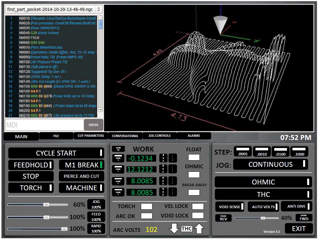
1. The first thing I noticed is the Breakaway status is missing from the Main page.
can you mention those?2. The THC panel has things in it that have really nothing to do with the THC.
if more people ask so.3. Consider having all of the "File" options on their own tab, this will free up a lot of room.
again if more people ask it4. I agree, there is a need for custom buttons on the main tab. A lot of us use that a lot.
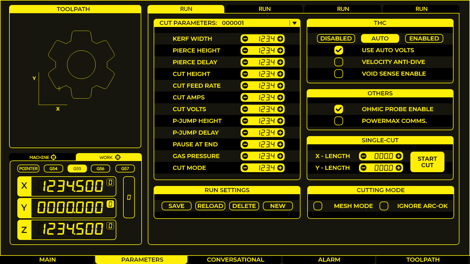
it was a space problem, I'll see if can manage5. I saw you left the Hypertherm Comms off of the config tab. Do you have a plan for those? As a hypertherm user, I need them
they are work under progress, you must have seen large screen screencapture6. The rapid, feed, and jog sliders are a bit large, any thing we could do to shrink them?
see the first page for reference size
time can me placed. I'll update in next screen7. Any chance we could work the time on to the main page? If we are going to load this full screen on touch monitors, seeing what time it is is really useful :laugh
Sure8. Can the "Alarm" tab, or really any of them blink when there is something that requires your attention there?
i have not used cut-recover before.9. For cut recovery, there are a few directional arrows missing (diagonal).
those can be added in needed.
Sorry, red is only for errors.10. I really like the colored G-Code.
read carefully.For example, the OHMIC and THC wouldnt have to take up so much room.
thats only a config panel.
thankyou for your suggestions. you've got a pretty GUI yourself
Please Log in or Create an account to join the conversation.
- pinder
-
 Topic Author
- Offline
- Elite Member
-

- Posts: 196
- Thank you received: 128
I have come up with something.
Yes, QtPyVCP already catches and makes the error messages as channels. There is an error messages widgets that records each error with a time stamp, and you can sort and filter error messages based on type. Maybe we can use this, or make something similar that might fit in with the design better.
When an error arrives, screen should auto switch to Alerts tab and highlight axis, estop or whatever.
And we have plenty of room there for error and alert widgets.
Please Log in or Create an account to join the conversation.
- AgentWD40
-

- Offline
- Platinum Member
-

- Posts: 339
- Thank you received: 96
Please Log in or Create an account to join the conversation.
- snowgoer540
-

- Offline
- Moderator
-

- Posts: 2548
- Thank you received: 871
Probe, Float, Arc-Ok, Float, Torch really have nothing to do with the THC.
can you mention those?2. The THC panel has things in it that have really nothing to do with the THC.
You might consider cross posting this in the PlasmaC section to get more feedback. I'm pretty active over there, and it took someone pointing me here for me to see it...
if more people ask so.3. Consider having all of the "File" options on their own tab, this will free up a lot of room.
again if more people ask it4. I agree, there is a need for custom buttons on the main tab. A lot of us use that a lot.
Sorry I was not clear, that was in reference to the GUI I mocked up. I had really large THC and OHMIC buttons that didnt need to be that big
read carefully.For example, the OHMIC and THC wouldnt have to take up so much room.
thats only a config panel.
Thank you for adding the other suggestions to the "list". I know there is a lot of hard work going into this!
Please Log in or Create an account to join the conversation.
- snowgoer540
-

- Offline
- Moderator
-

- Posts: 2548
- Thank you received: 871
Yea, I agree, it's not something I have in Plasma land now (I have it on my Tormach, but agree it's just a nice to have). I guess I got confused on the mockups, I must have saw an older one. Just saying what I did and didnt like.I agree with snowgoer that the color gcode syntax highlighting looks nice, but I can also see where pinder is coming from in regard to keeping it monochrome. My shop has sun lights that completely wash out the screen at certain parts of the day so I completely get the need for monochrome. And at the same time how much are we really reading the gcode in that window anyway? We can't even edit it there.
A friend suggested that he could still read the GUI with his Plasma shades (usually green) on, so I think that factors in too!.
Please Log in or Create an account to join the conversation.
- pinder
-
 Topic Author
- Offline
- Elite Member
-

- Posts: 196
- Thank you received: 128
They are indicators not buttons and are pretty important to me. All buttons have touchable size.Probe, Float, Arc-Ok, Float, Torch really have nothing to do with the THC.
Things on the main screen will have to be stick like that, because that it the idea from where it all started. IMHO Changing too much will ruin everything, and we will forget from where we started.You might consider cross posting this in the PlasmaC section to get more feedback. I'm pretty active over there, and it took someone pointing me here for me to see it...
Should I post on PlasmaC forum too?
thankyou too for your suggestions.Thank you for adding the other suggestions to the "list". I know there is a lot of hard work going into this!
here's your powermax option
Attachments:
Please Log in or Create an account to join the conversation.
- snowgoer540
-

- Offline
- Moderator
-

- Posts: 2548
- Thank you received: 871
They are indicators not buttons and are pretty important to me. All buttons have touchable size.Probe, Float, Arc-Ok, Float, Torch really have nothing to do with the THC.
Sorry indicators. At any rate I was just saying that the frame label of THC isn’t really accurate, since it contains more than that, that’s all.
Thanks for cross posting.
Please Log in or Create an account to join the conversation.
- AgentWD40
-

- Offline
- Platinum Member
-

- Posts: 339
- Thank you received: 96
You might consider cross posting this in the PlasmaC section to get more feedback. I'm pretty active over there, and it took someone pointing me here for me to see it...
Bookmark forum.linuxcnc.org/forum/recent
... It's all about 90% plasmac related anyway
Please Log in or Create an account to join the conversation.
- snowgoer540
-

- Offline
- Moderator
-

- Posts: 2548
- Thank you received: 871
You might consider cross posting this in the PlasmaC section to get more feedback. I'm pretty active over there, and it took someone pointing me here for me to see it...
Bookmark forum.linuxcnc.org/forum/recent
... It's all about 90% plasmac related anyway
Haha good idea
Please Log in or Create an account to join the conversation.
- rodw
-

- Away
- Platinum Member
-

- Posts: 11862
- Thank you received: 4022
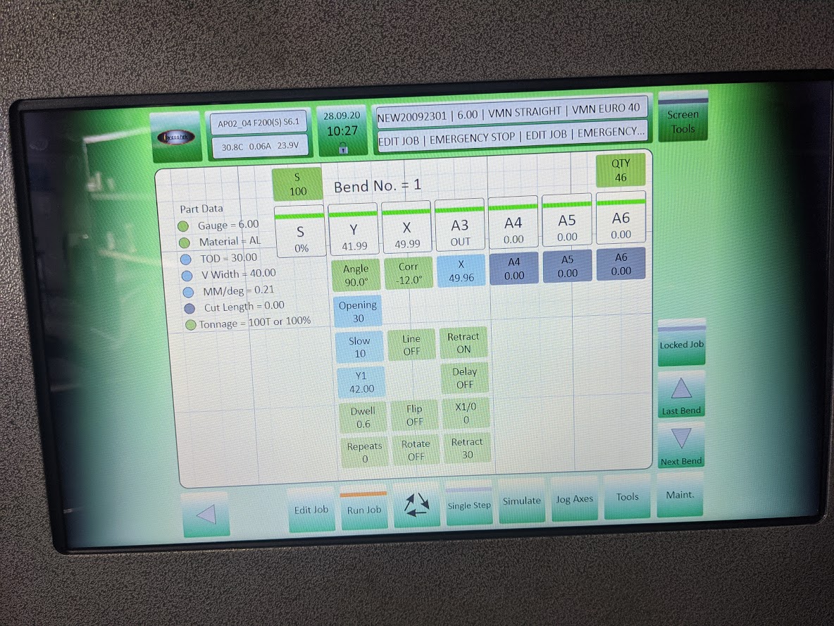
Pressbrake with no errors (note status lines at the top - first line summarises job settings, Job ID, Material thickness, top tool, bottom die; Second line prints latest event log entries)
The status line concatenates the last few errors on one line
Note the buttons are all colour coded. Green is operator entry, light blue is system calculated and will change colour if you override it.
Nothing will run until all axes have a green bar in them
Pressing Run, its bar will go green unless there is an error somewhere. Foot pedal is activated. Pressing foot pedal runs the cycle.
Pressbrake with estop set. Status turns red.
Clicking on the status line at any time displays the error log
Attachments:
Please Log in or Create an account to join the conversation.
