MonoKrom - QtPyVCP GUI for PlasmaC and Mill
- pinder
-
 Topic Author
- Offline
- Elite Member
-

Less
More
- Posts: 196
- Thank you received: 128
27 Sep 2020 20:55 - 27 Sep 2020 20:57 #184047
by pinder
I like that.
if others agree make it the final.
Cheers,
Pinder
Replied by pinder on topic MONOKROM - qypyvcp GUI for plasmac
thankyou Kurt
To late, i tend to disagree on this as all caps is considered screaming on the internet.Just a little request.
Make monokrom in capitals
MONOKROM
cheers
Pinder
But it has already been decided so i will shut up now !
I agree Tommy, but the man has done such a nice job with the rest of the GUI, we have to let him have it his way
I did try MonoKrom, which I think looks best and might help people pronounce it correctly...
")
I like that.
if others agree make it the final.
Cheers,
Pinder
Last edit: 27 Sep 2020 20:57 by pinder.
The following user(s) said Thank You: tommylight, KCJ
Please Log in or Create an account to join the conversation.
- tommylight
-

- Away
- Moderator
-

Less
More
- Posts: 21633
- Thank you received: 7388
27 Sep 2020 21:09 #184053
by tommylight
")
I agree, he has done a great job, so i am all for leaving the name in all caps.
This has gone from a drawing to reality so fast thanks to you all that i wonder what would Brenda think if she saw this as i did try to explain this exact thing to her but she insisted on drama and ended up killing a very nice project.
Ahhh, old times !
Replied by tommylight on topic MONOKROM - qypyvcp GUI for plasmac
When you put it that way, i wonder what was i on about?I agree Tommy, but the man has done such a nice job with the rest of the GUI, we have to let him have it his way
I agree, he has done a great job, so i am all for leaving the name in all caps.
This has gone from a drawing to reality so fast thanks to you all that i wonder what would Brenda think if she saw this as i did try to explain this exact thing to her but she insisted on drama and ended up killing a very nice project.
Ahhh, old times !
The following user(s) said Thank You: Clive S, KCJ, AgentWD40, pinder
Please Log in or Create an account to join the conversation.
- KCJ
-

- Offline
- Moderator
-
Less
More
- Posts: 328
- Thank you received: 267
27 Sep 2020 21:11 - 27 Sep 2020 21:12 #184055
by KCJ
Replied by KCJ on topic MONOKROM - qypyvcp GUI for plasmac
I was hopping we could leave Brenda out of this, but it was inevitable 
Last edit: 27 Sep 2020 21:12 by KCJ.
The following user(s) said Thank You: tommylight
Please Log in or Create an account to join the conversation.
- tommylight
-
- Away
- Moderator
-
Less
More
- Posts: 21633
- Thank you received: 7388
27 Sep 2020 21:16 #184058
by tommylight
Replied by tommylight on topic MONOKROM - qypyvcp GUI for plasmac
LOLI was hopping we could leave Brenda out of this, but it was inevitable
Please Log in or Create an account to join the conversation.
- rodw
-

- Away
- Platinum Member
-

Less
More
- Posts: 11953
- Thank you received: 4069
27 Sep 2020 21:28 #184060
by rodw
Replied by rodw on topic MONOKROM - QtPyVCP GUI for PlasmaC
So some feedback.
The Cut parameters drop down needs to display the material name, not just the number.
I Know you want to keep true to a monokrom screen but when I looked at best practice for HMI controls, it said that colour and other features should be used to draw the eye to a problem. So if it were possible, I would like to suggest that a section of the screen be allowed one different colour combination to highlight problems and errors. My press brake has one single status line that turns red when in an error state (estop, on limit etc) is present. I would suggest something similar but for this GUI, I think red background with white text would draw the eye very effectively. It would be great if all the annoying popups that Linuxcnc raises on errors could be captured and constrained to a single fixed area of the screen.
I'm not sure if linuxcnc can be tamed in this way.
And yes I agree that its amazing whats been done so quickly and it just shows how powerful group projects become.
The following user(s) said Thank You: KCJ, pinder
Please Log in or Create an account to join the conversation.
- AgentWD40
-

- Offline
- Platinum Member
-
Less
More
- Posts: 339
- Thank you received: 96
27 Sep 2020 21:32 #184061
by AgentWD40
Replied by AgentWD40 on topic MonoKrom - QtPyVCP GUI for PlasmaC
Can we get a cool little animated paper clip to bounce around the screen and periodically offer help and tips and tricks?!
The following user(s) said Thank You: pinder
Please Log in or Create an account to join the conversation.
- KCJ
-
- Offline
- Moderator
-
Less
More
- Posts: 328
- Thank you received: 267
27 Sep 2020 21:32 #184062
by KCJ
Cheers,
Kurt
Replied by KCJ on topic MONOKROM - qypyvcp GUI for plasmac
We can definitely make that an option. I will make the icons in the spinbox buttons shift a few pixels when pressed, which gives some feedback.Sorry I'm not able to download this and see for myself before I ask.. Do the buttons have a different color when pressed? Im just thinking about mashing a touchscreen with fat fingers, it might be nice for the + and - buttons to flash the control green and red respectively when pressing the "kerf width" control for example.
The numbers will increment up, based on where the cursor is in the number. It works pretty well. In the future it would be nice to have the MPG increment the number in any spinbox that was highlighted.If you press and hold + or - will the number cycle up or down as long as you hold or does it only increment once per tap? I assume that holding wouldn't be practical for some controls. What's the increment value? Will the increment value be end user adjustable in a config?
I am all about customizability (is that a word?). Everything that looks like a simple frame in the VCP is actually a special TabWidget that can have custom tabs added very easily without having to change anything in the main VCP code. So you can add your buttons just about wherever you like, while still keeping the clean look!Finally, will there be room for me to add my own buttons somewhere? At least a couple on the main screen?
Cheers,
Kurt
The following user(s) said Thank You: pinder
Please Log in or Create an account to join the conversation.
- snowgoer540
-
- Away
- Moderator
-
Less
More
- Posts: 2551
- Thank you received: 882
27 Sep 2020 21:42 #184063
by snowgoer540
Replied by snowgoer540 on topic MONOKROM - QtPyVCP GUI for PlasmaC
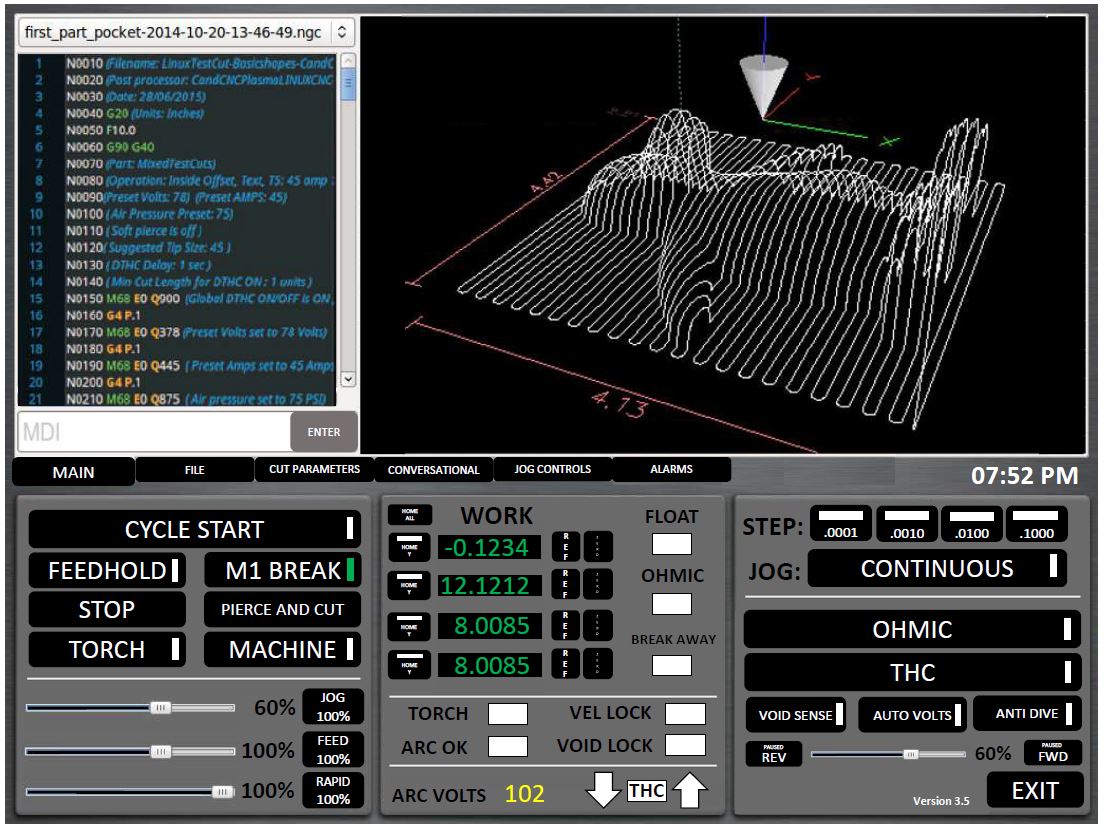
I'm a little late to the party here. I like the feel of the GUI and where it is headed! I had made a crude mockup of one myself back in March, but I don't have the skill to bring it to life without years of study (as you said ). Keep up the good work.
I have some unsolicited feedback and suggestions if you'd like them:
1. The first thing I noticed is the Breakaway status is missing from the Main page.
2. The THC panel has things in it that have really nothing to do with the THC.
3. Consider having all of the "File" options on their own tab, this will free up a lot of room.
4. I agree, there is a need for custom buttons on the main tab. A lot of us use that a lot.
5. I saw you left the Hypertherm Comms off of the config tab. Do you have a plan for those? As a hypertherm user, I need them
6. The rapid, feed, and jog sliders are a bit large, any thing we could do to shrink them?
7. Any chance we could work the time on to the main page? If we are going to load this full screen on touch monitors, seeing what time it is is really useful
8. Can the "Alarm" tab, or really any of them blink when there is something that requires your attention there?
9. For cut recovery, there are a few directional arrows missing (diagonal).
10. I really like the colored G-Code.
I attached a screenshot of the mockup I made from March, so that if for no other reason, you could maybe derive something useful, inspiration maybe (if necessary lol) out of it. If not, that's ok too! Some of the layout I would do different, as there are now features that there were not back then. For example, the OHMIC and THC wouldnt have to take up so much room.
). Keep up the good work.I have some unsolicited feedback and suggestions if you'd like them:
1. The first thing I noticed is the Breakaway status is missing from the Main page.
2. The THC panel has things in it that have really nothing to do with the THC.
3. Consider having all of the "File" options on their own tab, this will free up a lot of room.
4. I agree, there is a need for custom buttons on the main tab. A lot of us use that a lot.
5. I saw you left the Hypertherm Comms off of the config tab. Do you have a plan for those? As a hypertherm user, I need them
6. The rapid, feed, and jog sliders are a bit large, any thing we could do to shrink them?
7. Any chance we could work the time on to the main page? If we are going to load this full screen on touch monitors, seeing what time it is is really useful
8. Can the "Alarm" tab, or really any of them blink when there is something that requires your attention there?
9. For cut recovery, there are a few directional arrows missing (diagonal).
10. I really like the colored G-Code.
I attached a screenshot of the mockup I made from March, so that if for no other reason, you could maybe derive something useful, inspiration maybe (if necessary lol) out of it. If not, that's ok too! Some of the layout I would do different, as there are now features that there were not back then. For example, the OHMIC and THC wouldnt have to take up so much room.
The following user(s) said Thank You: tommylight, AgentWD40
Please Log in or Create an account to join the conversation.
- pinder
-
Topic Author
- Offline
- Elite Member
-
Less
More
- Posts: 196
- Thank you received: 128
27 Sep 2020 21:43 - 27 Sep 2020 22:01 #184064
by pinder
I will have to agree with others.
For saving the monochrome experience. I think only errrors and Estop Indicator Can be me made red.. at a specific location.
That location can only arise in Estop and error and replace a widget.
Please, no other color while normal working.
Replied by pinder on topic MONOKROM - QtPyVCP GUI for PlasmaC
thats not a numer, it can be anything.The Cut parameters drop down needs to display the material name, not just the number.
Linuxcnc is open-source so is MonoKrom.I Know you want to keep true to a monokrom screen but when I looked at best practice for HMI controls, it said that colour and other features should be used to draw the eye to a problem. So if it were possible, I would like to suggest that a section of the screen be allowed one different colour combination to highlight problems and errors. My press brake has one single status line that turns red when in an error state (estop, on limit etc) is present. I would suggest something similar but for this GUI, I think red background with white text would draw the eye very effectively. It would be great if all the annoying popups that Linuxcnc raises on errors could be captured and constrained to a single fixed area of the screen.
I'm not sure if linuxcnc can be tamed in this way.
I will have to agree with others.
For saving the monochrome experience. I think only errrors and Estop Indicator Can be me made red.. at a specific location.
That location can only arise in Estop and error and replace a widget.
Please, no other color while normal working.
ThankyouAnd yes I agree that its amazing whats been done so quickly and it just shows how powerful group projects become.
Last edit: 27 Sep 2020 22:01 by pinder.
The following user(s) said Thank You: rodw, KCJ
Please Log in or Create an account to join the conversation.
- KCJ
-
- Offline
- Moderator
-
Less
More
- Posts: 328
- Thank you received: 267
27 Sep 2020 21:45 #184065
by KCJ
Replied by KCJ on topic MONOKROM - QtPyVCP GUI for PlasmaC
I have this implemented for axis faults. I think it looks ok, and is clearly indicates which axis has faulted.I Know you want to keep true to a monokrom screen but when I looked at best practice for HMI controls, it said that colour and other features should be used to draw the eye to a problem. So if it were possible, I would like to suggest that a section of the screen be allowed one different colour combination to highlight problems and errors. My press brake has one single status line that turns red when in an error state (estop, on limit etc) is present. I would suggest something similar but for this GUI, I think red background with white text would draw the eye very effectively.
Yes, QtPyVCP already catches and makes the error messages as channels. There is an error messages widgets that records each error with a time stamp, and you can sort and filter error messages based on type. Maybe we can use this, or make something similar that might fit in with the design better.It would be great if all the annoying popups that Linuxcnc raises on errors could be captured and constrained to a single fixed area of the screen. I'm not sure if linuxcnc can be tamed in this way.
Attachments:
The following user(s) said Thank You: rodw
Please Log in or Create an account to join the conversation.
Moderators: KCJ, Lcvette
Time to create page: 1.499 seconds