A Widescreen Blender-Style Interface
- BrendaEM
- Offline
- Elite Member
-

Less
More
- Posts: 266
- Thank you received: 120
17 May 2018 02:55 - 17 May 2018 03:22 #110805
by BrendaEM
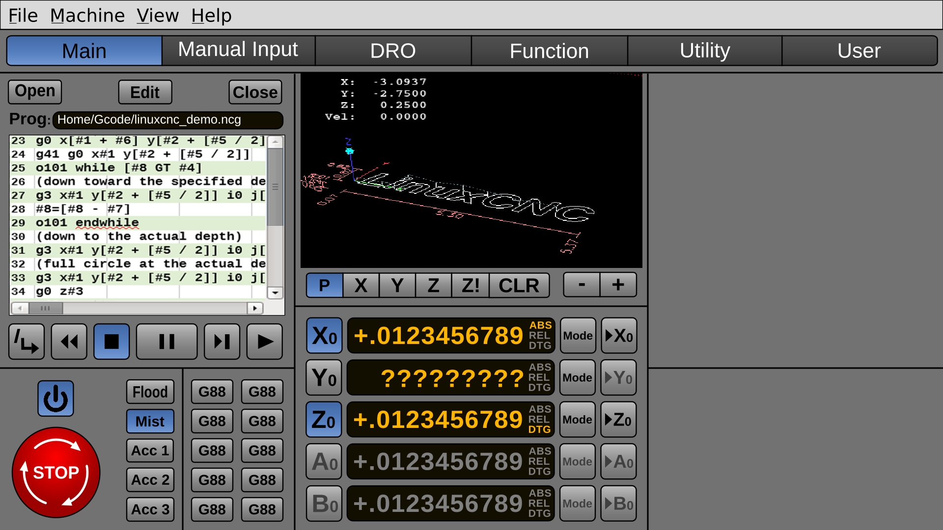
A Widescreen Blender-Style Interface was created by BrendaEM
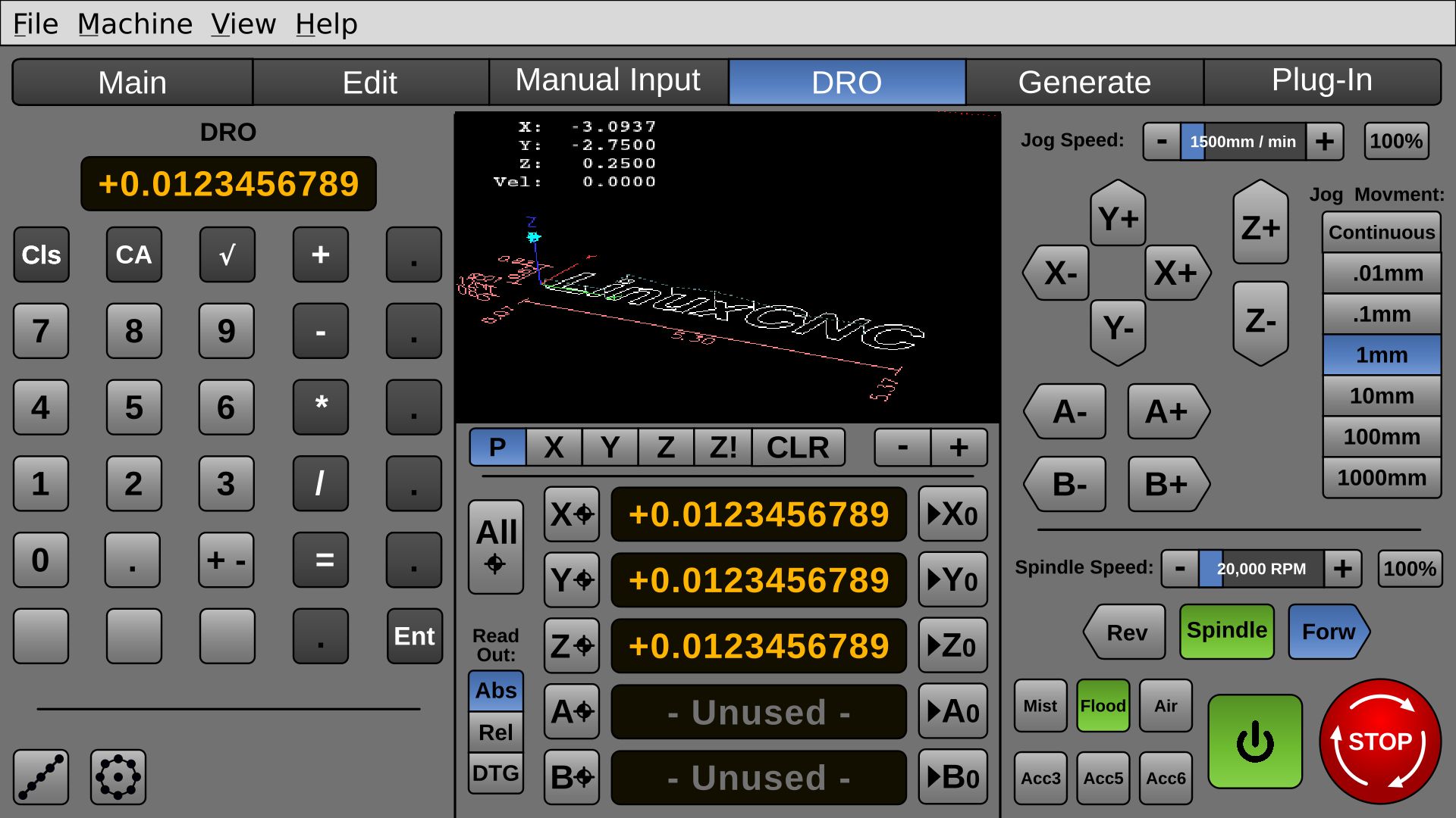
There are a lot of good ideas in the user interfaces I have seen for LinuxCNC. Still, I was inspired to fire up Inkscape and try moving some some shapes around. Outright, shamelessly, I am drawing on a lot of other people's ideas. I hope to inspire the others, just as they have inspired me.
Functionally, I would like one or two changes from the user interfaces, I want a DRO-like utility page for ordinary things, like you would find on a DRO for bolt circles, but also pocketing bolt layout and other things.
So, This these are the ideas I am messing around with:
* To do a Blender-styled interface, which has 3D shading in it, where it helps, so it's not too flat.
* To do a touch interface layout.
* To make it 16x9 for modern monitors.
* To incorporate as many ideas as I can from other interfaces.
* To make it consistent, uniform, and easy to read.
* To use all open source fonts.
* When it's time, put the artwork out in both 1920x1080 and for the future 4k. I would help others, if they want to help on it. I will share the source files for non-commerical use.
So, this is what I have so far. This will be updated.
By using more buttons that show state, fewer indicators are needed.
It's laid out for 5 axis, but 2 can be grayed out for 3 axis machines.
The Pause button was made largest of script/play controls as there is already an Estop, and pause can preserve the job.
I might make the buttons a little brighter and contrasty, but that will be it for colors.
MDI was changed to "Manual Input" to speed new users acclamation.
It needs spindle and jogging, and Home-All.
The file buttons will have GTK-style icons.
Last edit: 17 May 2018 03:22 by BrendaEM.
The following user(s) said Thank You: karlram
Please Log in or Create an account to join the conversation.
- cmorley
- Offline
- Moderator
-

Less
More
- Posts: 7307
- Thank you received: 2139
18 May 2018 12:39 #110841
by cmorley
Replied by cmorley on topic A Widescreen Blender-Style Interface
This looks pretty good - not sure from your description if this is a live display or concept artwork.
If you are interested in GUI building - there is a qtscreen branch that I have done a ton of work on.
I am interested in collaborators.
pyQT can have style sheets incorporated in add a nice look.
The macro dialog uses inkscape images.
I have taken a pause on that branch but would get back into it if someone showed interest.
Chris M
Please Log in or Create an account to join the conversation.
- BrendaEM
- Offline
- Elite Member
-

Less
More
- Posts: 266
- Thank you received: 120
18 May 2018 17:23 #110848
by BrendaEM
Replied by BrendaEM on topic A Widescreen Blender-Style Interface
Cmorely, where I am the video isn't loading, but the still image looks easily understood.
~
I am just focusing on concepts and art, AFAIK.
I want to layout a 2nd page, that did everything you could do manually with a DRO, so, there likely a lot of icons to make, such as bolt-circle, dividing, calculator functions, etc.
Currently, I am working on the spindle and jogging on the main page.
~
I am just focusing on concepts and art, AFAIK.
I want to layout a 2nd page, that did everything you could do manually with a DRO, so, there likely a lot of icons to make, such as bolt-circle, dividing, calculator functions, etc.
Currently, I am working on the spindle and jogging on the main page.
Please Log in or Create an account to join the conversation.
- cmorley
- Offline
- Moderator
-

Less
More
- Posts: 7307
- Thank you received: 2139
18 May 2018 22:03 - 18 May 2018 22:04 #110860
by cmorley
Replied by cmorley on topic A Widescreen Blender-Style Interface
youtube.com/watch?v=Dq4JMI1My98
Last edit: 18 May 2018 22:04 by cmorley.
Please Log in or Create an account to join the conversation.
- BrendaEM
- Offline
- Elite Member
-

Less
More
- Posts: 266
- Thank you received: 120
19 May 2018 05:58 - 19 May 2018 05:59 #110876
by BrendaEM
Replied by BrendaEM on topic A Widescreen Blender-Style Interface
Thank you for the link, but the problem was: was at a coffee shop at the time.
I like the probe menu.
I wish the 3D preview for all interfaces could be higher resolution or perhaps it could be anti-aliased--even if it is only was done when the user isn't moving the display position, as a post-processing step.
It would have to be an option for slower machines, I suppose.
I like the probe menu.
I wish the 3D preview for all interfaces could be higher resolution or perhaps it could be anti-aliased--even if it is only was done when the user isn't moving the display position, as a post-processing step.
It would have to be an option for slower machines, I suppose.
Last edit: 19 May 2018 05:59 by BrendaEM.
Please Log in or Create an account to join the conversation.
- BrendaEM
- Offline
- Elite Member
-

Less
More
- Posts: 266
- Thank you received: 120
20 May 2018 17:45 - 20 May 2018 18:07 #110929
by BrendaEM
Replied by BrendaEM on topic A Widescreen Blender-Style Interface
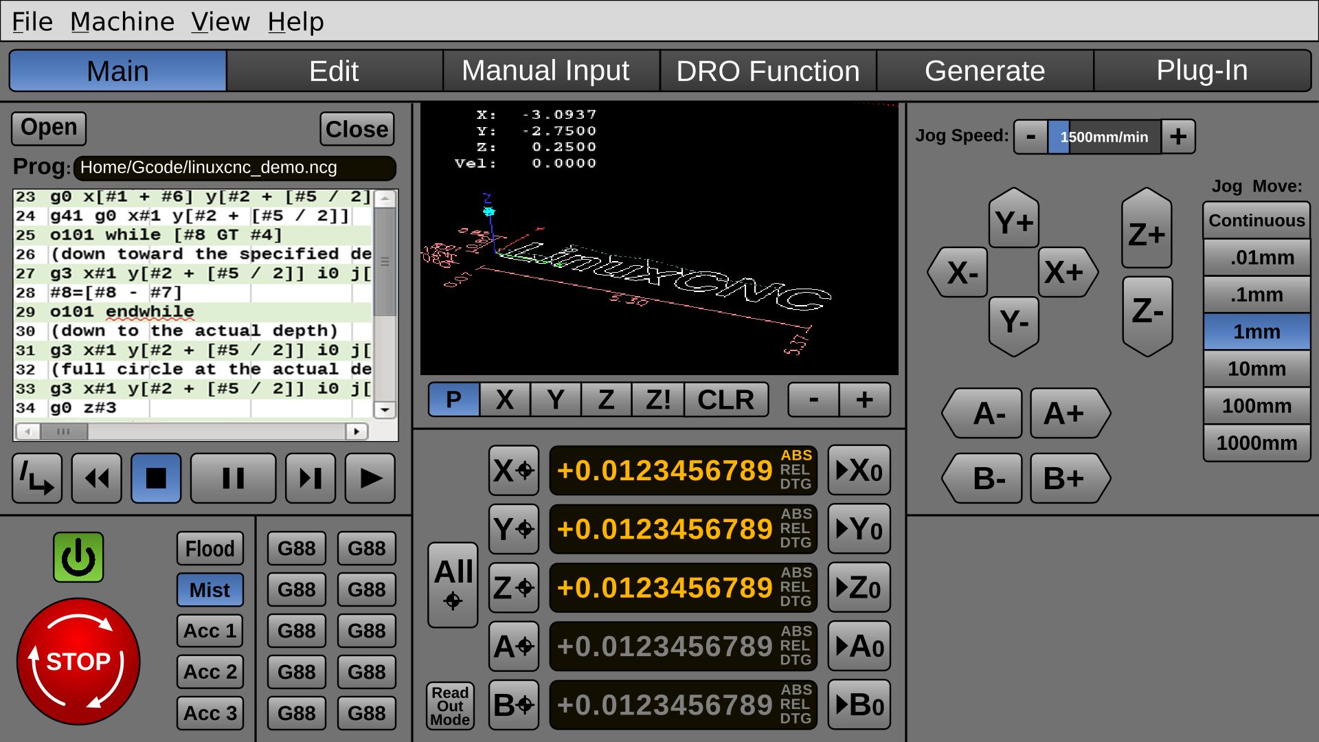
Perhaps a version of Pycam or something similar could be integrated, for generating gcode.
I felt that making the buttons for movement pointy makes them easier to understand, other than just having glyphs.
Many people have only 3 axis, but I want to keep 5 axis. I am not sure if enough pros have a 6th axis to warrant putting a C axis on.
This is a challenging project because, for some of the modes of operation, certain UI sets should remain, and others should go.
In certain modes, the smaller gcode window and the often-used-gcode buttons would be replaced, but they aren't in the same block, yet.
The spindle control and the other speed controls need to be added.
Last edit: 20 May 2018 18:07 by BrendaEM.
The following user(s) said Thank You: tommylight
Please Log in or Create an account to join the conversation.
- tommylight
-

- Away
- Moderator
-

Less
More
- Posts: 21538
- Thank you received: 7340
20 May 2018 19:27 #110931
by tommylight
Replied by tommylight on topic A Widescreen Blender-Style Interface
That is looking nice !
And that lower right part would be nice to have the THC plasma stuff, or tool changer stuff, or diagnostics or..... never mind.
And that lower right part would be nice to have the THC plasma stuff, or tool changer stuff, or diagnostics or..... never mind.
The following user(s) said Thank You: BrendaEM
Please Log in or Create an account to join the conversation.
- BrendaEM
- Offline
- Elite Member
-

Less
More
- Posts: 266
- Thank you received: 120
20 May 2018 19:55 - 20 May 2018 20:13 #110933
by BrendaEM
Replied by BrendaEM on topic A Widescreen Blender-Style Interface
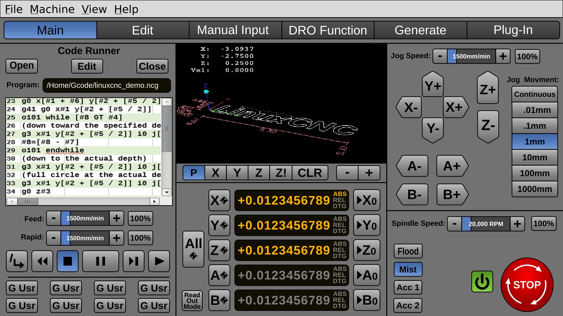
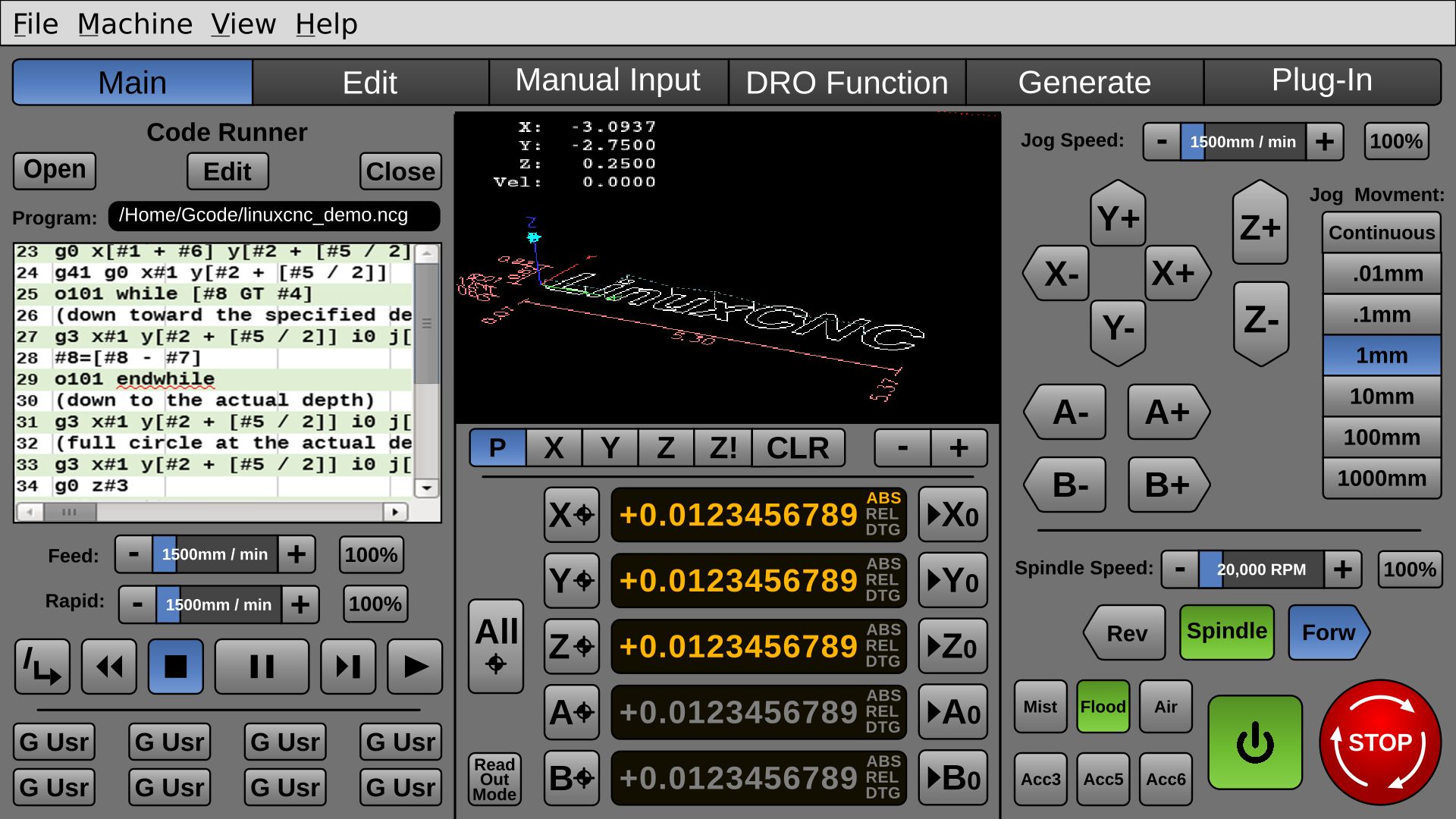
I want the entire left panel to be changeable for each mode of operation. For instance, if the user presses the "DRO Function" button, they would be able to do all the stuff they could do manually with a hardware DRO (such as dividing, bolt circles, drilling, single round or square pocket.) and the right panel "Code Runner" controls would be replaced with those DRO controls.
Many design programs have this modal panel on the right, but I wanted the Estop on the right, because most people are right handed, though, perhaps the right and left panels could be swapped for left-handed people, from an .ini file.
The Power and secondary on/offs would be on the right as well.
(No spindle (torch?) controls, yet.)
@tommylight, can you describe what's needed for a person with a plasma-cutter?
Perhaps, the on/off legends should be set up from the .ini file. I just want to make sure there are controls laid out for plasma, too.
For instance, can the "Spindle Speed" slider be used for plasma current, or "Laser Power"?
Can the "Flood" "Mist" controls be replaced with "Air" or "Co2" "Argon"
Last edit: 20 May 2018 20:13 by BrendaEM.
Please Log in or Create an account to join the conversation.
- BrendaEM
- Offline
- Elite Member
-

Less
More
- Posts: 266
- Thank you received: 120
20 May 2018 22:25 - 20 May 2018 22:40 #110936
by BrendaEM
Replied by BrendaEM on topic A Widescreen Blender-Style Interface
Last edit: 20 May 2018 22:40 by BrendaEM.
Please Log in or Create an account to join the conversation.
- BrendaEM
- Offline
- Elite Member
-

Less
More
- Posts: 266
- Thank you received: 120
21 May 2018 01:13 - 21 May 2018 01:15 #110940
by BrendaEM
Replied by BrendaEM on topic A Widescreen Blender-Style Interface
Last edit: 21 May 2018 01:15 by BrendaEM.
Please Log in or Create an account to join the conversation.
Time to create page: 0.438 seconds
