A Widescreen Blender-Style Interface
- KCJ
-

- Offline
- Platinum Member
-

Less
More
- Posts: 328
- Thank you received: 267
09 Jun 2018 23:43 #112104
by KCJ
Replied by KCJ on topic A Widescreen Blender-Style Interface
I agree with Tom.
Making a tweak here and there to a UI as the design evolves and improves is not a big deal. Once a reasonably workable layout has been reached and agreed upon (which I think we have at this point) it is time to start prototyping. There is little point in refining the design too much now as the prototype will almost certainly reveal some flaws in the design. Also, it might prove too difficult to implement certain parts of the design, which would then need to be changed to reflect what is realistically achievable.
Cheers,
Kurt
The following user(s) said Thank You: tommylight
Please Log in or Create an account to join the conversation.
- BrendaEM
- Offline
- Elite Member
-

Less
More
- Posts: 266
- Thank you received: 120
10 Jun 2018 00:36 - 10 Jun 2018 03:48 #112109
by BrendaEM
Replied by BrendaEM on topic A Widescreen Blender-Style Interface
I feel a little bad because while I have the interface roughed out, I still want to have something for the lathe people.
Today, while I had my CNC computer hooked up to a 16x9 monitor, I took a screen shot to see down to the pixel how how much room the XFCE's bar takes up, and how much whatever GTK 1? controls that are on Axis takes up.
Someone has offered to at least help code it; I want to have respect for their time, in that I want to make sure that there isn't a dead end or a situation, where everything has to be moved around.
If you check this thread, you may see that I've only been working on this a few like 3 weeks (May 17th.)
Today, I also got a chance to install NativeCAM. It's great, far exceeding my expectations. It will do at least everything a manual mill DRO can, and much more, which means that the "DRO" menu can just be an extended readout display for jogging, if it even needs to exist at all.
Perhaps I am doing too many update posts. I want feedback.
Last edit: 10 Jun 2018 03:48 by BrendaEM.
The following user(s) said Thank You: KCJ
Please Log in or Create an account to join the conversation.
- BrendaEM
- Offline
- Elite Member
-
Less
More
- Posts: 266
- Thank you received: 120
15 Jun 2018 19:34 - 15 Jun 2018 21:08 #112433
by BrendaEM
Replied by BrendaEM on topic A Widescreen Blender-Style Interface
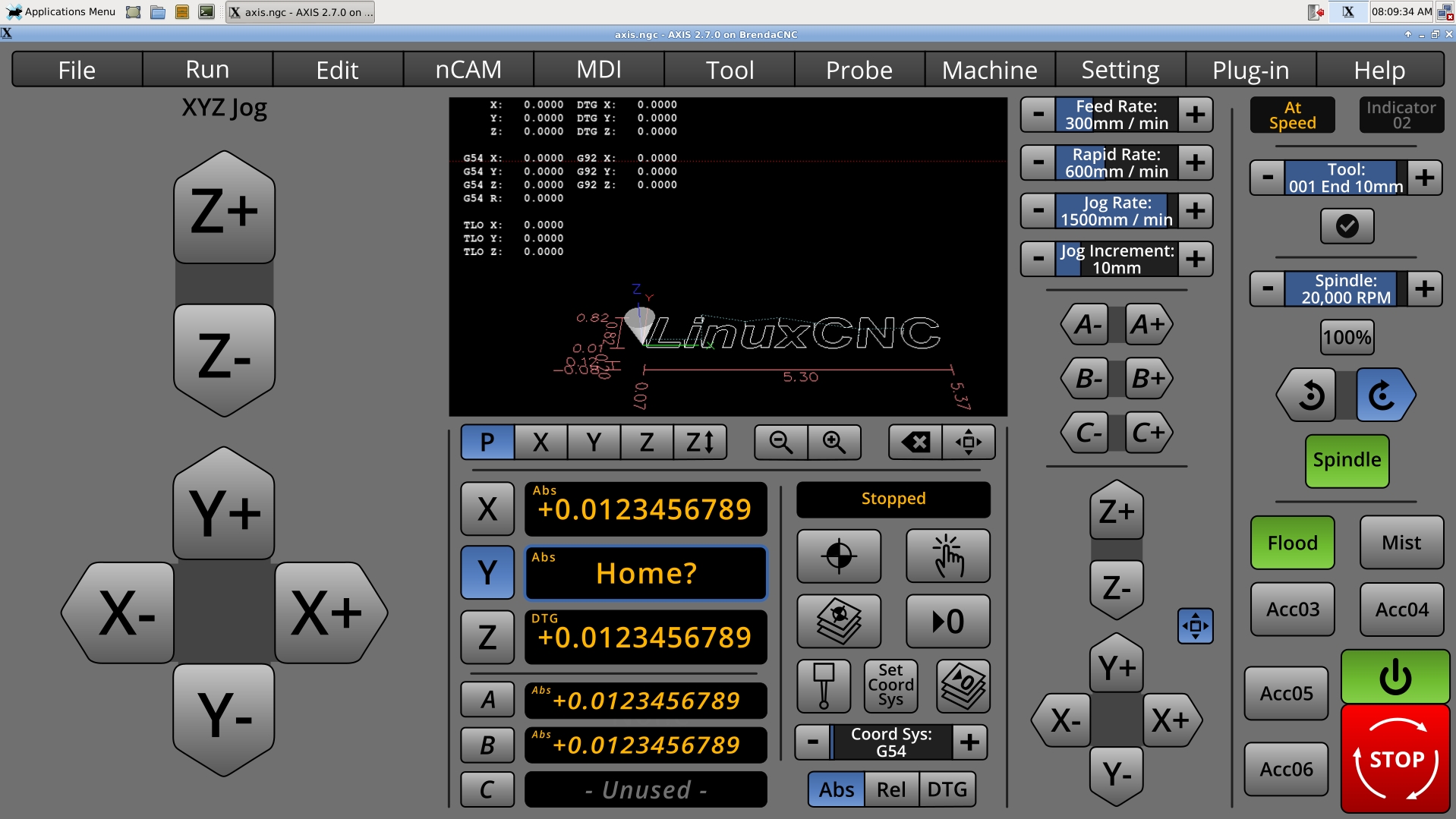
* First Lathe Attempt. I think the readout controls should be modular.
* Showing NativeCAM, which is a pretty long word. For now, I just shortened it to nCAM so it fits. Having tried NativeCAM, I feel that it does what I wanted a DRO tab to do. Perhaps the control color scheme could be made to match. I've tried making the main command bar light, like Native CAM, but it I feel it's hard to concentrate at the rest of the interface.
Perhaps someday, there could be a button in Nativecam, which make it expand and take up the left and center panel areas.
* Added Abs, Rel, DTG indicators. Earlier versions had these. They have returned out of safety considerations.
I've not known what to do with the menubar, whether or not to integrate all of Axis menus, cull them, or compromise, like this.
Most of the other things have changed little, but adjustment and refinement.
I am starting to feel that they general layout will work. I feel that it is a "reasonably workable layout" .
Do you see what you don't see? That crappy XFCE dock thing! I am not sure why they used "Applications Menu" when it's obvious that it's a menu. Just the little cute mouse would have done better. Apple has their little Apple menu. Windows has its Start menu. XFCE has two words.

* Added expand button near jogging controls to make the large like Touchy. Although the toggle button is rather small, pressing it would make the jogging control take up the left 1/3 of the screen. Because I made compromises to accomodate 4-6 axis mills, I wanted to give something back to the people with only 3 axis. Yes, the controls are quite large.
* Showing NativeCAM, which is a pretty long word. For now, I just shortened it to nCAM so it fits. Having tried NativeCAM, I feel that it does what I wanted a DRO tab to do. Perhaps the control color scheme could be made to match. I've tried making the main command bar light, like Native CAM, but it I feel it's hard to concentrate at the rest of the interface.
Perhaps someday, there could be a button in Nativecam, which make it expand and take up the left and center panel areas.
* Added Abs, Rel, DTG indicators. Earlier versions had these. They have returned out of safety considerations.
I've not known what to do with the menubar, whether or not to integrate all of Axis menus, cull them, or compromise, like this.
Most of the other things have changed little, but adjustment and refinement.
I am starting to feel that they general layout will work. I feel that it is a "reasonably workable layout" .
Do you see what you don't see? That crappy XFCE dock thing! I am not sure why they used "Applications Menu" when it's obvious that it's a menu. Just the little cute mouse would have done better. Apple has their little Apple menu. Windows has its Start menu. XFCE has two words.
* Added expand button near jogging controls to make the large like Touchy. Although the toggle button is rather small, pressing it would make the jogging control take up the left 1/3 of the screen. Because I made compromises to accomodate 4-6 axis mills, I wanted to give something back to the people with only 3 axis. Yes, the controls are quite large.
Last edit: 15 Jun 2018 21:08 by BrendaEM.
The following user(s) said Thank You: KCJ
Please Log in or Create an account to join the conversation.
- KCJ
-
- Offline
- Platinum Member
-
Less
More
- Posts: 328
- Thank you received: 267
15 Jun 2018 20:25 - 15 Jun 2018 20:35 #112435
by KCJ
Replied by KCJ on topic A Widescreen Blender-Style Interface
Looking great! Its been a while, but I think I got most of NCAM ported from Gtk2 to Gtk3. If I ever finish that up it would be pretty easy for somebody with CSS skills (i.e. not me!) to theme it so it looks more consistent.
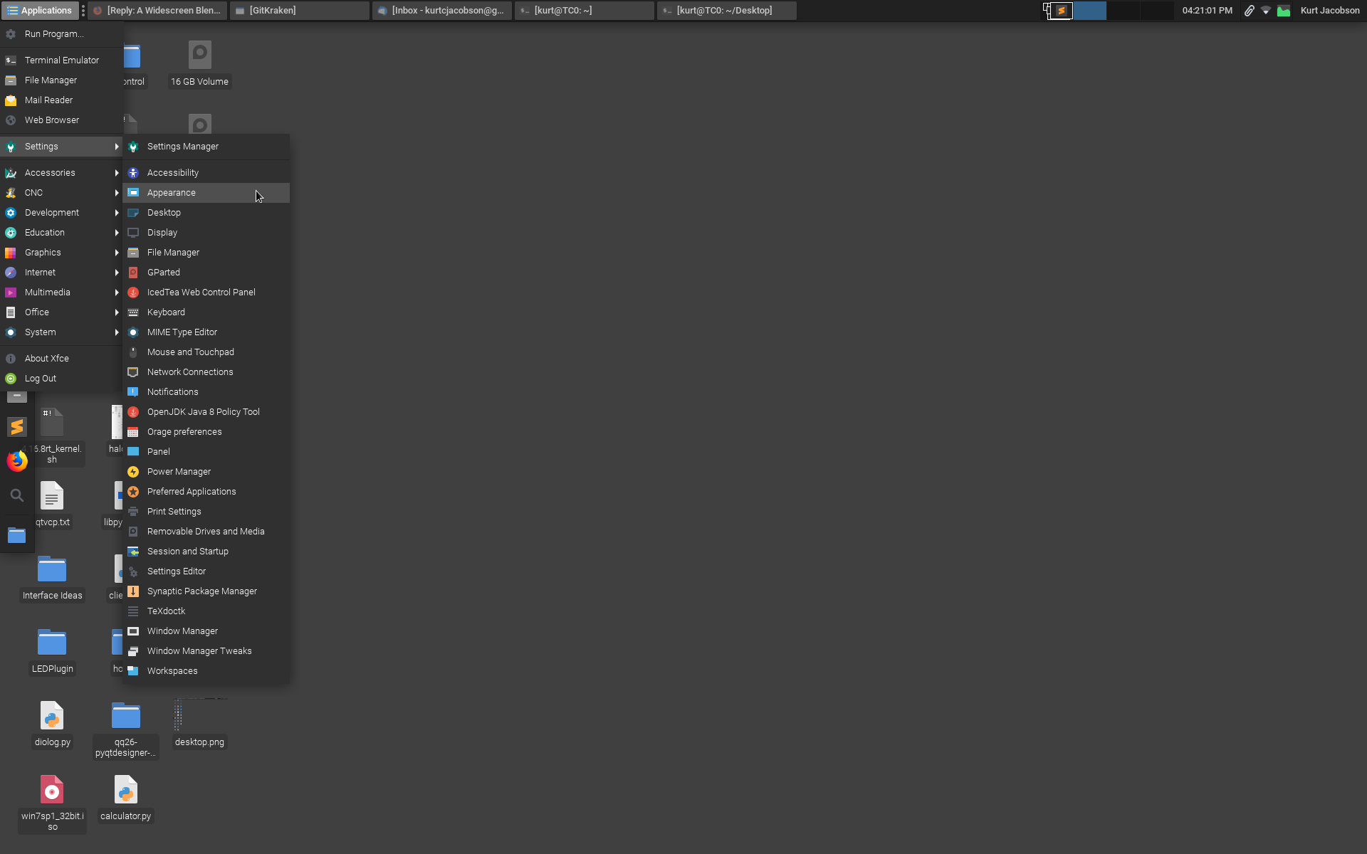
Re: The XFCE dock, panel, whatever you like to call it. It is very easy to customize its appearance however you like. Right click >> Properties and you can set the display text, icon etc. On my CNC machines I have the panel set to auto hide so I have full screen real estate for the UI.
Cheers,
Kurt
EDIT: XFCE panel auto hide demo:
Last edit: 15 Jun 2018 20:35 by KCJ.
The following user(s) said Thank You: BrendaEM
Please Log in or Create an account to join the conversation.
- BrendaEM
- Offline
- Elite Member
-
Less
More
- Posts: 266
- Thank you received: 120
15 Jun 2018 20:48 - 15 Jun 2018 21:10 #112436
by BrendaEM
Replied by BrendaEM on topic A Widescreen Blender-Style Interface
Thank you. The issue is: the dock would have taken up too much screen real-estate. As you know I was pretty upset about it.
I am glad it's easy to disable it, because I am designing the UI without it. In other words, users will have to shut off the dock to use this interface. On a 1920 x 1080 screen you can fit a more than a dozen icons on the upper bar.
The dock wastes too much space, and unlike a Tribble it not only provides no benefit, it doesn't love you.
~
I just wrote FernV about the interface. I just used nCAM because it fits on the bar. I mean no disrespect to NativeCAM.
~
I like the dark theme : ) I had no idea what NativeCAM was under the hood. It's great. The controls in Axis are often logical, but the widgets are getting on in years, a little small for touch.
My thoughts on colors are:
Red: Trouble
Blue: Choice
Green: On
Amber: Info
I could post a pic of the interface with a white background, but people would be confused that I had lost my way.
Last edit: 15 Jun 2018 21:10 by BrendaEM.
Please Log in or Create an account to join the conversation.
- KCJ
-
- Offline
- Platinum Member
-
Less
More
- Posts: 328
- Thank you received: 267
15 Jun 2018 21:19 #112437
by KCJ
Replied by KCJ on topic A Widescreen Blender-Style Interface
That is how I designed my first interface, the background image was 1024x768px so it filled the entire screen. I did not leave room for window decorations or the panel. I had some code in the init section that would check the screen size, If the screen was 1024x768px it would disable the dock and remove the window decorations (the bar along the top with the title, close/minimize buttons etc.), else it would add window decorations and enable the XFCE panels so it could be moved around.
It seems like you are aware of this, but the disadvantage of using images extensively in a UI is that is becomes non trivial to make the window resizable, but it is possible. It seems easier to do in Qt than in Gtk, though PP is entirely image based and uses Gtk and is resizable. I never could find the code where they resize the bitmaps, but it was not for lack of looking ...
Cheers,
Kurt
Please Log in or Create an account to join the conversation.
- BrendaEM
- Offline
- Elite Member
-
Less
More
- Posts: 266
- Thank you received: 120
15 Jun 2018 21:20 #112438
by BrendaEM
Replied by BrendaEM on topic A Widescreen Blender-Style Interface
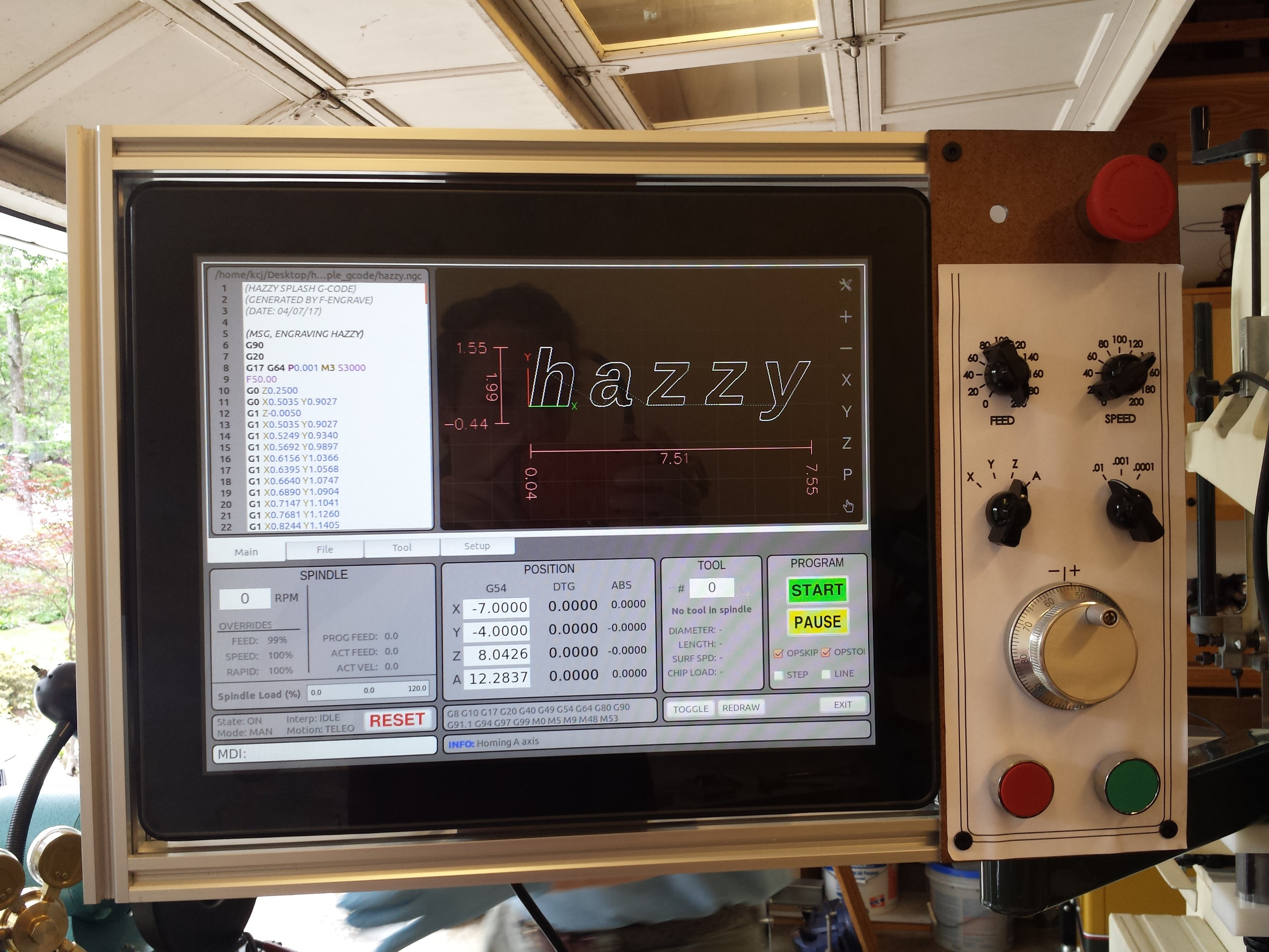
Nice panel!
I like the chicken-head knobs.
You need to send that jog control to me. : )
I like the chicken-head knobs.
You need to send that jog control to me. : )
The following user(s) said Thank You: KCJ
Please Log in or Create an account to join the conversation.
- KCJ
-
- Offline
- Platinum Member
-
Less
More
- Posts: 328
- Thank you received: 267
15 Jun 2018 21:23 - 15 Jun 2018 21:26 #112439
by KCJ
Replied by KCJ on topic A Widescreen Blender-Style Interface
Oh, everybody calls it NCAM! I think Fern or Nick started calling it that, so it is an "official" name for NativeCAM. ")
EDIT: You certainly deserve an MPG jog wheel after all the work you have done on the interface!
EDIT: You certainly deserve an MPG jog wheel after all the work you have done on the interface!
Last edit: 15 Jun 2018 21:26 by KCJ.
Please Log in or Create an account to join the conversation.
- andypugh
-

- Away
- Moderator
-

Less
More
- Posts: 19863
- Thank you received: 4636
15 Jun 2018 21:53 #112442
by andypugh
If you use svg it's a lot easier.
Not anything like a solution, but if you take a look at how my lathe macros work, the background of each tab is a specific layer all held in the same SVG file.
The ugly thing there is that the controls all live in a transparent "table" object on top of the image.
Replied by andypugh on topic A Widescreen Blender-Style Interface
It seems like you are aware of this, but the disadvantage of using images extensively in a UI is that is becomes non trivial to make the window resizable, but it is possible. It seems easier to do in Qt than in Gtk, though PP is entirely image based and uses Gtk and is resizable. I never could find the code where they resize the bitmaps, but it was not for lack of looking
If you use svg it's a lot easier.
Not anything like a solution, but if you take a look at how my lathe macros work, the background of each tab is a specific layer all held in the same SVG file.
The ugly thing there is that the controls all live in a transparent "table" object on top of the image.
The following user(s) said Thank You: KCJ
Please Log in or Create an account to join the conversation.
- andypugh
-
- Away
- Moderator
-
Less
More
- Posts: 19863
- Thank you received: 4636
15 Jun 2018 21:59 #112443
by andypugh
I think you need to get a lathe. (Everyone needs a lathe, but most don't realise it).
The typical lathe UI needs a left/right Z and an in/out X.
X should show radius or diameter (selectable) but I don't think anyone would complain if there was only diameter.
An optional C display/jog would be cool.
I have said this before, but I will repeat it: Much better to make a great mill/plasma UI and ignore lathes. Then, if you feel the urge, make a great lathe UI. The key to a good lathe UI would be a good preview, that handled both front and back tools at the same time.
Replied by andypugh on topic A Widescreen Blender-Style Interface
* First Lathe Attempt.
I think you need to get a lathe. (Everyone needs a lathe, but most don't realise it).
The typical lathe UI needs a left/right Z and an in/out X.
X should show radius or diameter (selectable) but I don't think anyone would complain if there was only diameter.
An optional C display/jog would be cool.
I have said this before, but I will repeat it: Much better to make a great mill/plasma UI and ignore lathes. Then, if you feel the urge, make a great lathe UI. The key to a good lathe UI would be a good preview, that handled both front and back tools at the same time.
Please Log in or Create an account to join the conversation.
Time to create page: 0.360 seconds