A Widescreen Blender-Style Interface
- BrendaEM
- Offline
- Elite Member
-

Less
More
- Posts: 266
- Thank you received: 120
07 Jun 2018 22:41 - 07 Jun 2018 22:42 #111945
by BrendaEM
Replied by BrendaEM on topic A Widescreen Blender-Style Interface
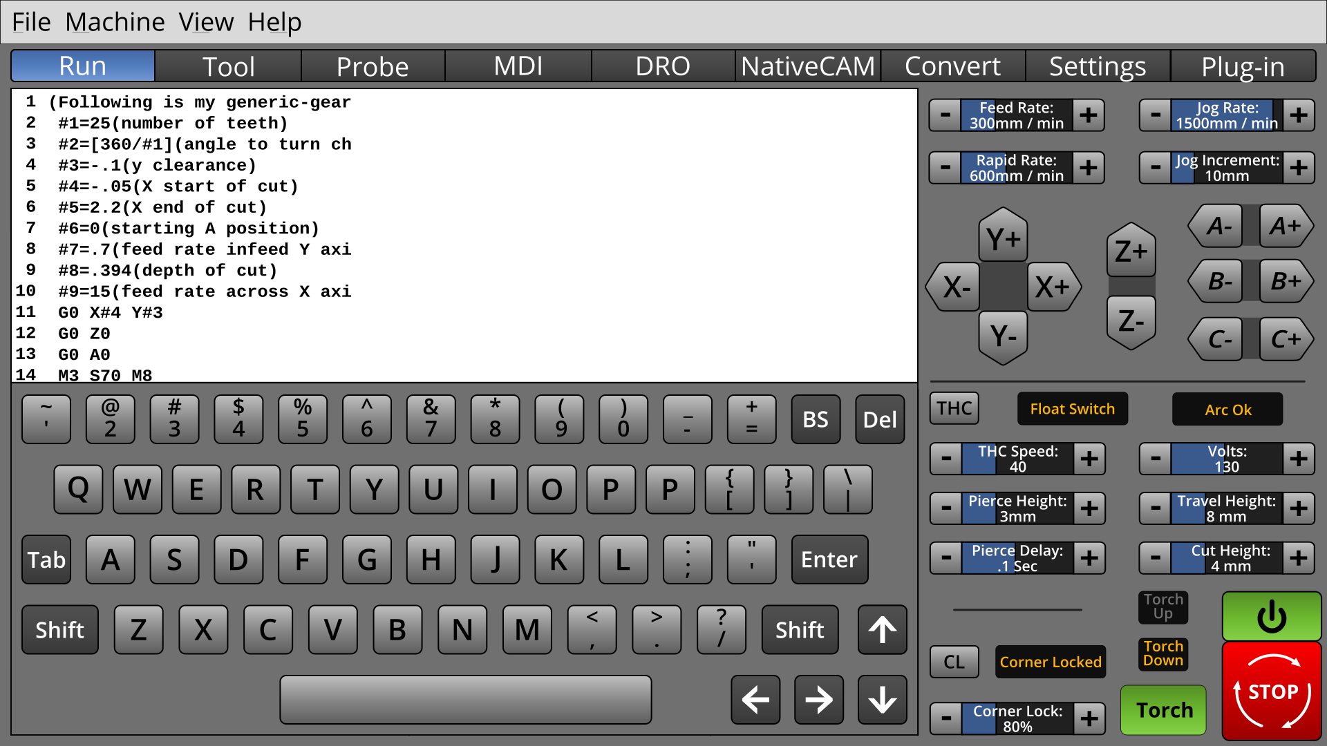
* Keyboard mockup now has spacebar, well and arrow keys : P The spacing varies from row to row. There's no scroll bars in the text window, but they would be there.
The on-screen keyboard needs a button to return to whatever called it.
The screen is unequally split horizontally to allow more room for machine controls.
A haunting question remains: DId Axis do it right by using a vertical strip on the right for machine unique controls?
I may do a test. Unbeknownst to anyone in this thread, there have been about a dozen effort-filled dead-end, wrong turns, and experiments which didn't show up. Perhaps I will do one more, after this.
Last edit: 07 Jun 2018 22:42 by BrendaEM.
Please Log in or Create an account to join the conversation.
- rodw
-

- Offline
- Platinum Member
-

Less
More
- Posts: 11855
- Thank you received: 4020
08 Jun 2018 03:26 #111958
by rodw
Replied by rodw on topic A Widescreen Blender-Style Interface
Just getting bigger than Ben Hurr.
I know one day soon you are going to have to turn this into reality and I found this Python code for keyboard emulation
github.com/boppreh/keyboard that may make your job easier...
I know one day soon you are going to have to turn this into reality and I found this Python code for keyboard emulation
github.com/boppreh/keyboard that may make your job easier...
The following user(s) said Thank You: KCJ, BrendaEM
Please Log in or Create an account to join the conversation.
- BrendaEM
- Offline
- Elite Member
-

Less
More
- Posts: 266
- Thank you received: 120
08 Jun 2018 04:56 - 08 Jun 2018 05:00 #111961
by BrendaEM
Replied by BrendaEM on topic A Widescreen Blender-Style Interface
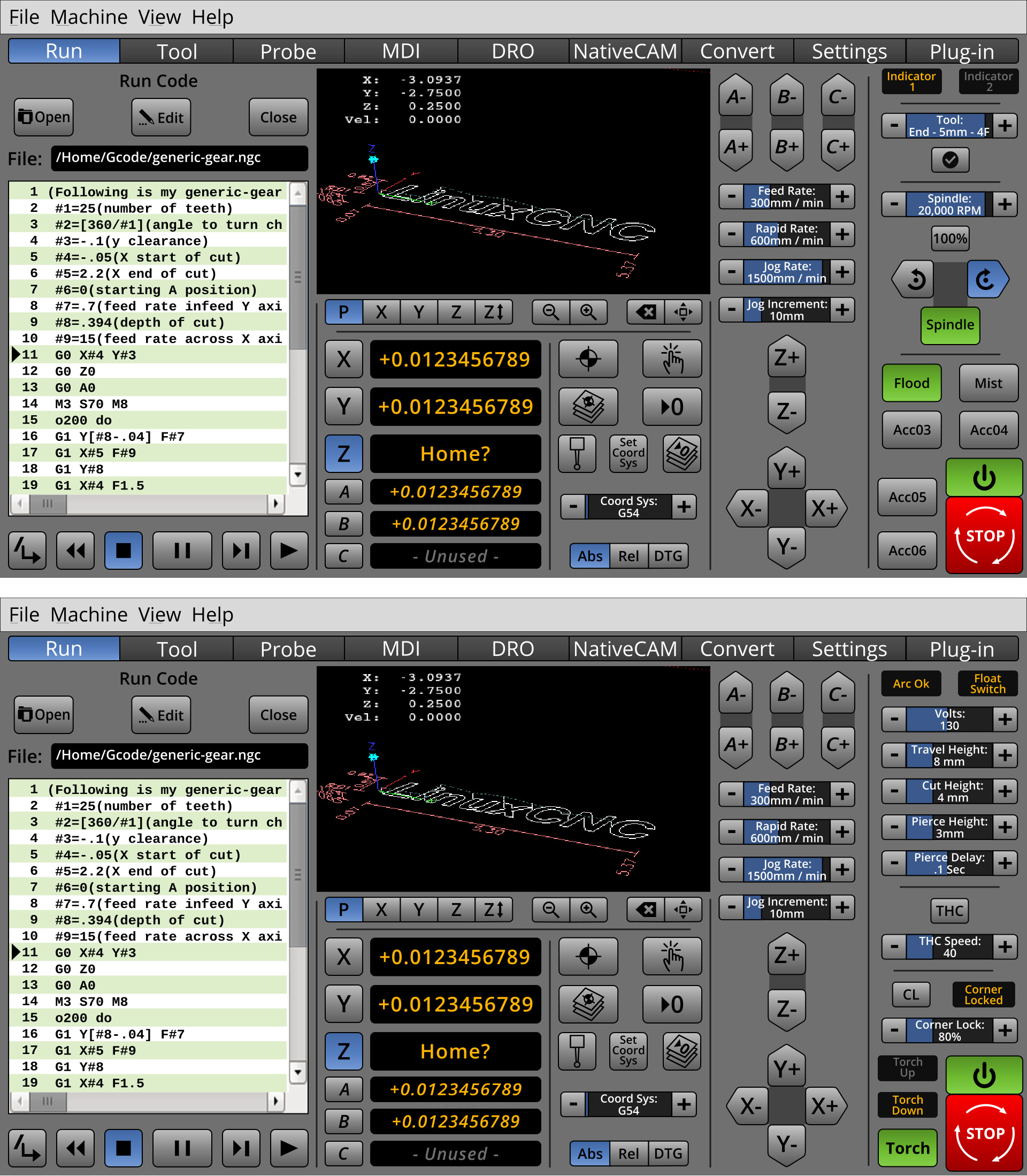
Well, this is the vertical experiment....
I broke up the direction buttons.
The indicators are smaller, so there can be more of them.
I will have to look at it with new eyes, but the Torch seems like a win, while the mill, seems like a win/lose, lose because the tool selector and the spindle control are as small as the others.
Comments?
I broke up the direction buttons.
The indicators are smaller, so there can be more of them.
I will have to look at it with new eyes, but the Torch seems like a win, while the mill, seems like a win/lose, lose because the tool selector and the spindle control are as small as the others.
Comments?
Last edit: 08 Jun 2018 05:00 by BrendaEM.
The following user(s) said Thank You: tommylight, KCJ
Please Log in or Create an account to join the conversation.
- tommylight
-

- Away
- Moderator
-

Less
More
- Posts: 21499
- Thank you received: 7329
08 Jun 2018 20:41 #112022
by tommylight
Replied by tommylight on topic A Widescreen Blender-Style Interface
That looks easier to use to me, all related things in one column. I can live with that.
Thank you.
Thank you.
Please Log in or Create an account to join the conversation.
- KCJ
-

- Offline
- Platinum Member
-

Less
More
- Posts: 328
- Thank you received: 267
08 Jun 2018 21:08 #112024
by KCJ
Replied by KCJ on topic A Widescreen Blender-Style Interface
I like the new layout. It is not quite as aesthetically pleasing, but I think it is more practical. It makes sense to have the entire right panel machine specific, and potentially be able to be replaced with a completely custom panel. Technically, the power and estop buttons are common to all machines so they might should be somewhere else ...
One thing I would suggest considering is placing the X, Y and Z axis jog controls beside each other like the A, B and C controls. For me that is more intuitive than having them point in the direction of axis movement. But I understand that may depend on personal preference, as I tend to think of the jog buttons as increasing or decreasing the axis position values (which incidentally moves the table), instead of buttons for moving the table (with incidentally changes the axis position).
If you did move the X and Y job buttons, there would be room for the power and estop buttons below them ...
I am really enjoining watching this screen evolve and improve, keep up the great work!
Cheers,
Kurt
The following user(s) said Thank You: tommylight, rodw
Please Log in or Create an account to join the conversation.
- persei8
-

- Offline
- Platinum Member
-

Less
More
- Posts: 398
- Thank you received: 132
08 Jun 2018 23:41 #112030
by persei8
Replied by persei8 on topic A Widescreen Blender-Style Interface
Is this going to useable for people with just a XYZ router? Hopefully, the unneeded stuff can be optionally hidden via a configuration file. Sure looks good though.
Please Log in or Create an account to join the conversation.
- BrendaEM
- Offline
- Elite Member
-

Less
More
- Posts: 266
- Thank you received: 120
09 Jun 2018 02:02 #112042
by BrendaEM
Replied by BrendaEM on topic A Widescreen Blender-Style Interface
For the first version, there may indeed be all 6 axis for mills. though I've tried to make sure that the axis are distinguishable.
Perhaps things could be done programmatically, but I am trying to support, mills, torches, lathes, and perhaps even lasers.
Oddly, as a goal, I've wanted the same person, to be able to run more than one type of machine comfortably.
Taken lightly, this is my mantra : )
Perhaps things could be done programmatically, but I am trying to support, mills, torches, lathes, and perhaps even lasers.
Oddly, as a goal, I've wanted the same person, to be able to run more than one type of machine comfortably.
Taken lightly, this is my mantra : )
Please Log in or Create an account to join the conversation.
- andypugh
-

- Offline
- Moderator
-

Less
More
- Posts: 19852
- Thank you received: 4633
09 Jun 2018 02:18 #112046
by andypugh
Replied by andypugh on topic A Widescreen Blender-Style Interface
You know that LinuxCNC supports 9 axes? 
Your GUI could configure itself based on INI file entries in the INI, or it could try to guess, like Axis does.
(Axis seems to parse the INI to work out what axes exists, and uses LATHE to figure out what to show and what the jog keys do. On a lathe <- and -> make sense as Z jog anr up and down arrows for X)
ARROWS = UWCBAZXYV
Please Log in or Create an account to join the conversation.
- BrendaEM
- Offline
- Elite Member
-

Less
More
- Posts: 266
- Thank you received: 120
09 Jun 2018 03:02 - 09 Jun 2018 03:33 #112051
by BrendaEM
Replied by BrendaEM on topic A Widescreen Blender-Style Interface
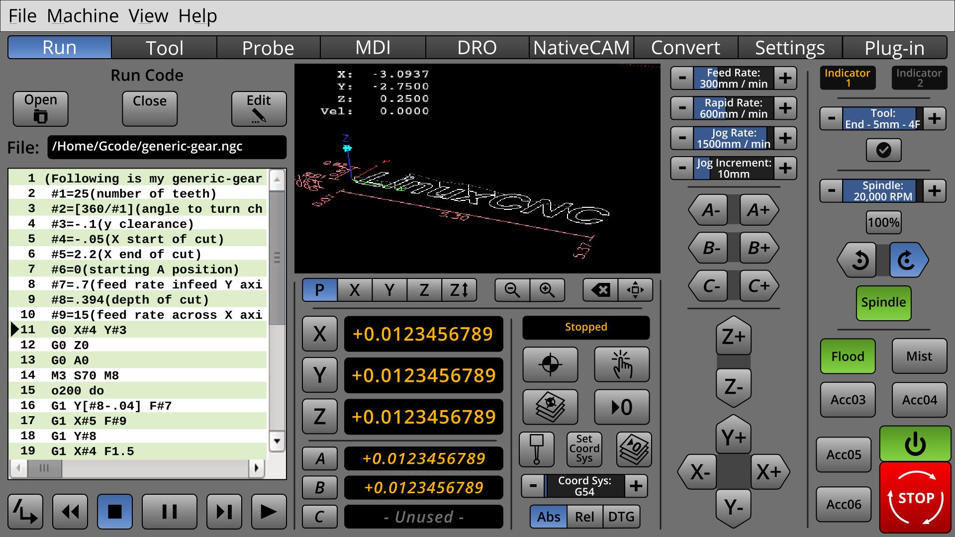
* Added a status indicator, though I've tried my best that what's going on can be summed up without it. I see it mostly as an error indicator.
* Because of the positive feedback, the way forward is with the vertical controls, such as in the last screenshots. I'm still moving controls around.
Originally, for mills, I planned to support 5 axis, but there's little difference between 5 and six, that I figured just to add one more, I wanted the user not to feel confined, nor TMI'ed.
I've tried to put the additional axis where the user doesn't have to look at them:
When the user is looking at the 3D window, 456 are at the bottom.
When the user is jogging 456 are at the bottom of the speed controls.
The hope is that a user would not have to relearn the control placement when walking back and fourth from a 3-axis to a 5-axis machine.
Last edit: 09 Jun 2018 03:33 by BrendaEM.
The following user(s) said Thank You: Roguish, tommylight, KCJ
Please Log in or Create an account to join the conversation.
- tommylight
-

- Away
- Moderator
-

Less
More
- Posts: 21499
- Thank you received: 7329
09 Jun 2018 23:06 #112098
by tommylight
Replied by tommylight on topic A Widescreen Blender-Style Interface
I am getting the sinking sensation that this is going nowhere, it looks like we are discussing god or love, everyone is talking about it but no one has ever seen it.
It is past the time to actually upload something, anything so we can start putting it together ( i am looking at you KCJ ).
If you upload the svg files, i can export the individual png files, having something to go on while you continue to improve the looks and usability.
Thank you for a great job at designing it, it looks awesome.
The following user(s) said Thank You: KCJ
Please Log in or Create an account to join the conversation.
Time to create page: 0.159 seconds

