A Widescreen Blender-Style Interface
- persei8
-

- Offline
- Platinum Member
-

Less
More
- Posts: 398
- Thank you received: 132
22 May 2018 20:44 #111035
by persei8
Replied by persei8 on topic A Widescreen Blender-Style Interface
This is one of the nicest screen layouts I have seen. I hope you continue it's development.
The following user(s) said Thank You: BrendaEM
Please Log in or Create an account to join the conversation.
- BrendaEM
- Offline
- Elite Member
-

Less
More
- Posts: 266
- Thank you received: 120
23 May 2018 00:21 - 23 May 2018 00:29 #111045
by BrendaEM
Replied by BrendaEM on topic A Widescreen Blender-Style Interface
Persei8, thank you. Yes, I'm still working on it. The interface is derivative of many others.
Last edit: 23 May 2018 00:29 by BrendaEM.
Please Log in or Create an account to join the conversation.
- BrendaEM
- Offline
- Elite Member
-

Less
More
- Posts: 266
- Thank you received: 120
23 May 2018 01:30 - 23 May 2018 11:10 #111048
by BrendaEM
Replied by BrendaEM on topic A Widescreen Blender-Style Interface
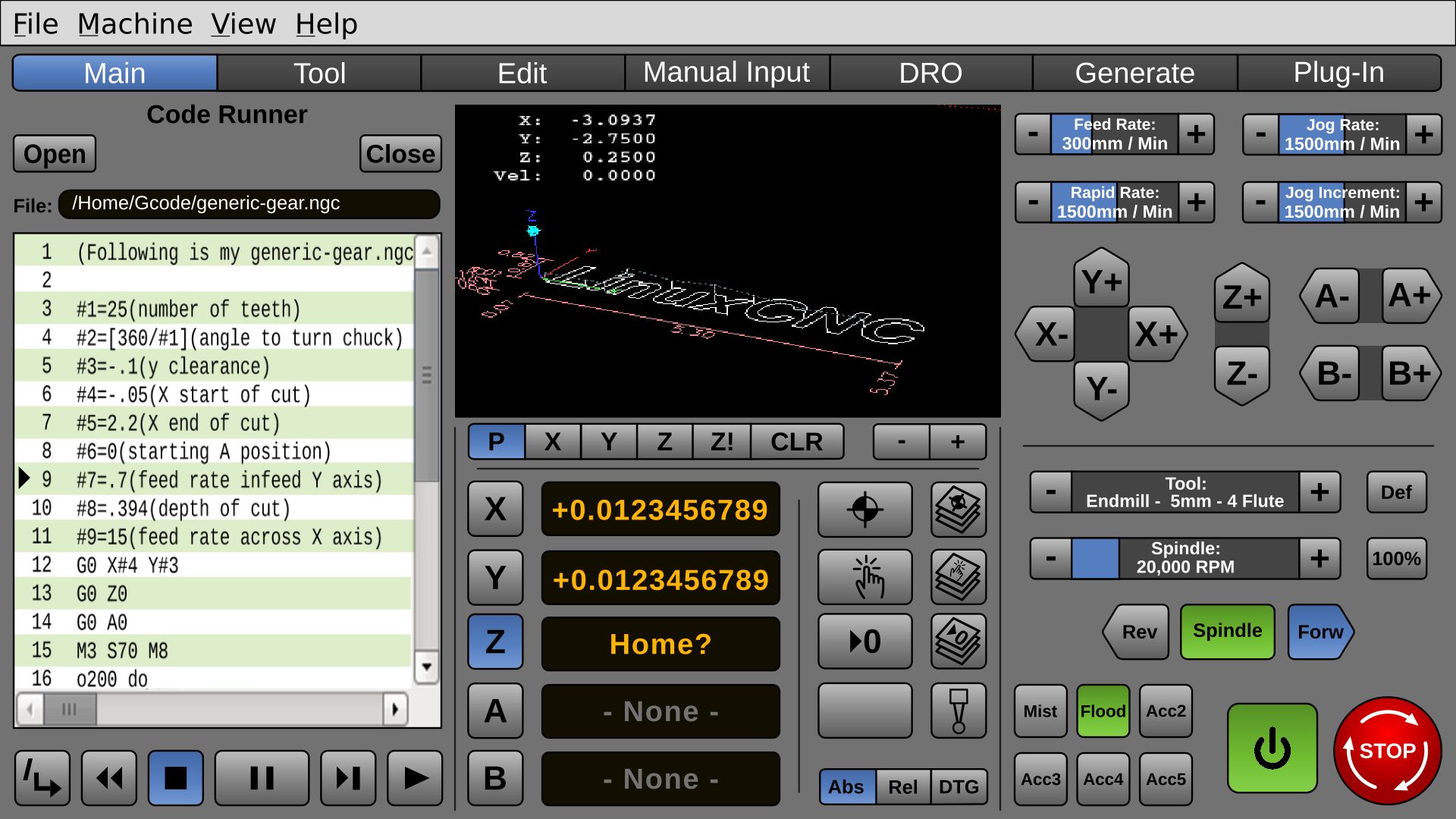
I'm still trying to keep an entire 1/3 screen for special functions, or the default "Code Runner" which means that all the other controls have to live on the other 2/3 of the screen. This has been a challenge, requiring compromise.
For now, I changed the Jog Increment to a progressive control. I don't like this, but I do like having all the normal controls on 2/3 of the screen these areas won't change.
The idea, as such is, that except for the On/Off and the E-Stop, the lower right panel would be configured to a machine-type, such as Mill, Torch, Laser.
I don't have a touchscreen, so I am resizing the mockup to 14" diagonal to see if I can hit them. I tend to favor the bottoms of each area.
Last edit: 23 May 2018 11:10 by BrendaEM.
Please Log in or Create an account to join the conversation.
- BrendaEM
- Offline
- Elite Member
-

Less
More
- Posts: 266
- Thank you received: 120
25 May 2018 05:00 - 26 May 2018 08:43 #111103
by BrendaEM
Replied by BrendaEM on topic A Widescreen Blender-Style Interface
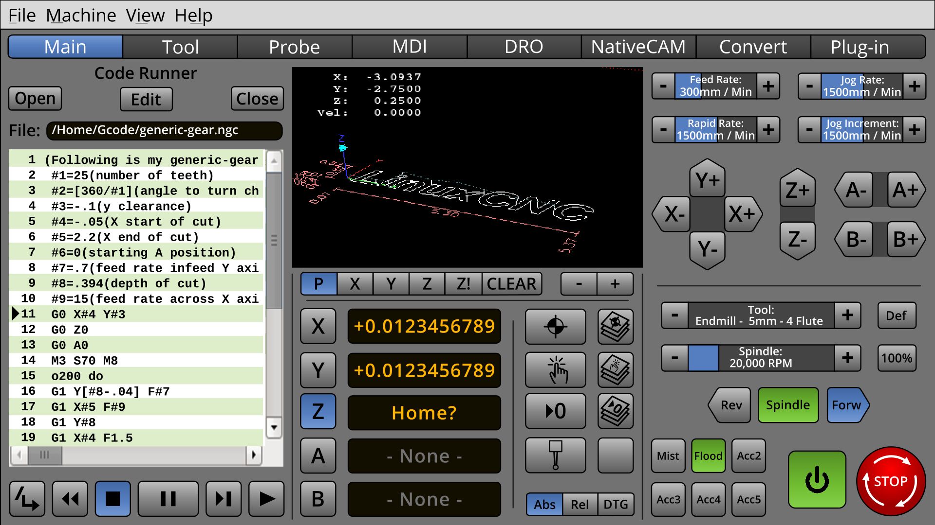
* Included Probe Menu. I thought that there would be a full probe menu, and also a probe button to perform a single predefined probe function.
* Font was changed to "Open Sans," which also has a good license is also good for. I really like the look of Mint Linux. This is almost the same font but has other typeface options, such as the Semi-Bold used mostly in this screenshot.
It's kind of a funny thing. If the fonts are too light, they are hard to see, and if they are too bold, the eye becomes lost inside the blackness of the letters when you get close. I noticed that on the X,Y,Z... Buttons.
It would seem like a good idea to include NativeCAM in LinuxCNC, perhaps Pycam, though with everything called CAM, it would be confusing to a new user. I would Generate and something else for NativeCAM, but if NativeCAM was native to LinuxCNC, what would it be called?
The Readout mode is really in the wrong column. It should be nearer the readout.
Last edit: 26 May 2018 08:43 by BrendaEM.
The following user(s) said Thank You: tommylight, tivoi
Please Log in or Create an account to join the conversation.
- BrendaEM
- Offline
- Elite Member
-

Less
More
- Posts: 266
- Thank you received: 120
26 May 2018 10:00 - 26 May 2018 10:10 #111145
by BrendaEM
Replied by BrendaEM on topic A Widescreen Blender-Style Interface
* Changed "Main" to "Run."
* Experimenting with adding some Faenza icons. Faenaz is a very popular icon theme. Because all the icons, so far in the mock-up are monochromatic, I just extracted part of each.
There are now several new icons.
I was worried about the Estop looking too similar to the Forward and Reverse icons, but because the color is different, it appears not to be a problem.
I've had an ulterior motive for using popular icons and fonts: I want to present a familiar interface. I've not really tried to make anything new here. In fact, I'm trying to take as much from other works, to make people comfortable.
On the Main or Run menu, I've not wanted to put the traditional probe icon, because it's not apparent what it is without adding the reddish probe tip color. I've been trying to keep red and green off the interface so they can be used for On/Off and Estop.
Last edit: 26 May 2018 10:10 by BrendaEM.
The following user(s) said Thank You: tommylight
Please Log in or Create an account to join the conversation.
- KCJ
-

- Offline
- Platinum Member
-

Less
More
- Posts: 328
- Thank you received: 267
28 May 2018 20:02 #111234
by KCJ
Replied by KCJ on topic A Widescreen Blender-Style Interface
That is a very nice looking screen!
I know you're not thinking about implementation yet, but what you have so far could be done in GTK3 or Qt without too much trouble. Most everything but the icons could be reproduced using CSS. It helps a lot that you have kept the shapes basic and the layout on a grid.
I know you're not thinking about implementation yet, but what you have so far could be done in GTK3 or Qt without too much trouble. Most everything but the icons could be reproduced using CSS. It helps a lot that you have kept the shapes basic and the layout on a grid.
The following user(s) said Thank You: BrendaEM
Please Log in or Create an account to join the conversation.
- BrendaEM
- Offline
- Elite Member
-

Less
More
- Posts: 266
- Thank you received: 120
28 May 2018 20:23 - 28 May 2018 20:25 #111237
by BrendaEM
Replied by BrendaEM on topic A Widescreen Blender-Style Interface
That's good to read. I think that the text-box with greenbar and indicator would be nonstandard. The selector boxes with text inside would also be non standard, but they save room.
I am having trouble with the torch controls. There are too many controls to fit on 1/6th of the screen. I don't have a torch, so it would be difficult to triage which controls need to be adjusted during normal running, and which ones could be put on the "Tool" menu, or a "Settings" menu. Hmmm.
I am having trouble with the torch controls. There are too many controls to fit on 1/6th of the screen. I don't have a torch, so it would be difficult to triage which controls need to be adjusted during normal running, and which ones could be put on the "Tool" menu, or a "Settings" menu. Hmmm.
Last edit: 28 May 2018 20:25 by BrendaEM.
Please Log in or Create an account to join the conversation.
- tommylight
-
- Away
- Moderator
-

Less
More
- Posts: 21541
- Thank you received: 7343
28 May 2018 21:11 #111238
by tommylight
Finaly !!! Welcome back Kurt.
Not to point out the obvious, but, you and Brenda could do the world of Linuxcnc a big favour by making this work as soon as possible. Again pointing the obvious, but i can't wait to have this working, but i have to steal from my sleep every day 15 to 30 minutes to do some quick reading/writing here on the forum, so i have no time to help much. By some strange turn of events i got to be the General Manager of a manufacturing factory, specialized in lifting equipment like cranes and the likes.
And again, this is a very nice looking screen and would be a nice addition to already wide variety of screens for Linuxcnc.
Thank you all.
P.S.
If by any chance someone needs an idea for another screen, have a look at Mazak, their new interface looks like something from a space ship.
Replied by tommylight on topic A Widescreen Blender-Style Interface
That is a very nice looking screen!
I know you're not thinking about implementation yet, but what you have so far could be done in GTK3 or Qt without too much trouble. Most everything but the icons could be reproduced using CSS. It helps a lot that you have kept the shapes basic and the layout on a grid.
Finaly !!! Welcome back Kurt.
Not to point out the obvious, but, you and Brenda could do the world of Linuxcnc a big favour by making this work as soon as possible. Again pointing the obvious, but i can't wait to have this working, but i have to steal from my sleep every day 15 to 30 minutes to do some quick reading/writing here on the forum, so i have no time to help much. By some strange turn of events i got to be the General Manager of a manufacturing factory, specialized in lifting equipment like cranes and the likes.
And again, this is a very nice looking screen and would be a nice addition to already wide variety of screens for Linuxcnc.
Thank you all.
P.S.
If by any chance someone needs an idea for another screen, have a look at Mazak, their new interface looks like something from a space ship.
The following user(s) said Thank You: KCJ
Please Log in or Create an account to join the conversation.
- BrendaEM
- Offline
- Elite Member
-

Less
More
- Posts: 266
- Thank you received: 120
28 May 2018 21:57 #111240
by BrendaEM
Replied by BrendaEM on topic A Widescreen Blender-Style Interface
I saw two Mazak interfaces, the Star Trek Next Gen one, and one with serif fonts.
As soon as a serif font makes its appearance on an interface, there is already a problem. Serifs on fonts are to lead the eye horizontally, you know, for paragraph text : P
As soon as a serif font makes its appearance on an interface, there is already a problem. Serifs on fonts are to lead the eye horizontally, you know, for paragraph text : P
Please Log in or Create an account to join the conversation.
- KCJ
-

- Offline
- Platinum Member
-

Less
More
- Posts: 328
- Thank you received: 267
29 May 2018 00:37 #111241
by KCJ
Replied by KCJ on topic A Widescreen Blender-Style Interface
Thank you Tommy!
I have been busy lately, but I hope to start working on LinuxCNC stuff again soon.
I'm glad you mentioned the new Mazatrols, I had not seen their new Smooth series yet. Looks like they are trying to follow the same trend as the DMG Mori CELOS controls. The CELOS control was the inspiration for Hazzy!
Cheers,
Kurt
The following user(s) said Thank You: tommylight
Please Log in or Create an account to join the conversation.
Time to create page: 0.172 seconds
