A Widescreen Blender-Style Interface
- BrendaEM
- Offline
- Elite Member
-

Less
More
- Posts: 266
- Thank you received: 120
31 May 2018 04:39 - 31 May 2018 04:46 #111345
by BrendaEM
Replied by BrendaEM on topic A Widescreen Blender-Style Interface
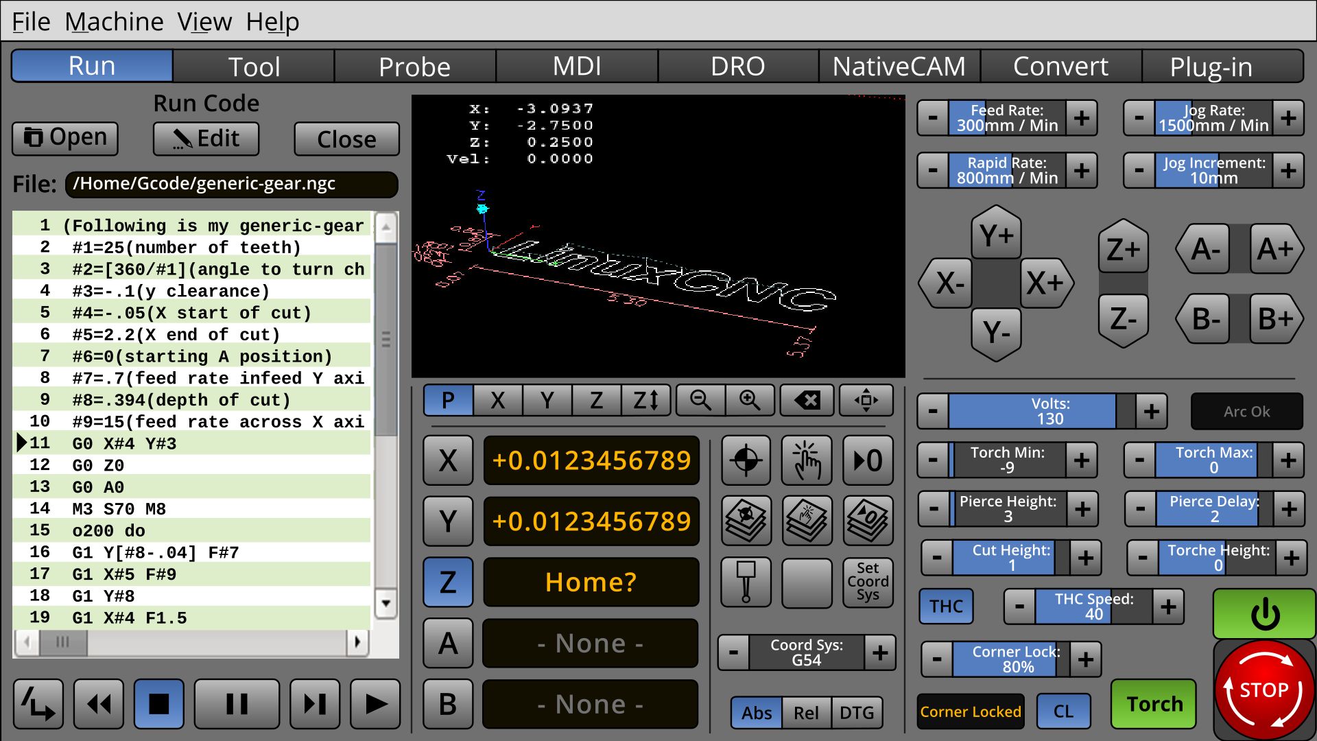
I am still working on the torch controls, but I don't know which ones need to be on the main screen.
With no feedback as to their priority, this is the mess I've made of them.
I was hoping that I would get them close enough so a Torch Person could tell me what I am doing wrong.
Until then, this is what there is : )
Note: The torch controls on the lower right are swapped for milling controls, where applicable.
Also note: Minor redesign of the Estop and Power buttons. They aren't going any smaller.
Last edit: 31 May 2018 04:46 by BrendaEM.
Please Log in or Create an account to join the conversation.
- BrendaEM
- Offline
- Elite Member
-

Less
More
- Posts: 266
- Thank you received: 120
31 May 2018 05:28 - 31 May 2018 06:20 #111346
by BrendaEM
Replied by BrendaEM on topic A Widescreen Blender-Style Interface
* Changed E-Stop button shape to square. I was worried that the user might mistake the onscreen Estop for a physical one. The screen button is estop'ie enough, but not too much.
* Reworked Home/Touch controls. I am back to liking them.
* Minor change on View controls.
* Totally done with this for tonight, this time, really, I think.
* Reworked Home/Touch controls. I am back to liking them.
* Minor change on View controls.
* Totally done with this for tonight, this time, really, I think.
Last edit: 31 May 2018 06:20 by BrendaEM.
The following user(s) said Thank You: KCJ
Please Log in or Create an account to join the conversation.
- andypugh
-

- Offline
- Moderator
-

Less
More
- Posts: 19852
- Thank you received: 4634
31 May 2018 09:28 #111348
by andypugh
No love for the Lathe People
No, don't worry, I am joking. I think that there is probably room for a dedicated lathe interface, but I think it could usefully be quite a lot different to the others rather than an afterthought in a milling interface like the current options are.
Replied by andypugh on topic A Widescreen Blender-Style Interface
KcjI am still moving around stuff, trying to get more room for the "Torch People" : )
No love for the Lathe People
No, don't worry, I am joking. I think that there is probably room for a dedicated lathe interface, but I think it could usefully be quite a lot different to the others rather than an afterthought in a milling interface like the current options are.
Please Log in or Create an account to join the conversation.
- BrendaEM
- Offline
- Elite Member
-

Less
More
- Posts: 266
- Thank you received: 120
31 May 2018 13:48 #111350
by BrendaEM
Replied by BrendaEM on topic A Widescreen Blender-Style Interface
Do you think a lower right panel could be made for a lathe?
What should Icopy--err draw inspiration from?
What do you want on there?
What should I
What do you want on there?
Please Log in or Create an account to join the conversation.
- andypugh
-

- Offline
- Moderator
-

Less
More
- Posts: 19852
- Thank you received: 4634
31 May 2018 14:10 #111352
by andypugh
Replied by andypugh on topic A Widescreen Blender-Style Interface
Well, seeing as you asked...
If the INI says "Lathe" then you probably want to rotate the jog arrows and lose the A, B and Y. (But potentially reinstate them if the GEOMETRY says that they exist)
A lot of people seem to be jumping through hoops to be able to use the Tormach PathPilot interface, though I haven't even bothered to experiment.
goo.gl/images/1qP9o9
As I say, I think what LinuxCNC needs is a dedicated lathe interface, not a Mill interface with mods.
The following user(s) said Thank You: BrendaEM
Please Log in or Create an account to join the conversation.
- BrendaEM
- Offline
- Elite Member
-

Less
More
- Posts: 266
- Thank you received: 120
31 May 2018 19:37 #111361
by BrendaEM
Replied by BrendaEM on topic A Widescreen Blender-Style Interface
Many of the controls are common between a lathe and mill, but the nice tool selection menu should be made in the "Tool" tab.
The X,Y, Z should work for both.
I've made the A and B controls and readouts smaller, though I've added a C. For a lathe, this area can be used for "Diameter" and "Length", and perhaps something else, perhaps something avant-garde such as "Tool Distance to Chuck."
Other than the Estop and Power buttons, the lower right panel can be whatever else a lathe needs, but the remaining controls are closer to a mill than a torch : )
Please Log in or Create an account to join the conversation.
- tommylight
-

- Online
- Moderator
-

Less
More
- Posts: 21538
- Thank you received: 7340
31 May 2018 21:56 #111364
by tommylight
-Torch Volts should be there for people with THCAD ( myself included recently, still sitting on my desk)
-Pierce height should be there, rarely adjusted but needed for cutting thin and thick plates.
-Pierce delay should be there, used more often but can also be set in gcode.
-ARC-OK must be there, usually programmed to motion-enable so machine will not move without that signal.
-UP/DOWN LED's should be there for people with simple THC, also useful for THCAD.
-Cut height should be there, can also be adjusted by changing Voltage.
-Torch height not needed, can be adjusted by changing Voltage, same as cut height.
-LED for floating head switch should be there.
-Floating head switch travel does not need to be there, has to be set once per machine.
-Travel heigh would be nice to have, on thicker material can be set lower, saves time on multiple cuts.
Can not think of anything else for the moment.
Thank you very much.
Replied by tommylight on topic A Widescreen Blender-Style Interface
I am still working on the torch controls, but I don't know which ones need to be on the main screen.
With no feedback as to their priority, this is the mess I've made of them.
I was hoping that I would get them close enough so a Torch Person could tell me what I am doing wrong.
Until then, this is what there is : )
Note: The torch controls on the lower right are swapped for milling controls, where applicable.
Also note: Minor redesign of the Estop and Power buttons. They aren't going any smaller.
-Torch Volts should be there for people with THCAD ( myself included recently, still sitting on my desk)
-Pierce height should be there, rarely adjusted but needed for cutting thin and thick plates.
-Pierce delay should be there, used more often but can also be set in gcode.
-ARC-OK must be there, usually programmed to motion-enable so machine will not move without that signal.
-UP/DOWN LED's should be there for people with simple THC, also useful for THCAD.
-Cut height should be there, can also be adjusted by changing Voltage.
-Torch height not needed, can be adjusted by changing Voltage, same as cut height.
-LED for floating head switch should be there.
-Floating head switch travel does not need to be there, has to be set once per machine.
-Travel heigh would be nice to have, on thicker material can be set lower, saves time on multiple cuts.
Can not think of anything else for the moment.
Thank you very much.
The following user(s) said Thank You: KCJ, BrendaEM
Please Log in or Create an account to join the conversation.
- islander261
- Offline
- Platinum Member
-

Less
More
- Posts: 757
- Thank you received: 216
01 Jun 2018 16:10 #111393
by islander261
Replied by islander261 on topic A Widescreen Blender-Style Interface
My two cents.
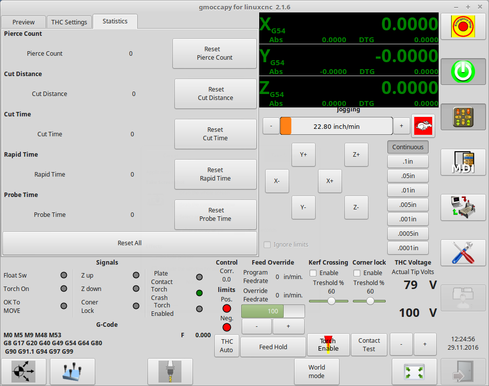
Most set points are rarely changed during a given job so for me having a separate tab for the set points is ok. One thing not mentioned by tommylight is tracking of consumable use. It is nice to have a pierce counter and a total distance cut display so you can track consumable life. Accumulating timers for cut time, rapid (traverse) time and probing time are also useful for job costing analysis. Again this can all be on a separate tab.
So for the main screen I vote for arc voltage set point, arc voltage display. All the indicator LEDs that tommylight mentioned plus height hold active, torch enabled, break away mount status (torch crash). Controls for torch enable, thc height servo enable, torch velocity hold enable, kerf crossing enable.
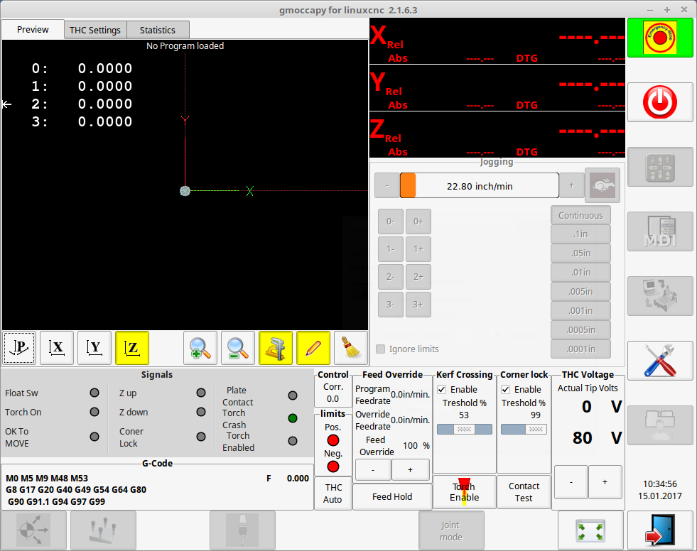
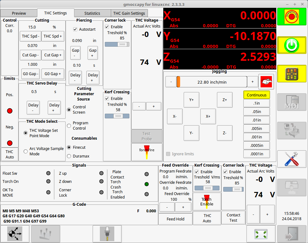
You can have a look at my crude Gmoccapy screens posted in other threads.
John
The following user(s) said Thank You: tommylight
Please Log in or Create an account to join the conversation.
- islander261
- Offline
- Platinum Member
-

Less
More
- Posts: 757
- Thank you received: 216
01 Jun 2018 17:00 #111396
by islander261
Replied by islander261 on topic A Widescreen Blender-Style Interface
The following user(s) said Thank You: BrendaEM
Please Log in or Create an account to join the conversation.
- BrendaEM
- Offline
- Elite Member
-

Less
More
- Posts: 266
- Thank you received: 120
02 Jun 2018 01:01 - 02 Jun 2018 04:09 #111424
by BrendaEM
Replied by BrendaEM on topic A Widescreen Blender-Style Interface
Thank you all for your input.
I think that I still want a group of controls on the lower right to control several things about whatever machine.
I think the Menu Bar needs a "Settings" tab, number 2 below.
So, there would be a 3 tier way of doing things.
1.) Lower-right = Things that need adjusting during use.
2.) Settings Page
3.) On LinuxCNC standard tool-bar, the same HAL-related stuff that we normally see.
I will do some more work on the torch-panel.
BTW, Gmoccapy has a lot of good ideas going for it. It's one of the interfaces I am drawing ideas from.
For instance, the incremental controls in my interface mock-up, were based on Gmoccapy, but just a little more compact because there are 2 rows of legends on the inside of the indicator portion.
Axis is minimal and it fits a lot of controls.
I am also drawing inspiration from Pietvr's interface, and of course: Blender and Mint/Cinnamon.
~
[Unfortunately, I have some tedious work to do on the interface. I am drawing the interface in Inkscape, which is open and pretty good--except for the size input boxes.
Anyway, when I started the interface project I just wanted it 16 x 9 in aspect ratio; I was more worried about button sizes than anything else. Well, now that things are coming along, it occurred to me, that the controls and perimeters should all be sized along powers of two, such as 128, 64, 32, or some kind of combination, such as 112, and 160, and so I have to think about absolute pixel sizes. Though it's insane to think of vector anything in integer pixel sizes, yet that's where I am....
Oddly, with the interface being 16x9, Inkscape has settings for simulate absolute pixel sizes, and in this case I've chosen 1920x1080, yet someday, icons could be exported from the same file for 3840 x 2160 4K.
So, stuff should be resized. I've been changing most of the controls--every few days, anyway, it's that everything will need some adjusting before progressing.]
Last edit: 02 Jun 2018 04:09 by BrendaEM.
Please Log in or Create an account to join the conversation.
Time to create page: 0.561 seconds
