A Widescreen Blender-Style Interface
- andypugh
-

- Offline
- Moderator
-

Less
More
- Posts: 19852
- Thank you received: 4633
06 Jun 2018 08:39 #111726
by andypugh
For a big and dangerous machine you might want to look at the Touchy interface. It isn't as slick as Gmoccapy or "Brendy" but it does attempt to ensure that no machine movement happens without a physical control being operated. It requires a single jog-wheel and physical run and stop buttons.
It has its limitations, but I like this design philosophy and use it on both my machines.
Replied by andypugh on topic A Widescreen Blender-Style Interface
- One of my gripes about the current AXIS interface is with the sliders that control jog speed, feed override, etc. You just don't get the same fine-grained control that you do with a big chunky knob with detents on an industrial machine. If your wrist twitches a little you might even drive the feed WAY too fast and break a cutter or scrap a workpiece.
For a big and dangerous machine you might want to look at the Touchy interface. It isn't as slick as Gmoccapy or "Brendy" but it does attempt to ensure that no machine movement happens without a physical control being operated. It requires a single jog-wheel and physical run and stop buttons.
It has its limitations, but I like this design philosophy and use it on both my machines.
Please Log in or Create an account to join the conversation.
- ozzyrob
-

- Visitor
-

06 Jun 2018 08:59 #111727
by ozzyrob
Replied by ozzyrob on topic A Widescreen Blender-Style Interface
I like the philosophy of touchy as well
Please Log in or Create an account to join the conversation.
- rodw
-

- Offline
- Platinum Member
-

Less
More
- Posts: 11862
- Thank you received: 4022
06 Jun 2018 08:59 #111728
by rodw
Ahh, thanks to Andy, this delightful interface has a name! "Brendy" it has to be! (unless touchy "Brendy" becomes "Trendy"
Replied by rodw on topic A Widescreen Blender-Style Interface
For a big and dangerous machine you might want to look at the Touchy interface. It isn't as slick as Gmoccapy or "Brendy"
Ahh, thanks to Andy, this delightful interface has a name! "Brendy" it has to be! (unless touchy "Brendy" becomes "Trendy"
Please Log in or Create an account to join the conversation.
- Sparky961
-

- Offline
- Elite Member
-

Less
More
- Posts: 210
- Thank you received: 15
06 Jun 2018 13:07 #111746
by Sparky961
Thanks, I'll definitely give it a look for the VMC after I've tweaked and fixed a number of things. I don't want to introduce another variable at this point.
Replied by Sparky961 on topic A Widescreen Blender-Style Interface
For a big and dangerous machine you might want to look at the Touchy interface.
Thanks, I'll definitely give it a look for the VMC after I've tweaked and fixed a number of things. I don't want to introduce another variable at this point.
Please Log in or Create an account to join the conversation.
- BrendaEM
- Offline
- Elite Member
-

Less
More
- Posts: 266
- Thank you received: 120
06 Jun 2018 18:01 #111775
by BrendaEM
Replied by BrendaEM on topic A Widescreen Blender-Style Interface
Just to nip this in the bud: I am against naming things with names which are difficult to document.
I should think that if I am successful, I will become just another faceless person who helped LinuxCNC.
Perhaps someday, it could be called "LinuxCNC Wide Rounded-Dark 1.0," but there is a lot of work to be done first.
I should think that if I am successful, I will become just another faceless person who helped LinuxCNC.
Perhaps someday, it could be called "LinuxCNC Wide Rounded-Dark 1.0," but there is a lot of work to be done first.
Please Log in or Create an account to join the conversation.
- tommylight
-

- Away
- Moderator
-

Less
More
- Posts: 21503
- Thank you received: 7330
06 Jun 2018 19:15 #111781
by tommylight
11 cents, if we calculate for the inflation these days!!!


Back on topic:
I think it is about time to move from a nice looking picture and a lot of discussion to something that can be tested and used.
I can manage to steal about half an hour to 1 hour a day from my sleep to help with it (i sleep 4 to 5 hours max. as it is ), but not much more. I also need to implement the THC portion of the step/dir control ( no feedback ) to analogue servo control ( feedback loop closed in Linuxcnc ), as it has a lot of things needed for THC plasma control implemented in hal, Not with remaps and Subs and gcode workarounds, etc. so that is a must, not want or should !
Sorry for flying of topic, but i am tired of reading on this forum that Linuxcnc does not have a decent THC control,
-- IT Does have and IT Works perfectly on several industrial and hobby machines working at least 12 hours every day for several years.
Oh, i also have to make it work with THCAD from Mesa, including controlling the current output on Plasma power supplies that have external or internal potentiometer controlled output, or by adding relays on ones that do not.
Also adding an extra panel with pre-sets for material types and thickness would improve usability a lot, with a settings panel for fine tuning the feeds and speeds and current and nozzle types etc etc etc.
To many possibilities, not enough time.
Replied by tommylight on topic A Widescreen Blender-Style Interface
My two cents, whatever that's worth these days:
11 cents, if we calculate for the inflation these days!!!
Back on topic:
I think it is about time to move from a nice looking picture and a lot of discussion to something that can be tested and used.
I can manage to steal about half an hour to 1 hour a day from my sleep to help with it (i sleep 4 to 5 hours max. as it is ), but not much more. I also need to implement the THC portion of the step/dir control ( no feedback ) to analogue servo control ( feedback loop closed in Linuxcnc ), as it has a lot of things needed for THC plasma control implemented in hal, Not with remaps and Subs and gcode workarounds, etc. so that is a must, not want or should !
Sorry for flying of topic, but i am tired of reading on this forum that Linuxcnc does not have a decent THC control,
-- IT Does have and IT Works perfectly on several industrial and hobby machines working at least 12 hours every day for several years.
Oh, i also have to make it work with THCAD from Mesa, including controlling the current output on Plasma power supplies that have external or internal potentiometer controlled output, or by adding relays on ones that do not.
Also adding an extra panel with pre-sets for material types and thickness would improve usability a lot, with a settings panel for fine tuning the feeds and speeds and current and nozzle types etc etc etc.
To many possibilities, not enough time.
Please Log in or Create an account to join the conversation.
- BrendaEM
- Offline
- Elite Member
-

Less
More
- Posts: 266
- Thank you received: 120
06 Jun 2018 20:11 - 06 Jun 2018 20:26 #111786
by BrendaEM
Replied by BrendaEM on topic A Widescreen Blender-Style Interface
Hi Tommylight,
The design is still young enough that I am still worried about dead-ends, design-wise, given that it's only been a few weeks. I guess I should make a to-do list.
To do list:
* Draw up an on-screen keyboard, and make sure it works well with the other panels and sections. (In progress)
* Make sure interface works with space allotted, with the bars and Linux-CNC pull-down menubar. As installed, the XFCE dock wastes a lot of space, and I have met with resistance about changing it, though I strongly feel that it will help other interfaces as well. I will have to see if my 16x9 monitor has an analog input, so it can be moved out in the garage to see how much the XFCE top bar takes up, as well as the LinuxCNC native controls, which I have just estimated. In the end, I just state that the dock's icons should be moved to the top Launch bar, and the wasteful dock eliminated to use the interface. I know a lot of Mac people who don't like the OSX dock either. Microsoft is so stupid for continually working to eliminate it's launch-bar and start button, which are arguably the best part of Windows.
* Come up with a readout and axis controls panel which will make lathe-people happy.
* Get more feedback.
I am sorry that this is taking so long, but with other people working on this, I want them to use their time efficiently.
[Aside from this I am trying to finish my CNC mill and large 3d printer before I lose my place to live.]
Last edit: 06 Jun 2018 20:26 by BrendaEM.
The following user(s) said Thank You: tommylight
Please Log in or Create an account to join the conversation.
- BrendaEM
- Offline
- Elite Member
-

Less
More
- Posts: 266
- Thank you received: 120
06 Jun 2018 21:54 - 06 Jun 2018 23:15 #111793
by BrendaEM
Replied by BrendaEM on topic A Widescreen Blender-Style Interface
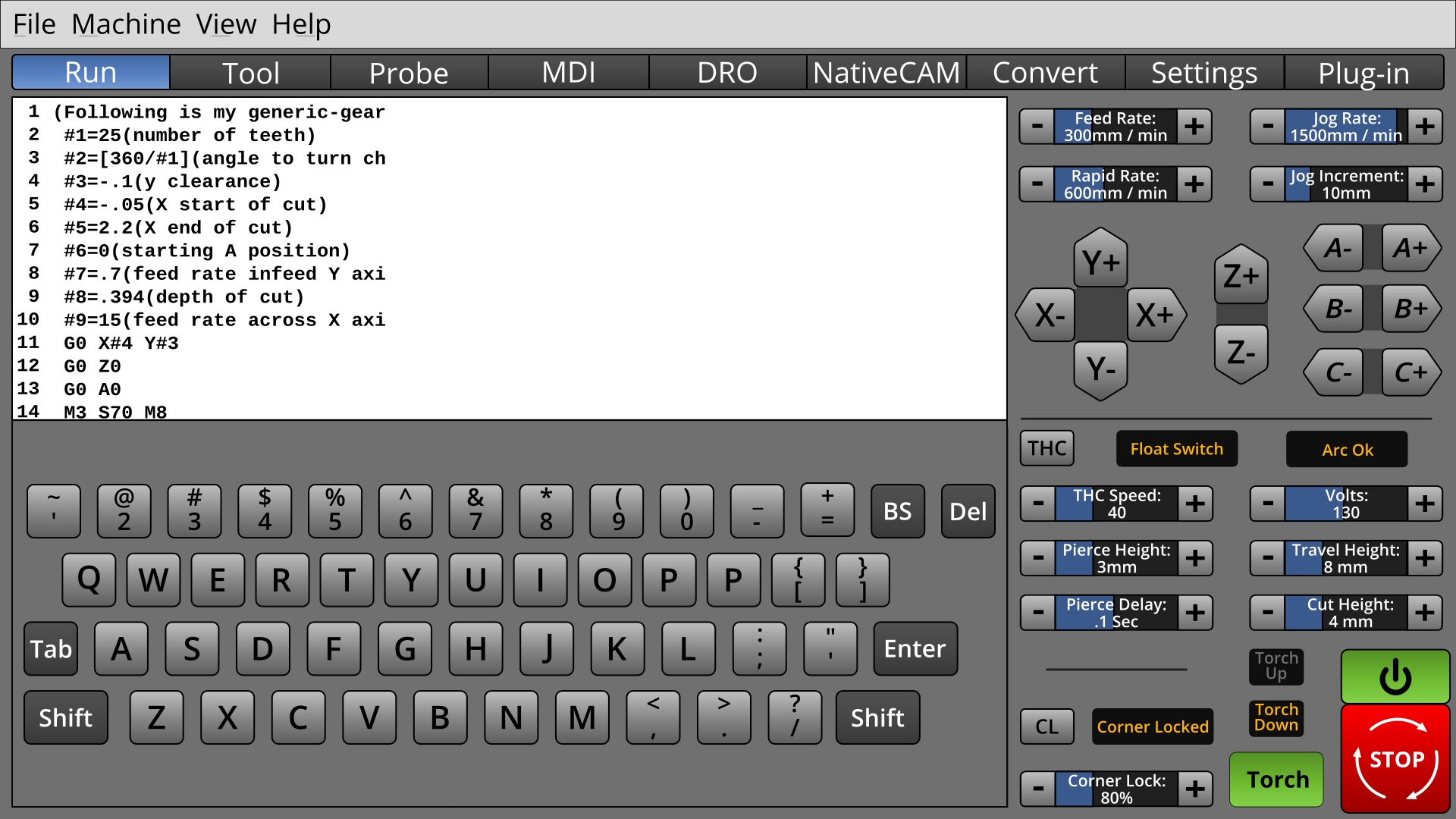
* A rough on-screen keyboard mockup.
I would rather not ever cover up the machine EStop and power controls, but the user would probably have to be prevented from turning anything on when a keyboard or editing window is up.
This is the stuff that times time: to work out if things will work out.
Arrow keys should be fitted in there somewhere.
Edit: probably should have a spacebar, too : )
Last edit: 06 Jun 2018 23:15 by BrendaEM.
Please Log in or Create an account to join the conversation.
- andypugh
-

- Offline
- Moderator
-

Less
More
- Posts: 19852
- Thank you received: 4633
06 Jun 2018 23:22 #111799
by andypugh
I think "Axis" was a poor choice in retrospect, but Gscreen, Gmoccapy and Touchy are all working OK in context. If it becomes a finished GUI then I will be typing the name a lot and favour a short name.
Replied by andypugh on topic A Widescreen Blender-Style Interface
Just to nip this in the bud: I am against naming things with names which are difficult to document.
I think "Axis" was a poor choice in retrospect, but Gscreen, Gmoccapy and Touchy are all working OK in context. If it becomes a finished GUI then I will be typing the name a lot and favour a short name.
Please Log in or Create an account to join the conversation.
- andypugh
-

- Offline
- Moderator
-

Less
More
- Posts: 19852
- Thank you received: 4633
06 Jun 2018 23:28 #111801
by andypugh
I didn't see resistance. I saw vague agreement with the point of view and a statement that you are asking the wrong people.
Replied by andypugh on topic A Widescreen Blender-Style Interface
* Make sure interface works with space allotted, with the bars and Linux-CNC pull-down menubar. As installed, the XFCE dock wastes a lot of space, and I have met with resistance about changing it,
I didn't see resistance. I saw vague agreement with the point of view and a statement that you are asking the wrong people.
The following user(s) said Thank You: tommylight
Please Log in or Create an account to join the conversation.
Time to create page: 0.405 seconds

