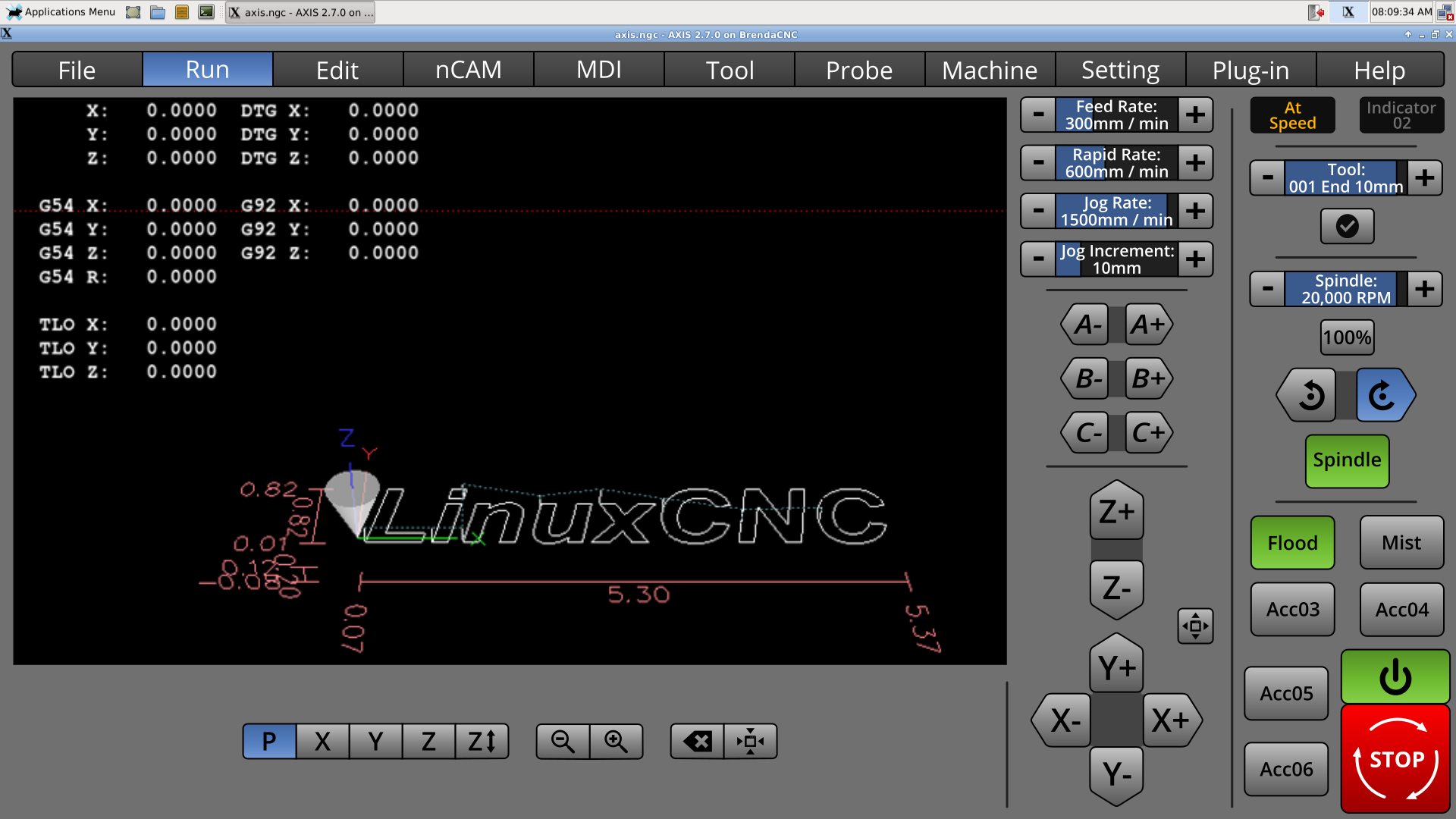
A Widescreen Blender-Style Interface
- BrendaEM
- Offline
- Elite Member
-

Less
More
- Posts: 266
- Thank you received: 120
19 Jun 2018 20:49 - 19 Jun 2018 21:19 #112598
by BrendaEM
Replied by BrendaEM on topic A Widescreen Blender-Style Interface
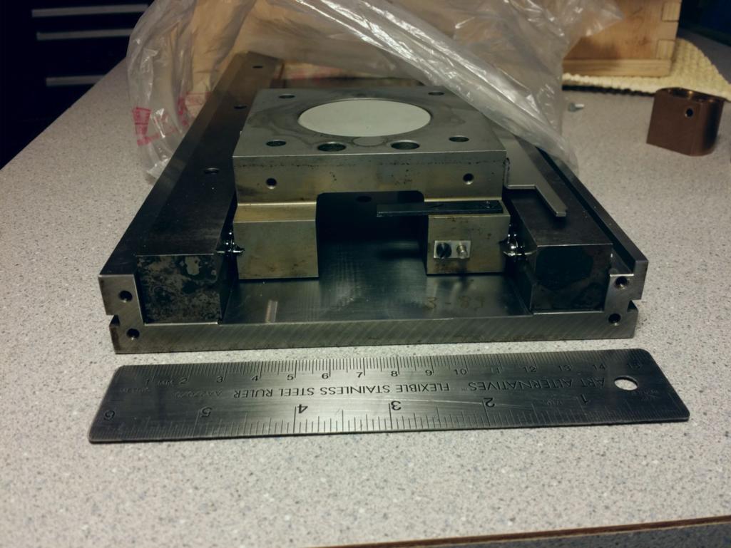
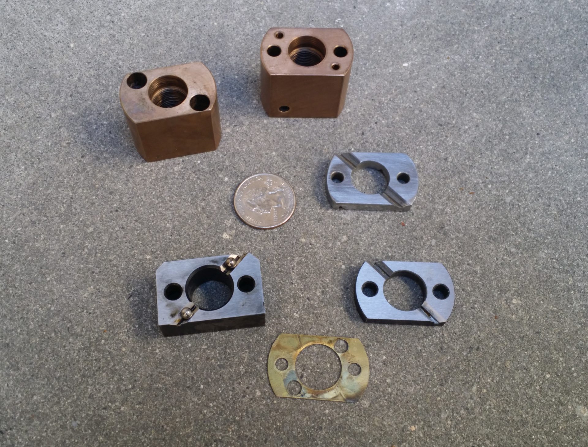
I have 2 axis; they are part of a wafer inspection microscope. The axis was made from ground wireEDM'ed tool steel. Originally the axis had wicks and a tank for lubrication. The leadnut had sliders to decouple its radial motion from its axial motion. In the photo, one of the sliders was broken, so I tried my best to make a new one from oil-hardening tool steel. Still, you can just see the bearings. The axis is stained, but it still seems to work pretty good.
The screw is 1mm.
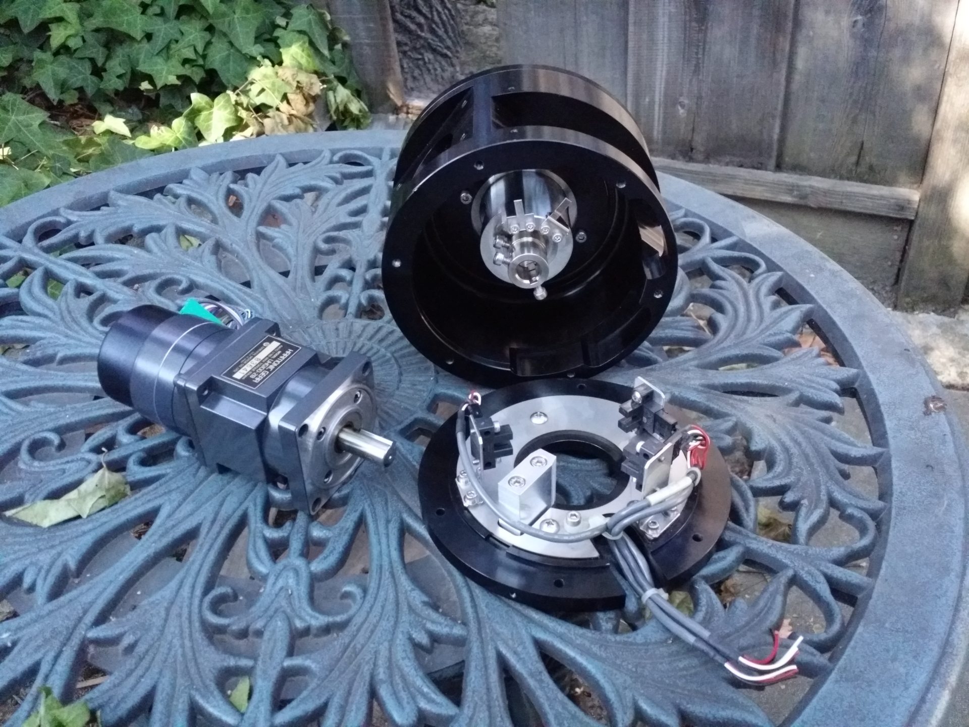
The original motors were 200 step motors.
The units came with a 4:1 reduction drive.
There was hardware to run this closed-loop with microstepping, with photointeruppters, which were to the best of my recollection 4x.
The unit originally were set up for 0.0003125mm steps, or 0.0000123031(4960629921)".
I dumbed them down a little by installing .36 degree motors to .0001mm without microstepping.
From here, you need piezo manipulators, anti-vibration table, and yes, likely heating.
I also have some harmonic drives which are 50,000 steps per revolution.
From my perspective, there are people on this forum who want me to finish this design. I am time constrained, and I am not sure if truncating the digits will give me a full button width, and I don't know what controls universal to most machines need to go there. Functionally, I don't see a problem with the way it is.
The nail in the coffin is: the digits can't be much taller without hitting the ABS/Rel/DTG indicators, which I feel need to be there for safety.
Or, if you look at pragmatically, if I am designing this interface, would I not also make it inclusive to my needs?
I am looking at time VS benefit, and while you may not see the need for that much accuracy, I don't see the benefit to change it.
I appreciate it being brought to my attention. If I get desperate for space, perhaps I can shave a digit or two off, but it looks like 4 or more digits would have to go for another button row.
Last edit: 19 Jun 2018 21:19 by BrendaEM.
Please Log in or Create an account to join the conversation.
- Sparky961
-

- Offline
- Elite Member
-

Less
More
- Posts: 210
- Thank you received: 15
20 Jun 2018 01:21 #112602
by Sparky961
Replied by Sparky961 on topic A Widescreen Blender-Style Interface
Well, yours is definitely an application I wouldn't have thought of. So, yes, I'm sure there are some to whom those extra zeros make a difference. I do, however, believe that you're in the minority. You are also, as you politely point out, the one doing the work. Thus you do get the right to make the decision - not that you need my permission or acknowledgement on that front. 
So that means the space can't be freed up, but I do hope that when the UI is tied together with some live variables that there is a configuration setting for the number of displayed digits.
Keep at it. I know what it's like to have a project blow up out of control, but you're handling this well. I think you have the right idea of trying to get input but not please everybody.
The following user(s) said Thank You: KCJ, BrendaEM
Please Log in or Create an account to join the conversation.
- BrendaEM
- Offline
- Elite Member
-

Less
More
- Posts: 266
- Thank you received: 120
26 Jun 2018 06:08 - 27 Jun 2018 05:53 #112866
by BrendaEM
Replied by BrendaEM on topic A Widescreen Blender-Style Interface
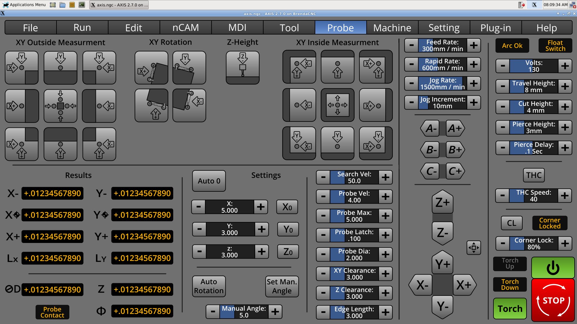
I've had a pretty bad cold, but the probe screen is still progressing. Layout-wise Verser's probe screen was good, but the controls need to fit into 2/3 of the screen, and work for touch.
* The probe symbol is changed mostly to top-downs. My other ones were from the side, but that was confusing once Z axis came into play.
* The arrows and axis letters are integrated to give a good sense of direction.
I don't like cramming all eight settings together like that, but there is not enough width to make another column.
Last edit: 27 Jun 2018 05:53 by BrendaEM.
Please Log in or Create an account to join the conversation.
- BrendaEM
- Offline
- Elite Member
-

Less
More
- Posts: 266
- Thank you received: 120
26 Jun 2018 07:08 - 26 Jun 2018 07:11 #112868
by BrendaEM
Replied by BrendaEM on topic A Widescreen Blender-Style Interface
Last edit: 26 Jun 2018 07:11 by BrendaEM.
The following user(s) said Thank You: tommylight
Please Log in or Create an account to join the conversation.
- BrendaEM
- Offline
- Elite Member
-

Less
More
- Posts: 266
- Thank you received: 120
26 Jun 2018 07:14 - 26 Jun 2018 18:07 #112869
by BrendaEM
Replied by BrendaEM on topic A Widescreen Blender-Style Interface
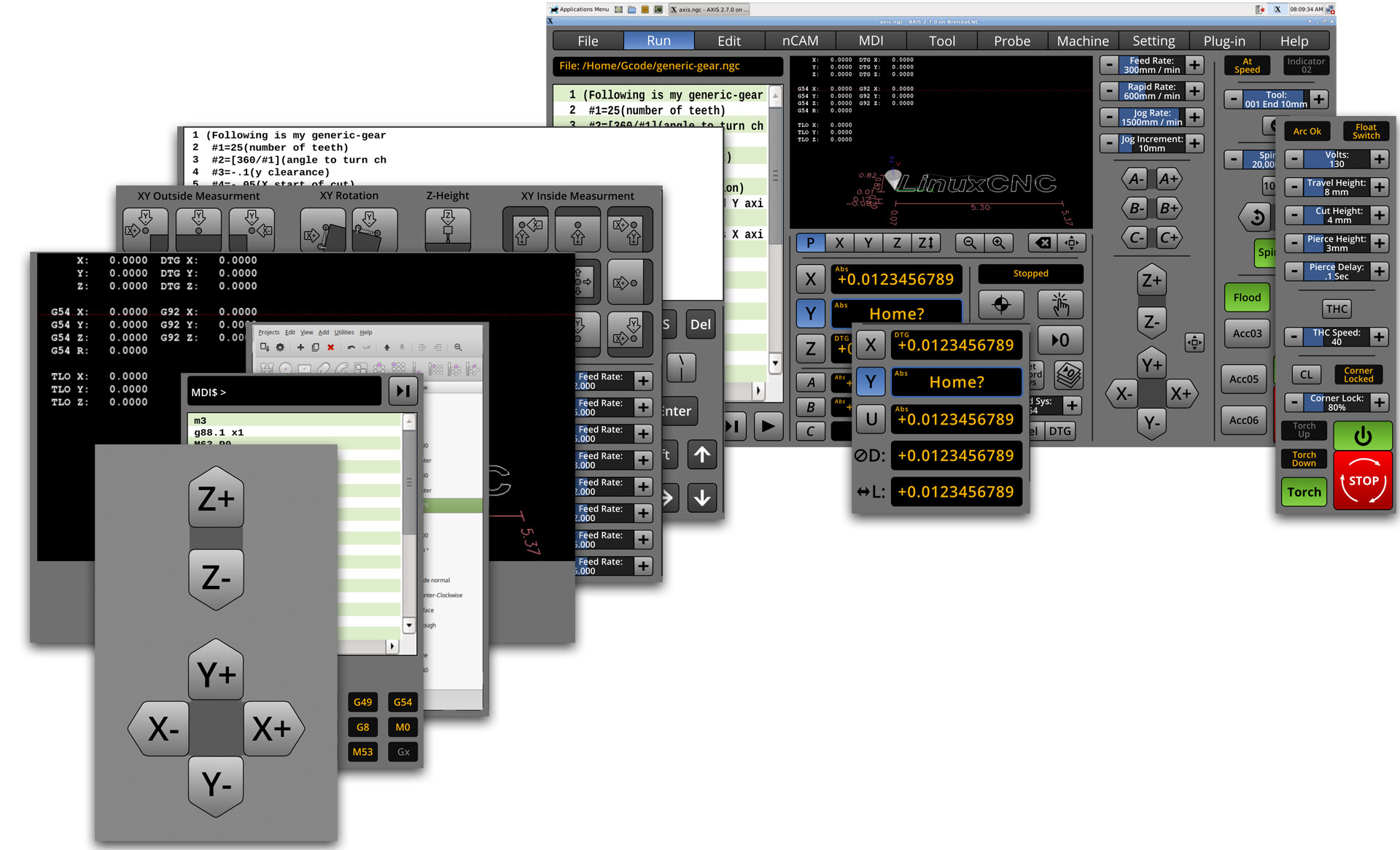
I made an updated collage' showing most of the panels. There are two sizes of left panels; the larger ones also cover the middle portion of the screen as well, but not the jog and machine-specific controls. The left panels are: Run, Edit, Probe, Large-Screen, nCAM, MDI, and Large-Jog. The center overlay hopes to be for a lathe. The right overlay is for a torch.
nCam could have 2 sizes, either taking up just the left, or the left and middle sections, perhaps taking the jog controls as well when the machine is not running.
The lathe controls still need more work, as do the panels for Tool, Machine, Setting, Plugin, but the screen arrangement works fairly well.
It's my hope to get enough together to create a system that other people can add to. The style is still largely Blender (coloring, Axis(vertical), and Gmoccapy(buttons), with a newspaper-like separator strip motif to lead the eye around, and elements from the other interfaces.
I hope there to be an inclusive interface system, just as I hope that LinuxCNC integrates NativeCAM, and the probe screen, whether this is done with the next LinuxCNC release or not.
LOL, I got your big jog buttons right here : )
Last edit: 26 Jun 2018 18:07 by BrendaEM.
Please Log in or Create an account to join the conversation.
- grijalvap
-

- Offline
- Elite Member
-

Less
More
- Posts: 199
- Thank you received: 63
27 Jun 2018 05:51 #112912
by grijalvap
Replied by grijalvap on topic A Widescreen Blender-Style Interface
how can I test this interface?
Please Log in or Create an account to join the conversation.
- BrendaEM
- Offline
- Elite Member
-

Less
More
- Posts: 266
- Thank you received: 120
27 Jun 2018 05:54 - 27 Jun 2018 06:00 #112913
by BrendaEM
Replied by BrendaEM on topic A Widescreen Blender-Style Interface
Thank you for the interest.
It has to be programmed first, and well, I need to finish the design before the programming starts, at least as much to make sure the programming effort is efficient. I've been working on this about 5 weeks.
The interface is meant to be very derivative from the other interfaces. I'm just trying to meld together what's already here.
Last edit: 27 Jun 2018 06:00 by BrendaEM.
Please Log in or Create an account to join the conversation.
- grijalvap
-

- Offline
- Elite Member
-

Less
More
- Posts: 199
- Thank you received: 63
27 Jun 2018 06:01 #112914
by grijalvap
Replied by grijalvap on topic A Widescreen Blender-Style Interface
Ok, thanks, I will keep an eye on it, it looks nice, I'm looking for a good plasma interface.
Please Log in or Create an account to join the conversation.
- rodw
-

- Offline
- Platinum Member
-

Less
More
- Posts: 11855
- Thank you received: 4020
27 Jun 2018 07:15 #112917
by rodw
Me too!
Replied by rodw on topic A Widescreen Blender-Style Interface
Ok, thanks, I will keep an eye on it, it looks nice, I'm looking for a good plasma interface.
Me too!
Please Log in or Create an account to join the conversation.
- Lcvette
-

- Offline
- Platinum Member
-

Less
More
- Posts: 1617
- Thank you received: 753
27 Jun 2018 20:58 #112939
by Lcvette
Replied by Lcvette on topic A Widescreen Blender-Style Interface
Holy smokes this is AWESOME LOOKING!!!!! Fantastic work you are doing!! I am following with great interest and excitement!! Can't believe I stumbled upon this by accident looking for probing information..lol blown away!
Chris
Chris
The following user(s) said Thank You: BrendaEM
Please Log in or Create an account to join the conversation.
Time to create page: 0.308 seconds
