A Widescreen Blender-Style Interface
- KCJ
-

- Offline
- Platinum Member
-

- Posts: 328
- Thank you received: 267
From a design and usability standpoint I think the shape of the jog buttons is very good. I have been studying how to make them, and I am confidant that it can be done, but they may not make it into the first prototype.Perhaps the pointy jogs can be placed in a square button. Although the the button border may confuse they eye. In places placing legends inside arrows seem to improve recognition, and reduce visual clutter.
When I get some time will see about implementing the incremental indicators, shouldn't be too hard. What do you think about being able to swipe the indicator area to increase/decrease the setting in addition to the -/+ buttons?
The separators can be dynamically moved/hidden/shown as needed. Does that relieve the nag?One thing that's been a nagging detail for me: switching out some of the separator lines, when certain panels are changed.
My heart beats faster for Gtk+ too, but only because it reminds me of all the time I have spent fighting with it!Do you know both GTK+ and QT?
I am not asking because I want you to do both, it's just that my heart beats a little faster for GTK+
I know Gtk+3 (including a good many of it's various quirks and bugs) pretty well, maybe too well given that I have helped people do things that the devs thought was impossible, but life is too short. Don't get me wrong, I really like it in many ways. It has some great features and there is no question that it beats Qt in look and feel, but it is a nightmare trying to use it for anything remotely complicated.
My new preferred method of testing toolkits is to give the IDE a spin. On the surface GNOME Builder (the IDE for developing Gtk apps) looks very nice and is loaded with features, but in reality it is so slow and buggy it struggles to open and syntax highlight a single file. On the other hand the Qt IDEs (QtCreator and QtDesigner) are pretty bare bones, but they work well, have all the features that are actually needed, and are reliable. This seems to be consistent for most Qt and Gtk apps.
I have only been playing with Qt for a few weeks, but so far I have been very impressed. It is MUCH simpler to use than Gtk and I have yet to encounter anything that does not behave exactly as expected. Also it seems to run better on old hardware and does not have the graphics problems Gtk tends to. Anyway, so far I feel like the practical advantages of Qt far outweigh the aesthetic ones of Gtk. I only wish I had listened sooner to all those that told me to run from Gtk ..
I should clarify that I have only had problems with Gtk+3 , Gtk+2 (as use by Gmoccapy, gscreen, touchy, gladeVCP ...) is a very solid toolkit. The problem is it is getting old and probably will not be supported for much longer, so would probably not make sense to use in a new project.
I hope your cold gets better soon.
Cheers,
Kurt
Please Log in or Create an account to join the conversation.
- BrendaEM
- Offline
- Elite Member
-

- Posts: 266
- Thank you received: 120
If the swiping to make a fader-like control could be done safe, it would be good, but what I am worried about is someone putting a milling fly cutter in a chuck, or a heavy part in a 4-jaw lathe chuck, and sneezing while they adjust it, creating mayhem and an ambulance ride.
I should think that the increments should be settable, and the arrows on the end could repeat if held, like a keyboard repeat.
Can you think of a way way to make an analog slider safe?
I would like to also be able to long-press on an indicator to type a numerical entry, using an onscreen pop-up keyboard, like in NativeCAM. If you haven't noticed, I am a big proponent of NativeCAM because it's handy for one-off tasks and small projects.
The separators can be a little complicated--even in Inkscape layers. As the layout progresses, I think I am going to have to be consistent with them if I expect others too.
I do like GTK+ because it adds consistency to many Linux distributions.
I wonder also if a meta button layout language like an .XML file could be used, as they are in Axis. In other words, I worry that if it's too hard for people to customize the interface, then this project might instead futher fragment LinuxCNC further instead of drawing it together.
I wonder if more than one person could help code this.
Please Log in or Create an account to join the conversation.
- BrendaEM
- Offline
- Elite Member
-

- Posts: 266
- Thank you received: 120
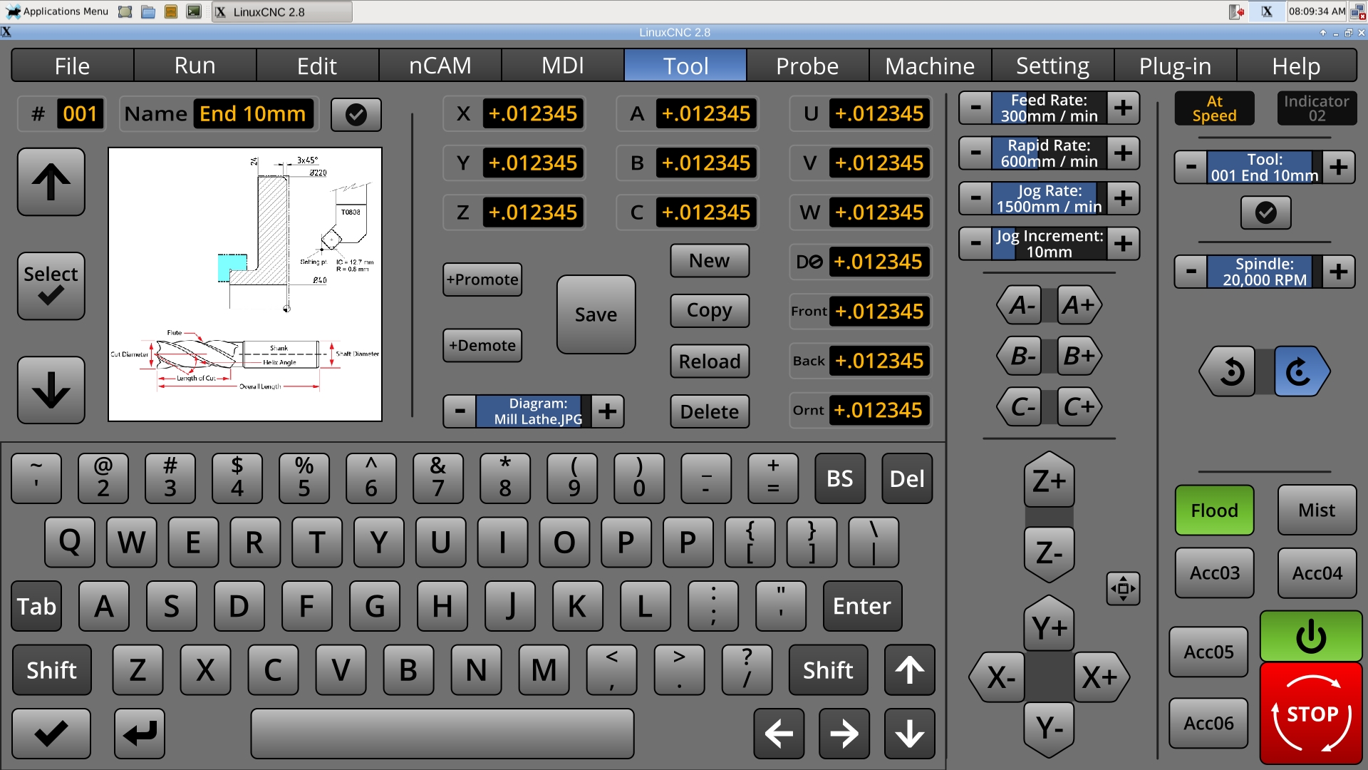
Currently, the diagrams are shown 384px square. Using 512s would take up too much room and memory. I don't think 256s will work well with line art. If I made them rectangle half-of the people wouldn't be happy; now everyone will be
The user can open up the Tool Menu, and select a tool. Perhaps this should dismiss the menu, and return the user to the last menu?
The user can also move the tool up or down the list by promoting/demoting.
The user can click on the check with the circle around it to make it the default tool. The default tool can be chosen on the matching default tool machine control button.
In some ways it is a compromise from Axis's list, but in order to do touchscreen, as part of a overall system, hopefully it is an acceptable compromise.
* Made keyboard smaller.
* Updated other keyboard-related layouts.
* Changed Text Legend Bezels, for better readability. I had been trying to come up with something like this, for weeks.
I think the keyboard background should be special, perhaps a bit lighter, or perhaps a concave-looking gradient can be used.
Please Log in or Create an account to join the conversation.
- grijalvap
-

- Offline
- Elite Member
-

- Posts: 199
- Thank you received: 63
Please Log in or Create an account to join the conversation.
- cmorley
- Away
- Moderator
-

- Posts: 7309
- Thank you received: 2139
I do like GTK+ because it adds consistency to many Linux distributions.
I wonder also if a meta button layout language like an .XML file could be used, as they are in Axis. In other words, I worry that if it's too hard for people to customize the interface, then this project might instead futher fragment LinuxCNC further instead of drawing it together.
I wonder if more than one person could help code this.
When You are talking of a program that usually takes over the whole screen - consistency with other computer program's look/control doesn't really matter.
If you target users are big OEM cnc users then consistency with big OEM controls would be useful.
If you target windows users then consistency with window ways of doing things might be important.
In general GTK and QT programs can be made to look very similar.
Maintainability is the most important after utility. This is where (for now at least) Qt has GTK beat hands down.
It's a double barrel problem right now as the transition from python (Currently the best language choice) version 2 to 3 is a big pain in the ass.
Axis actually is the hardest modern screen to modify - and it doesn't use XML at all - I believe you are referring to pyVCP, which is easily integrated into AXIS.
There is work being done on a Qt/ Python based VCP/screen system by Kurt and I.
It uses XML, It uses a drag-and-drop editor. It is easily extended with python.
We would love more people to hack on it.
Linuxcnc is working towards relatively easily modified screens.
pyVCP was a first start of simple control panels
gladeVCP was a great next step for sophisticated control panels
Gscreen was a first step toward completely customizable screens
Qtscreen/Qtvcp will hopefully be the next great step for customizable screens.
As Kurt mentioned, IMHO continue on your discovery of screen layout till you are quite happy.
Then maybe come try QTvcp to make your screen functional. - there is much docs and widgets that need to be made yet.
Chris M
Please Log in or Create an account to join the conversation.
- BrendaEM
- Offline
- Elite Member
-

- Posts: 266
- Thank you received: 120
Perhaps I shouldn't think outloud, but most of Blender3D is written in Python, and the root page of interface has more controls on it that this entire project. The menus attack from all sides. The tabs on the left are full of widgets. The menubar slides down to reveal more controls. Only one tab of the Object menu shows. You can't even see the animation timeline controls from here--or the game engine controls--or the procedural shader layout screen. (That's not to state that programming this project would be a trivial matter.)
I chose to emulate this style because it lends it self well to complexity. Look strangely familiar? : )
Please Log in or Create an account to join the conversation.
- persei8
-

- Offline
- Platinum Member
-

- Posts: 398
- Thank you received: 132
Please Log in or Create an account to join the conversation.
- KCJ
-

- Offline
- Platinum Member
-

- Posts: 328
- Thank you received: 267
The tool edit section looks very good. What about a little GL widget that plots the actual tool geometry instead of the image? The Romi EzPath control has this feature and I find it prevents a lot of tool data input errors from being missed ...
persei8, you can absolutely do that, and that is exactly how the PathPilot UI works! The problem is, short of changing the image for every event, you have no visual feedback from the UI when the button is pressed/hovered/focused/disabled etc. To provide this feedback the folks at tormach shift the image 1px down and to the left when the button is pressed. It works ok, but if you have ever used PathPilot you will probably have noticed that some of the buttons are like sticky piano keys - they don't let up when you let go. This is because the images are moved back to the original position AFTER the callback has returned. I found a way to get around that, its been a while but it might have been as simple as using "connect_after" instead of "connect" when connecting the callback.
Another disadvantage of using images is that they will never look as crisp as if it were directly painted.
Cheers,
Kurt
Please Log in or Create an account to join the conversation.
- BrendaEM
- Offline
- Elite Member
-

- Posts: 266
- Thank you received: 120
As a designer note: outputting so may graphics in multiple resolutions will be a chore, outputting several waves of conflicting version would be a nightmare.
I've made hundreds of textures before; this isn't my first rodeo.
Not counting the alternate panels that are done, as I look across the menu 7:11 of the menus are done, and the Help will just be a document.
Don't worry it will be done soon. I am losing my place to live, and I will be homeless soon. Everything's gonna be exported and uploaded by then.
What is to be done about github; they are owned by Microsoft now, the company 2nd only to Oracle for their desire to kill open source everything.
...i did make a whole new menu today. : )
Please Log in or Create an account to join the conversation.
- KCJ
-

- Offline
- Platinum Member
-

- Posts: 328
- Thank you received: 267
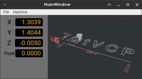
I could not help but try styling your new DROs before going to bed (though it might not be worth it, its almost 1am and I have to take delivery of a shipment at 3:30, darned truck drivers
Please Log in or Create an account to join the conversation.


