A Widescreen Blender-Style Interface
- BrendaEM
- Offline
- Elite Member
-

Less
More
- Posts: 266
- Thank you received: 120
04 Jul 2018 03:33 - 04 Jul 2018 03:39 #113374
by BrendaEM
Replied by BrendaEM on topic A Widescreen Blender-Style Interface
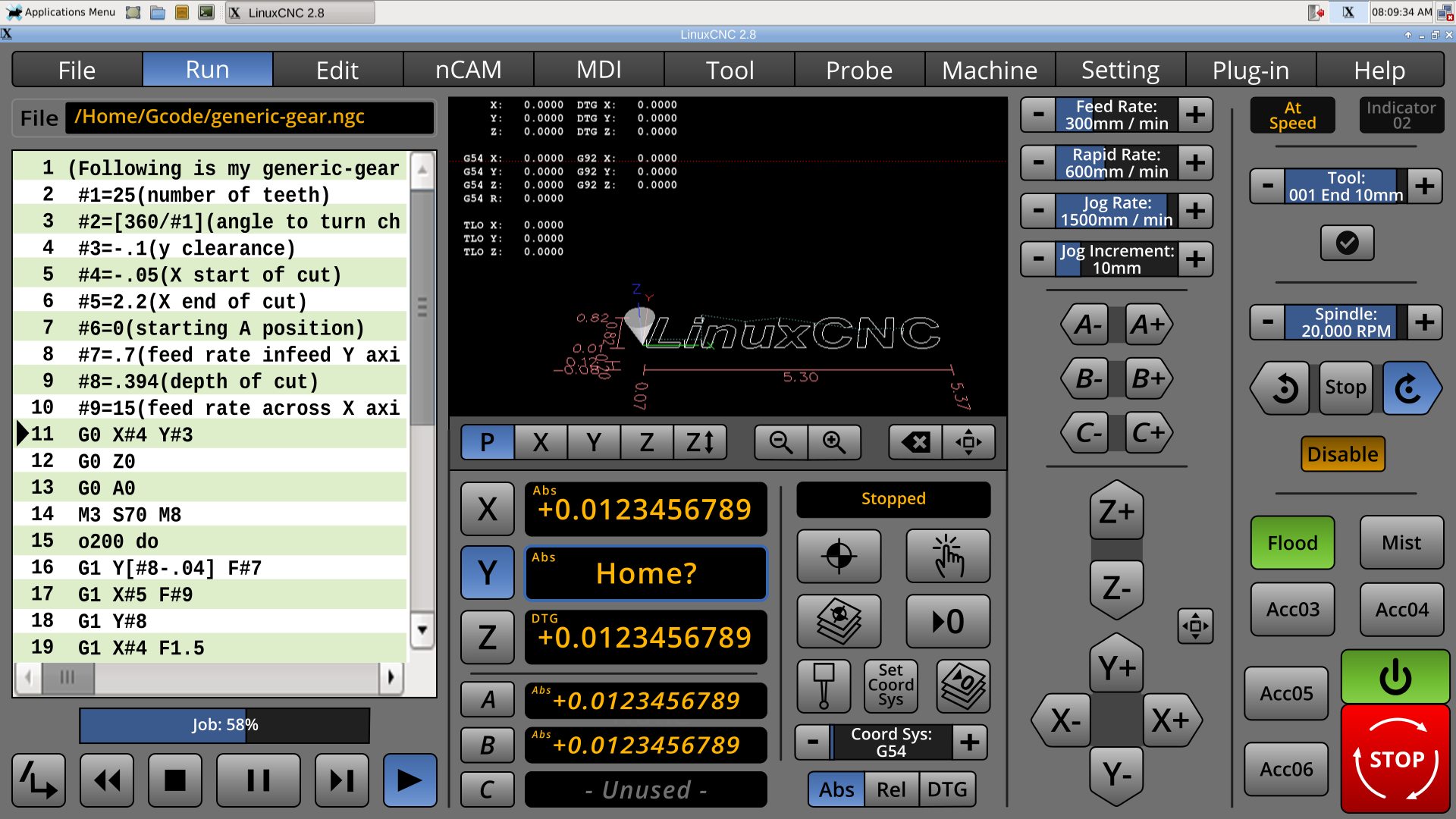
Only want one "P" ?
You people are so demanding : )
I fixed it, though I'll I won't update the screenshot. Let's see in anyone else notices. : )
You people are so demanding : )
I fixed it, though I'll I won't update the screenshot. Let's see in anyone else notices. : )
Last edit: 04 Jul 2018 03:39 by BrendaEM.
Please Log in or Create an account to join the conversation.
- BrendaEM
- Offline
- Elite Member
-

Less
More
- Posts: 266
- Thank you received: 120
04 Jul 2018 06:00 - 04 Jul 2018 17:26 #113387
by BrendaEM
Replied by BrendaEM on topic A Widescreen Blender-Style Interface
* Added Spindle Stop Buttons to Mill and Lathe Controls.
* Added Run Gcode Progress Indicator. In the first release, this would likely only show the line proportion. It may not be accurate, but it's better than guesstimating vertical code scroll/elevator box. Perhaps in later version an ETA can be calculated before the Gcode is ran, with a precalculated time value for each line. I tried gold color for this because it is an data output, but it was bad. I would like this to have rounded corners, but that might make programming much harder.
* Added Spindle Disable button. I would have liked it today. The idea is, you can touch off away from the part, and have the Gcode runner go through the motions to make sure nothing is really weird. I colored it orange, so it might be noticed. I don't want to introduce a safety problem by adding a safety feature. I am sure the same thing can be done by editing the gcode, but why?
* Updated Filename legend to the new bezel. Must have missed that one.
* Showing the Screen Small panel as darker, like all the other panels.
Last edit: 04 Jul 2018 17:26 by BrendaEM.
The following user(s) said Thank You: Lcvette
Please Log in or Create an account to join the conversation.
- Lcvette
-

- Offline
- Platinum Member
-

Less
More
- Posts: 1607
- Thank you received: 749
06 Jul 2018 00:14 #113524
by Lcvette
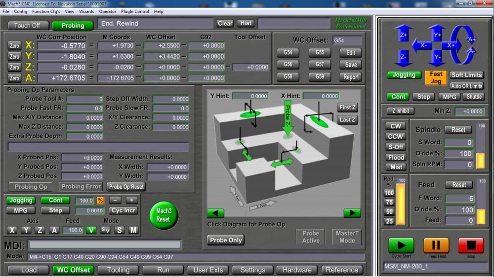
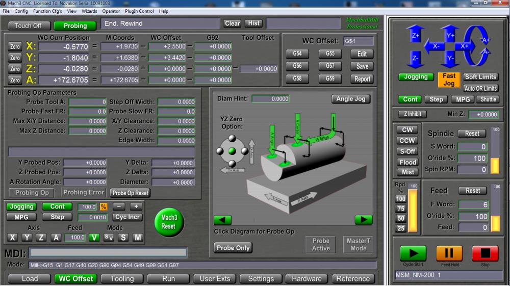
for the probe screens, I know you are basing probing on the existing probe routines from download currently available, is it or would it be possible to allow for the probe screen to have multiple in screen view ports for different probe routine graphics? this may be a great way to offer more probing functionality without having to scrunch everything into too small of a space. what is there is a great basic package, but there are alot more probing opportunities i think that could, can,should be added in the future and this would give room for growth in that regard without having to redevelop the whole screen set down the line.
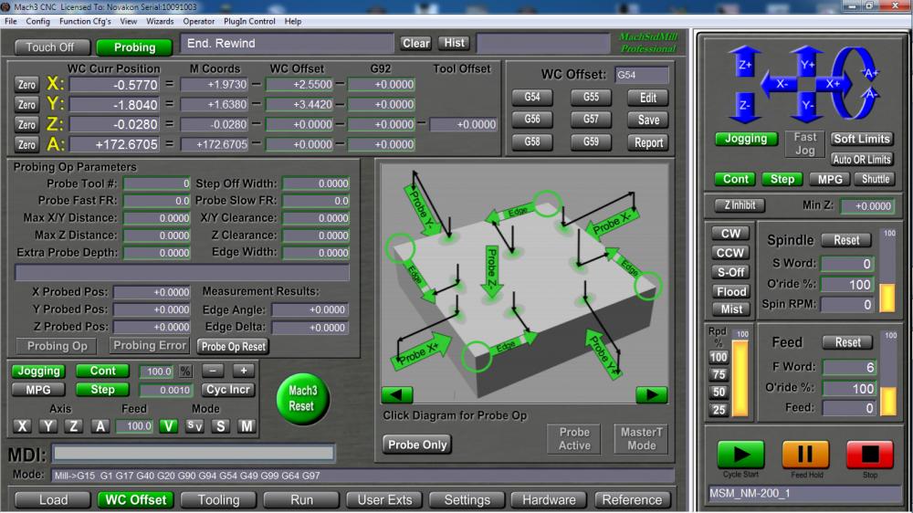
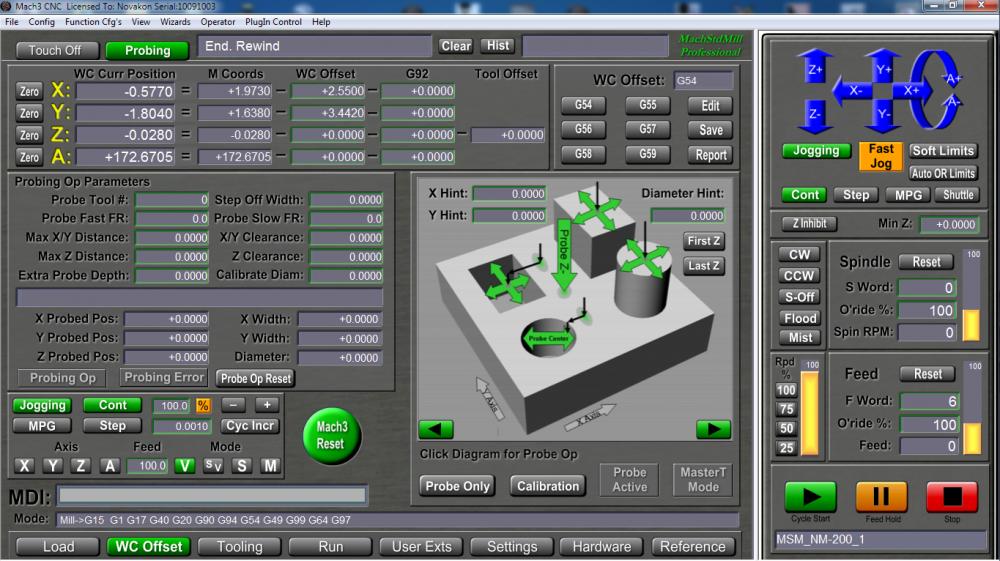
Please understand i'm not a programmer and I am in no way belittling what is already being accomplished here as it is simply fantastic and beautiful and already better than what is available at the moment that I have looked at in the sims. I am just coming from MachSTDMill which has a viewport method such as this and it really adds some powerful expansion to the probing screen without having to go to a different screen or change the existing peripheral buttons associated for a probe screen/workoffset page etc. it is a really good concept that may be an idea that had not been considered? here is a visual showing the viewport changes with the main probe screen remaining the same. not sure if this is possible or not, but if it is it would really open up some possibilities I think to offer more functionality in less space on one page?
Thoughts?
Replied by Lcvette on topic A Widescreen Blender-Style Interface
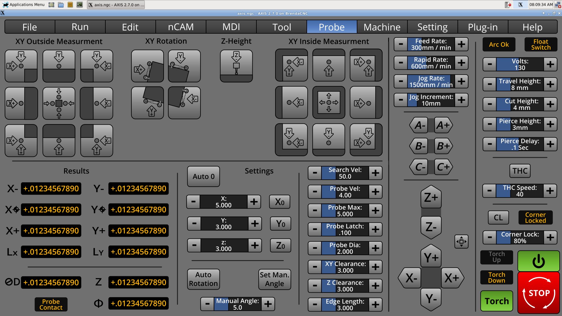
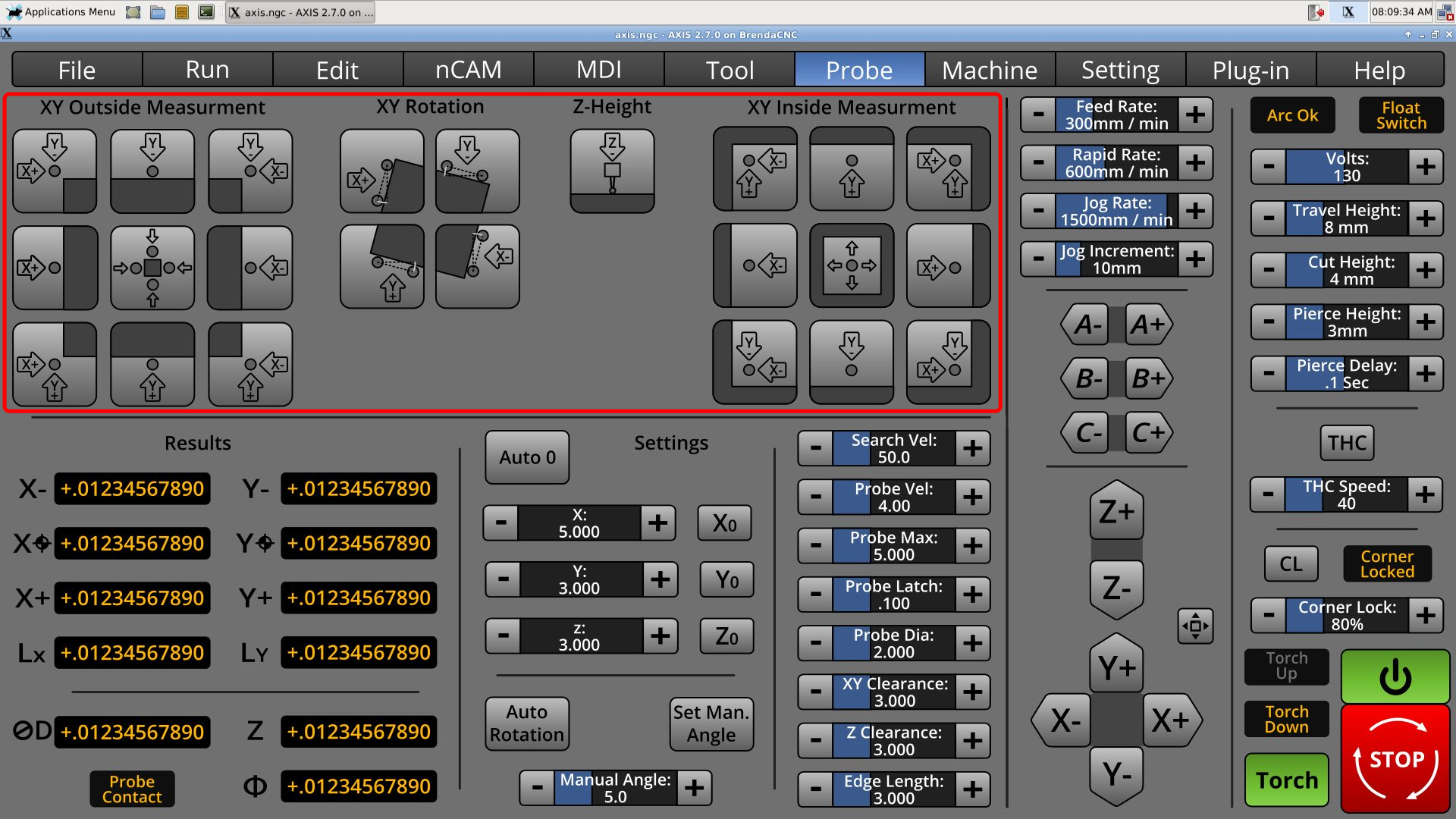
I've had a pretty bad cold, but the probe screen is still progressing. Layout-wise Verser's probe screen was good, but the controls need to fit into 2/3 of the screen, and work for touch.
* The probe symbol is changed mostly to top-downs. My other ones were from the side, but that was confusing once Z axis came into play.
* The arrows and axis letters are integrated to give a good sense of direction.
I don't like cramming all eight settings together like that, but there is not enough width to make another column.
for the probe screens, I know you are basing probing on the existing probe routines from download currently available, is it or would it be possible to allow for the probe screen to have multiple in screen view ports for different probe routine graphics? this may be a great way to offer more probing functionality without having to scrunch everything into too small of a space. what is there is a great basic package, but there are alot more probing opportunities i think that could, can,should be added in the future and this would give room for growth in that regard without having to redevelop the whole screen set down the line.
Please understand i'm not a programmer and I am in no way belittling what is already being accomplished here as it is simply fantastic and beautiful and already better than what is available at the moment that I have looked at in the sims. I am just coming from MachSTDMill which has a viewport method such as this and it really adds some powerful expansion to the probing screen without having to go to a different screen or change the existing peripheral buttons associated for a probe screen/workoffset page etc. it is a really good concept that may be an idea that had not been considered? here is a visual showing the viewport changes with the main probe screen remaining the same. not sure if this is possible or not, but if it is it would really open up some possibilities I think to offer more functionality in less space on one page?
Thoughts?
The following user(s) said Thank You: KCJ
Please Log in or Create an account to join the conversation.
- KCJ
-

- Offline
- Platinum Member
-

Less
More
- Posts: 328
- Thank you received: 267
06 Jul 2018 00:41 #113525
by KCJ
Replied by KCJ on topic A Widescreen Blender-Style Interface
Chris, from a programing point of view that is absolutely possible. We'll have to see what Brenda thinks, but it might be possible to simply add a tabbed multi page widget where the red box is:
I really like the Renishaw probe screen (see post #113171 ) , maybe something like that might could be an option too ...
Cheers,
Kurt
I really like the Renishaw probe screen (see post #113171 ) , maybe something like that might could be an option too ...
Cheers,
Kurt
The following user(s) said Thank You: Lcvette
Please Log in or Create an account to join the conversation.
- Lcvette
-

- Offline
- Platinum Member
-

Less
More
- Posts: 1607
- Thank you received: 749
06 Jul 2018 01:07 - 06 Jul 2018 01:11 #113527
by Lcvette
That would be awesome! yeah I like the visual representation of the MSM and Renishaw probing graphics personally better than the 2D graphics in the current design, I think it's a bit more intuitive to have a graphical representation showing the probe movements and starting position for easy reference. But that is just my personal perspective. I know it was very used friendly when I first started probing and even now it's helpful so I don't goof when setting up initial probe positions.
I'd be happy to do some graphics in solidworks if it's helpful? Beyond that I'm not sure what I could offer to the effort to help unfortunately...
If there is anything let me know I'm willing to try!
Chris
Replied by Lcvette on topic A Widescreen Blender-Style Interface
Chris, from a programing point of view that is absolutely possible. We'll have to see what Brenda thinks, but it might be possible to simply add a tabbed multi page widget where the red box is:
I really like the Renishaw probe screen (see post #113171 ) , maybe something like that might could be an option too ...
Cheers,
Kurt
That would be awesome! yeah I like the visual representation of the MSM and Renishaw probing graphics personally better than the 2D graphics in the current design, I think it's a bit more intuitive to have a graphical representation showing the probe movements and starting position for easy reference. But that is just my personal perspective. I know it was very used friendly when I first started probing and even now it's helpful so I don't goof when setting up initial probe positions.
I'd be happy to do some graphics in solidworks if it's helpful? Beyond that I'm not sure what I could offer to the effort to help unfortunately...
If there is anything let me know I'm willing to try!
Chris
Last edit: 06 Jul 2018 01:11 by Lcvette.
The following user(s) said Thank You: KCJ
Please Log in or Create an account to join the conversation.
- BrendaEM
- Offline
- Elite Member
-

Less
More
- Posts: 266
- Thank you received: 120
06 Jul 2018 02:20 - 06 Jul 2018 02:24 #113528
by BrendaEM
Replied by BrendaEM on topic A Widescreen Blender-Style Interface
Hi,
Needless to state, I cannot copy an anything from a commercial interface because that would place not only myself but LinuxCNC at legal peril.
Anyway, In looking at the layout, the adaption of the current probe screen has less functionality, but less complexity, than the posted screenshots, though I wonder if for some of the more descriptive information a help page (which I haven't drawn up) could be brought up.
Programming a first-gen effort for a new interface will place a great demand on the programmers. I worry that if the bar is too high, it may not be reached.
In the case of the Probe screen, I feel that I can get a sense of what the controls are for, and the settings shouldn't have to be changed all that much. Though I am talking rot because I haven't made a probe yet.
By design, the interface design is contextual, in that the Probe menu item tells you that you are dealing with a probe, if we add another layer then there is no context and no breadcrumbs.
As far as drawings, at this point I would want to put more emphasis on the Tool menu, as the lathe people were asking for it, and I can see how that measurements on on carbide cutters and asymmetrical tool holders could be a challenge to describe.
If we want to support a touch interface, the buttons can't be that small. Someone has already raised a concern. I've read guides. I've also used Gmoccapy as an example of a great working definitely bring LinuxCNC forward.
A possible solution is consider modifying the Probe menu interface to expand it occupy the Jog panel as well, then there would be enough room for helping graphics... ...if our programmers can handle the additional burden.
Note: that's an older Probe menu.
Lcvette, you seem apologetic about only having a $7000 CAD problem : )
Last edit: 06 Jul 2018 02:24 by BrendaEM.
The following user(s) said Thank You: KCJ
Please Log in or Create an account to join the conversation.
- BrendaEM
- Offline
- Elite Member
-

Less
More
- Posts: 266
- Thank you received: 120
06 Jul 2018 02:27 - 06 Jul 2018 02:27 #113529
by BrendaEM
Replied by BrendaEM on topic A Widescreen Blender-Style Interface
Also note. While I am not always the most diplomatic person, and my message is not always positive, I am having a difficult time here on the forums. : (
Last edit: 06 Jul 2018 02:27 by BrendaEM.
Please Log in or Create an account to join the conversation.
- Lcvette
-

- Offline
- Platinum Member
-

Less
More
- Posts: 1607
- Thank you received: 749
06 Jul 2018 03:03 #113531
by Lcvette
I have access to it and happy to use it to make graphics, I have several tool holders made up already so that's pretty easy, not sure what format is best? Let me know and I can send some examples. I can also send a nice ATC platter and BT30 type holders if you need some of those for an ATC page
As for the probe graphics, block representation are fairly generic I would think. As for the viewport idea, the probe options down there are bare minimum in the probing world. I would suspect that the ability to add probe functionality and growth would be very desirable. If what KCJ says is true and the option to add a scroll through viewport option is possible fairly easily, is a great way to increase the room for various types of probing and make buttons bigger and easier to touch for touch screens. This would be because you'd group them together in more complimentary clusters.
- Rectangular pockets, rectangular bosses
- Circular pockets, Round bosses
- Corners, Alignment
- rotary axis probing
- 5axis probing
- digitizing etc
- custom probe configs and macros etc
I think it gives the interface expandability on the probing page. I understand this is your baby, I'm just relaying some experience that has been very useful personally in other controls that I think may really benefit this design layout while your at these stages. I certainly understand not wanting to overcomplicate the first draft. But thought along the question couldn't hurt.
Chris
Replied by Lcvette on topic A Widescreen Blender-Style Interface
Hi,
Needless to state, I cannot copy an anything from a commercial interface because that would place not only myself but LinuxCNC at legal peril.
Anyway, In looking at the layout, the adaption of the current probe screen has less functionality, but less complexity, than the posted screenshots, though I wonder if for some of the more descriptive information a help page (which I haven't drawn up) could be brought up.
Programming a first-gen effort for a new interface will place a great demand on the programmers. I worry that if the bar is too high, it may not be reached.
In the case of the Probe screen, I feel that I can get a sense of what the controls are for, and the settings shouldn't have to be changed all that much. Though I am talking rot because I haven't made a probe yet.
By design, the interface design is contextual, in that the Probe menu item tells you that you are dealing with a probe, if we add another layer then there is no context and no breadcrumbs.
As far as drawings, at this point I would want to put more emphasis on the Tool menu, as the lathe people were asking for it, and I can see how that measurements on on carbide cutters and asymmetrical tool holders could be a challenge to describe.
If we want to support a touch interface, the buttons can't be that small. Someone has already raised a concern. I've read guides. I've also used Gmoccapy as an example of a great working definitely bring LinuxCNC forward.
A possible solution is consider modifying the Probe menu interface to expand it occupy the Jog panel as well, then there would be enough room for helping graphics... ...if our programmers can handle the additional burden.
Note: that's an older Probe menu.
O
Lcvette, you seem apologetic about only having a $7000 CAD problem : )
I have access to it and happy to use it to make graphics, I have several tool holders made up already so that's pretty easy, not sure what format is best? Let me know and I can send some examples. I can also send a nice ATC platter and BT30 type holders if you need some of those for an ATC page
As for the probe graphics, block representation are fairly generic I would think. As for the viewport idea, the probe options down there are bare minimum in the probing world. I would suspect that the ability to add probe functionality and growth would be very desirable. If what KCJ says is true and the option to add a scroll through viewport option is possible fairly easily, is a great way to increase the room for various types of probing and make buttons bigger and easier to touch for touch screens. This would be because you'd group them together in more complimentary clusters.
- Rectangular pockets, rectangular bosses
- Circular pockets, Round bosses
- Corners, Alignment
- rotary axis probing
- 5axis probing
- digitizing etc
- custom probe configs and macros etc
I think it gives the interface expandability on the probing page. I understand this is your baby, I'm just relaying some experience that has been very useful personally in other controls that I think may really benefit this design layout while your at these stages. I certainly understand not wanting to overcomplicate the first draft. But thought along the question couldn't hurt.
Chris
The following user(s) said Thank You: KCJ
Please Log in or Create an account to join the conversation.
- Lcvette
-

- Offline
- Platinum Member
-

Less
More
- Posts: 1607
- Thank you received: 749
06 Jul 2018 03:17 #113532
by Lcvette
Replied by Lcvette on topic A Widescreen Blender-Style Interface
As a side note as someone who probes daily for work setup, often times when flipping a part you lose reference features or are left with features that are difficult to probe using standard routines for Corners etc and must get creative to locate your zero point. Sometimes using more than one routine, possibly a web routine to find a center in one axis and an edge in another, or an angle on two sides of the perimeter to locate a convergence point that's not a perfect square corner etc.. so often times if probing is to be your only form of work coordinate offset setting, you really want some control over how you can use it. Just a thought if you are not currently an avid probe user.
The following user(s) said Thank You: KCJ
Please Log in or Create an account to join the conversation.
- BrendaEM
- Offline
- Elite Member
-

Less
More
- Posts: 266
- Thank you received: 120
06 Jul 2018 04:22 #113533
by BrendaEM
Replied by BrendaEM on topic A Widescreen Blender-Style Interface
I appreciate the respect offered by calling this interface design my baby, though when done, it is my proposal, and my attempt to return something to the LinuxCNC community.
For now, I only plot the course of the compromises : )
The cool thing about the existing Probe screen: the code is out there. Some Probe settings can live in the .ini or perhaps the setting screen.
I will revisit the Probe screen next, and let's see what can be done without going to additional sheets/panels/menus. Let's see if one picture is worth a thousand words.
There are spots left for a few more buttons as well.
The following user(s) said Thank You: grijalvap
Please Log in or Create an account to join the conversation.
Time to create page: 0.326 seconds
