A Widescreen Blender-Style Interface
- BrendaEM
- Offline
- Elite Member
-

Less
More
- Posts: 266
- Thank you received: 120
03 Jul 2018 05:10 - 03 Jul 2018 12:48 #113295
by BrendaEM
Replied by BrendaEM on topic A Widescreen Blender-Style Interface
Wow, you got out those indicators even before the paint was dry on the Inkscape file!
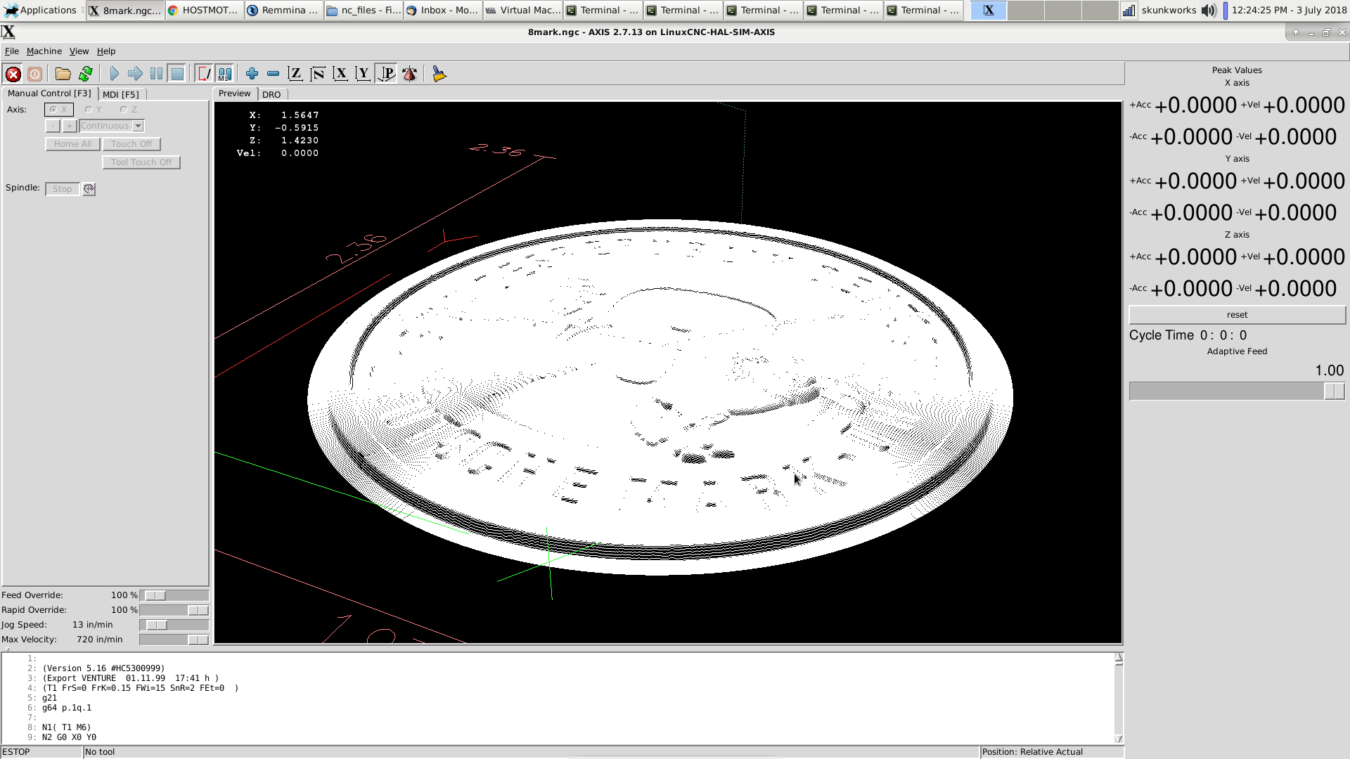
Oh, I wish something could be done to antialias the 3D preview. : )
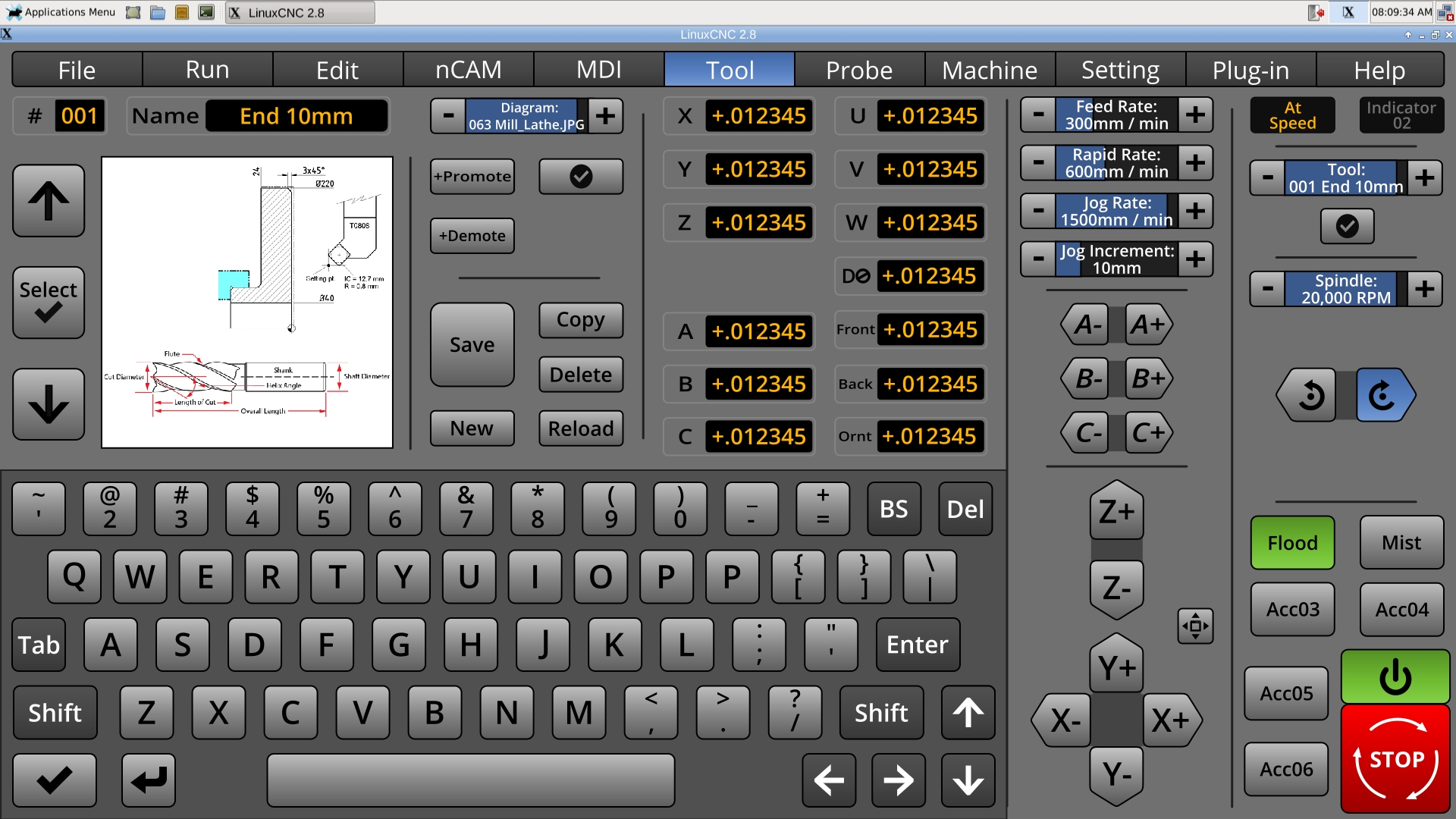
With the bitmaps, I worry about memory. With plots and vectors, I worry about speed, and who's going to be able to draw a milling bit in vector.
Even if the pics were in vector, they could be sped up by creating bitmaps, so I wonder if bitmaps are the way to go.
I can just see people, taking cellphone pics of their bits, their cutting bits, and napkin sketches of their tools. I like accessible and modifiable over sophisticated.
I am going to have to drop the incremental indicator text size a bit to allow 8 characters for a tool name. They have a three digit number. If anyone has more than 999 toolbits, do complain, but first, send me some.
The promote/demote buttons need to live on the left, where they were in the beginning.
Last edit: 03 Jul 2018 12:48 by BrendaEM.
Please Log in or Create an account to join the conversation.
- tommylight
-

- Away
- Moderator
-

Less
More
- Posts: 21499
- Thank you received: 7329
03 Jul 2018 16:22 #113334
by tommylight
Replied by tommylight on topic A Widescreen Blender-Style Interface
Not true for Oracle, they own MySQL and it is still free and they made some nice improvements to it.What is to be done about github; they are owned by Microsoft now, the company 2nd only to Oracle for their desire to kill open source everything.
Please Log in or Create an account to join the conversation.
- BrendaEM
- Offline
- Elite Member
-

Less
More
- Posts: 266
- Thank you received: 120
03 Jul 2018 16:59 - 03 Jul 2018 17:10 #113335
by BrendaEM
Replied by BrendaEM on topic A Widescreen Blender-Style Interface
Um, OpenOffice, the big LibreOffice spit, and there's the whole I'll sue anyone who uses Java thing.
From Wikipedia:
"The petition of 50,000+ developers and users called upon the European Commission to block approval of the acquisition. "
...But, as revealed by WikiLeaks, the US Department of Justice, at the request of Oracle, pressured the EU to approve the merger unconditionally.[73] The European Commission eventually unconditionally approved Oracle's acquisition of MySQL on 21 January 2010."
en.wikipedia.org/wiki/MySQL#Legal_disputes_and_acquisitions
I've had friend who work for Oracle. I used to stay at a company house right next to Oracle Belmont. Still, in my opinion Oracle is not to be trusted.
Last edit: 03 Jul 2018 17:10 by BrendaEM.
Please Log in or Create an account to join the conversation.
- skunkworks
- Offline
- Moderator
-

Less
More
- Posts: 349
- Thank you received: 152
03 Jul 2018 17:27 #113336
by skunkworks
Replied by skunkworks on topic A Widescreen Blender-Style Interface
The following user(s) said Thank You: KCJ, BrendaEM
Please Log in or Create an account to join the conversation.
- KCJ
-

- Offline
- Platinum Member
-

Less
More
- Posts: 328
- Thank you received: 267
03 Jul 2018 18:31 - 03 Jul 2018 19:46 #113339
by KCJ
Replied by KCJ on topic A Widescreen Blender-Style Interface
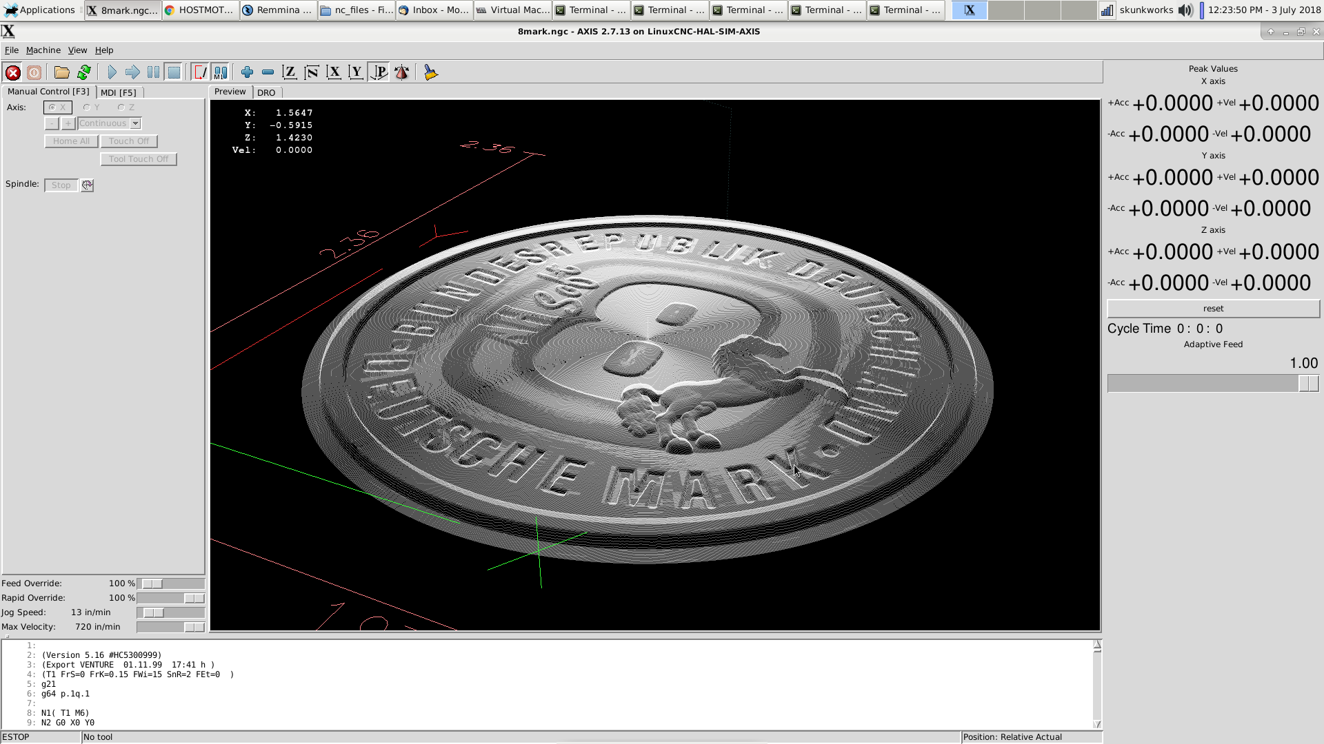
skunkworks alpha blend simply adds some transparency to the backploted paths, literally all it does is take the RGB color and append an alpha channel to it. It is amazing how much better it makes the backplot look, especially for programs with a lot of paths like your example. I don't know why it is not the default display mode, probably some historical reason...
I've been looking into enabling anti-aliasing, it appears that the QGLWidget that Chris is using for the QtVCP backplot supports it, but I can't figure out how to enable it successfully. So far I've just got the backplot to look like TV static, but that is kinda the opposite of what I am trying to achieve.
Cheers,
Kurt
Last edit: 03 Jul 2018 19:46 by KCJ.
Please Log in or Create an account to join the conversation.
- BrendaEM
- Offline
- Elite Member
-

Less
More
- Posts: 266
- Thank you received: 120
03 Jul 2018 19:52 #113344
by BrendaEM
Replied by BrendaEM on topic A Widescreen Blender-Style Interface
Many systems woudn't have the horsepower to do this, but the window could be rendered and resampled bicubic. This is what nVidia DSR Factors does.
Please Log in or Create an account to join the conversation.
- BrendaEM
- Offline
- Elite Member
-

Less
More
- Posts: 266
- Thank you received: 120
03 Jul 2018 20:09 #113345
by BrendaEM
Replied by BrendaEM on topic A Widescreen Blender-Style Interface
Please Log in or Create an account to join the conversation.
- BrendaEM
- Offline
- Elite Member
-

Less
More
- Posts: 266
- Thank you received: 120
03 Jul 2018 21:33 - 03 Jul 2018 21:33 #113349
by BrendaEM
Replied by BrendaEM on topic A Widescreen Blender-Style Interface
Last edit: 03 Jul 2018 21:33 by BrendaEM.
Please Log in or Create an account to join the conversation.
- persei8
-

- Offline
- Platinum Member
-

Less
More
- Posts: 398
- Thank you received: 132
04 Jul 2018 03:24 #113371
by persei8
Replied by persei8 on topic A Widescreen Blender-Style Interface
Your keyboard has 2 P's. 
The following user(s) said Thank You: BrendaEM
Please Log in or Create an account to join the conversation.
- rodw
-

- Offline
- Platinum Member
-

Less
More
- Posts: 11857
- Thank you received: 4020
04 Jul 2018 03:28 #113373
by rodw
Replied by rodw on topic A Widescreen Blender-Style Interface
Thats the nuke button or is it Puke???Your keyboard has 2 P's.
The following user(s) said Thank You: BrendaEM
Please Log in or Create an account to join the conversation.
Time to create page: 0.357 seconds
