A Widescreen Blender-Style Interface
- KCJ
-

- Offline
- Platinum Member
-

Less
More
- Posts: 328
- Thank you received: 267
07 Jul 2018 03:21 - 07 Jul 2018 03:23 #113628
by KCJ
Replied by KCJ on topic A Widescreen Blender-Style Interface
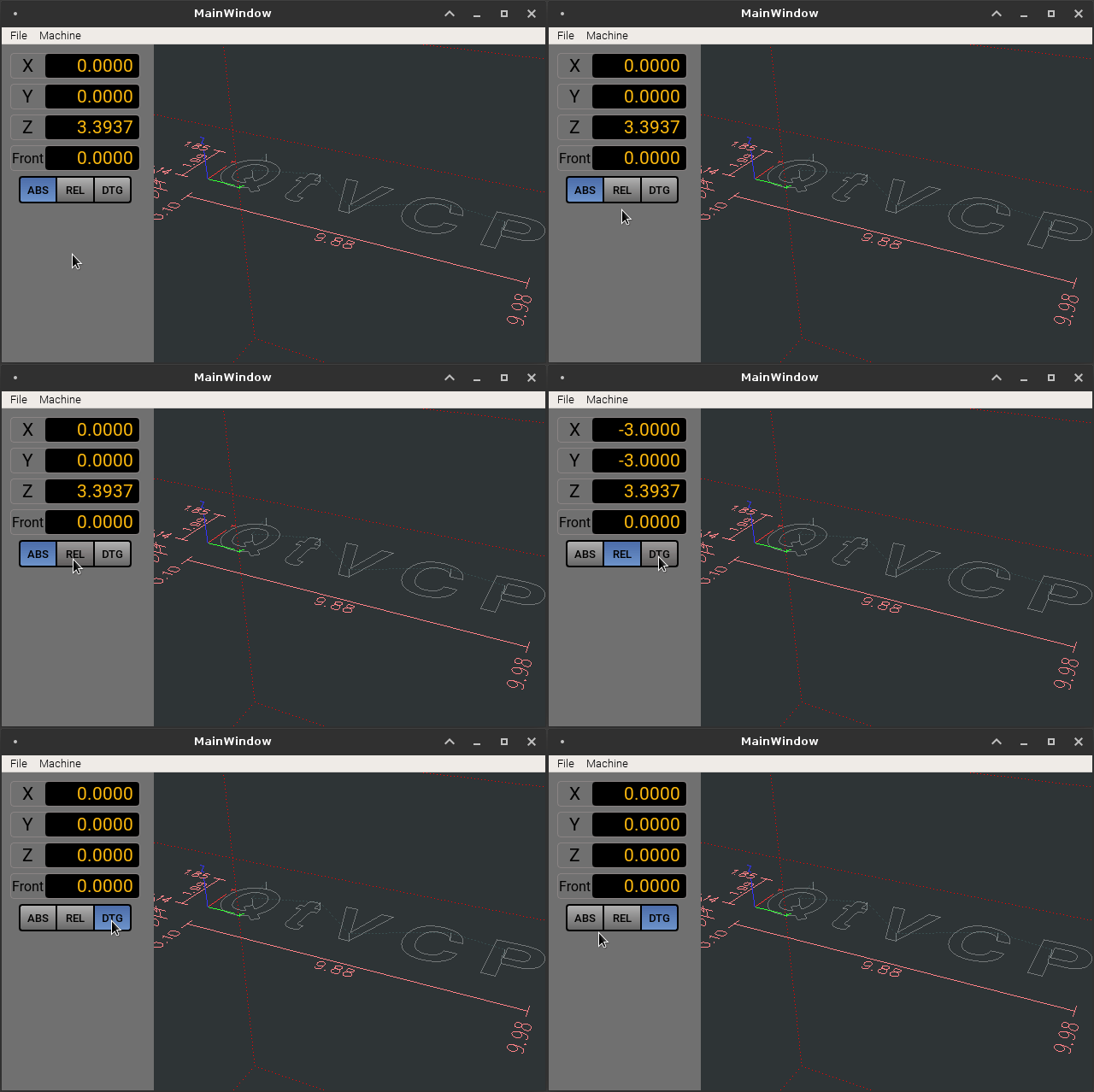
Some QSS style sheet and Qt dynamic property shenanigans and I was able to get something that resembles the radio button bars. This was one thing I thought might be a bit of a challenge to get looking and working right, as Qt does did not have a button bar widget.
EDIT: Brenda, have you thought any about what disabled (grayed out) button states should look like?
Cheers,
Kurt
EDIT: Brenda, have you thought any about what disabled (grayed out) button states should look like?
Cheers,
Kurt
Last edit: 07 Jul 2018 03:23 by KCJ.
The following user(s) said Thank You: tommylight, rodw, Lcvette, BrendaEM
Please Log in or Create an account to join the conversation.
- Lcvette
-

- Offline
- Platinum Member
-

Less
More
- Posts: 1617
- Thank you received: 753
07 Jul 2018 03:31 #113630
by Lcvette
Replied by Lcvette on topic A Widescreen Blender-Style Interface
Looks awesome KCJ!
The following user(s) said Thank You: KCJ
Please Log in or Create an account to join the conversation.
- BrendaEM
- Offline
- Elite Member
-

Less
More
- Posts: 266
- Thank you received: 120
07 Jul 2018 03:45 - 07 Jul 2018 04:59 #113631
by BrendaEM
Replied by BrendaEM on topic A Widescreen Blender-Style Interface
It's pretty cool to see this stuff working, KCJ! It looks fine to me. I thought everything would have a RadioButton Widget. I like grey text, for greyed out stuff.
I had little text indicators for the modes, as a safety thing. It's redundant, but I when the user's eyes are trained on the the display, it would be good to remind them what they are doing. I would like to include all the DRO readouts, but three for each axis would make them too small, perhaps. I like the biggest Axis buttons possible because they need to be clicked to perform other functions, such as home and zero.
Is that OpenSans Semi-Bold? Do you have/want the fonts? When in doubt everything is OpenSans Semi-Bold, except for the OpenSans Semi-Bold Italic used for A,B,C
Last edit: 07 Jul 2018 04:59 by BrendaEM.
The following user(s) said Thank You: Lcvette
Please Log in or Create an account to join the conversation.
- BrendaEM
- Offline
- Elite Member
-

Less
More
- Posts: 266
- Thank you received: 120
07 Jul 2018 06:12 - 07 Jul 2018 06:14 #113636
by BrendaEM
Replied by BrendaEM on topic A Widescreen Blender-Style Interface
Last edit: 07 Jul 2018 06:14 by BrendaEM.
The following user(s) said Thank You: Lcvette
Please Log in or Create an account to join the conversation.
- KCJ
-

- Offline
- Platinum Member
-

Less
More
- Posts: 328
- Thank you received: 267
07 Jul 2018 06:21 #113637
by KCJ
Replied by KCJ on topic A Widescreen Blender-Style Interface
Right now I have the border gray out a bit too for disabled widgets, probably a little premature for me to be worrying about getting these details right though 
The font I am using is Roboto normal, as that is what have installed from doing some web work. Believe it or not, I don't think OpenSans comes on Debian (neither does Roboto), but that no big deal, fonts are easy to install. I think OpenSans is a good choice.
Cheers,
Kurt
The font I am using is Roboto normal, as that is what have installed from doing some web work. Believe it or not, I don't think OpenSans comes on Debian (neither does Roboto), but that no big deal, fonts are easy to install. I think OpenSans is a good choice.
Cheers,
Kurt
The following user(s) said Thank You: Lcvette, BrendaEM
Please Log in or Create an account to join the conversation.
- Lcvette
-

- Offline
- Platinum Member
-

Less
More
- Posts: 1617
- Thank you received: 753
07 Jul 2018 06:37 #113639
by Lcvette
Not sure why the graphics of tooling is on the probe page?
As for probing, one more button is many buttons short..lol. Sure you won't reconsider the scrolling viewport for the probe button window like KCJ posted an example of? It sure would open things up.
Replied by Lcvette on topic A Widescreen Blender-Style Interface
I tried reworking the menu to include a graphic or graphics. We can add more setting controls now, but I wish I could get more room for probe buttons. Adding any more than one, will be an issue. Perhaps it will all make sense in the morning.
What other probing routines should be there?
Not sure why the graphics of tooling is on the probe page?
As for probing, one more button is many buttons short..lol. Sure you won't reconsider the scrolling viewport for the probe button window like KCJ posted an example of? It sure would open things up.
Please Log in or Create an account to join the conversation.
- Lcvette
-

- Offline
- Platinum Member
-

Less
More
- Posts: 1617
- Thank you received: 753
07 Jul 2018 06:53 #113640
by Lcvette
Replied by Lcvette on topic A Widescreen Blender-Style Interface
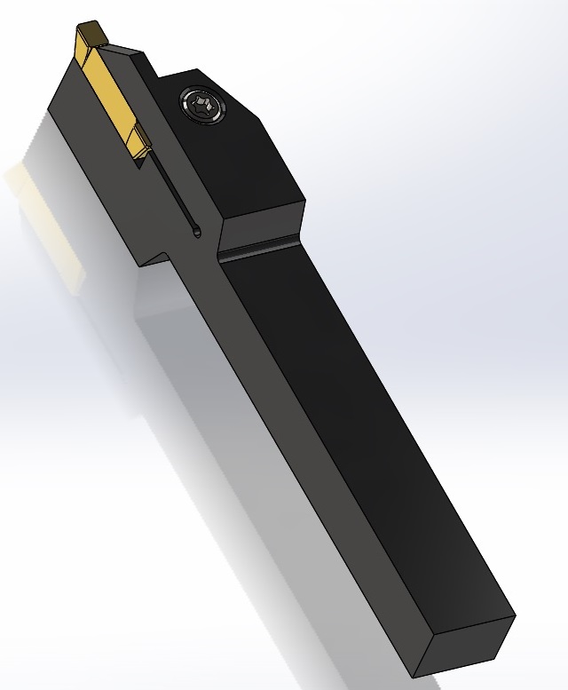
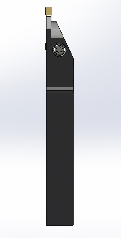
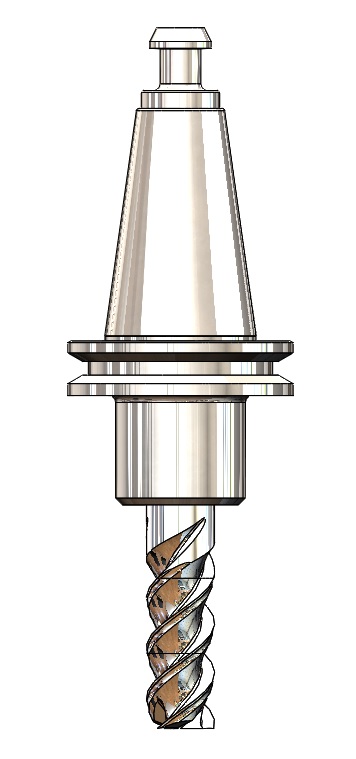
I had mentioned I could supply some graphics for tooling if you desired, here are some jpegs if you are interested, I am not very graphics savvy for software programming building and not sure what formats are best suited but if you would like more I have a library I built for my CAM software for true simulation with most of the lathe insert holders one would expect to use. I am happy to supply them.
Just let me know!
Chris
Just let me know!
Chris
The following user(s) said Thank You: KCJ, BrendaEM
Please Log in or Create an account to join the conversation.
- Lcvette
-

- Offline
- Platinum Member
-

Less
More
- Posts: 1617
- Thank you received: 753
07 Jul 2018 07:14 #113641
by Lcvette
Replied by Lcvette on topic A Widescreen Blender-Style Interface
The following user(s) said Thank You: KCJ
Please Log in or Create an account to join the conversation.
- BrendaEM
- Offline
- Elite Member
-

Less
More
- Posts: 266
- Thank you received: 120
07 Jul 2018 07:30 #113643
by BrendaEM
Replied by BrendaEM on topic A Widescreen Blender-Style Interface
Lcvette, that looks good! The lathe people might be happy, yet : )
If we could have 3-views like that with measurement indicators that match the tool table, which I think* wonder* perhaps* are x,y,z,a,b,c....it would be good for the lathe tool menu. The reflection may cost clarity with the moderate 348px resolution of the menu picture.
If the tools are made as generic as possible it will prevent people from adding tools that have only slightest variation until the program crashes.
Currently with a 1920x1080 interface, the tool picture is 384px square, though for the future it should be outputted larger and then we can resample them smaller. Somewhere down the road, this could be 4k interface.
*Having a lathe person who understands which dimensions are important is a valuable asset, such as yourself.
Please Log in or Create an account to join the conversation.
- Lcvette
-

- Offline
- Platinum Member
-

Less
More
- Posts: 1617
- Thank you received: 753
07 Jul 2018 07:37 #113644
by Lcvette
Replied by Lcvette on topic A Widescreen Blender-Style Interface
I can use a plain white background for the image. I'm not sure about the other stuff you said about 348px etc. Sorry, I just did a screen print and posted in Microsoft paint an me saved as a JPEG. I will send over the views , if you can sketch what you want on them right I can add to the models, or send me examples etc how you want it to look.
Please Log in or Create an account to join the conversation.
Time to create page: 0.278 seconds
