A Widescreen Blender-Style Interface
- BrendaEM
- Offline
- Elite Member
-

Less
More
- Posts: 266
- Thank you received: 120
12 Jul 2018 04:13 - 12 Jul 2018 05:10 #114039
by BrendaEM
Replied by BrendaEM on topic A Widescreen Blender-Style Interface
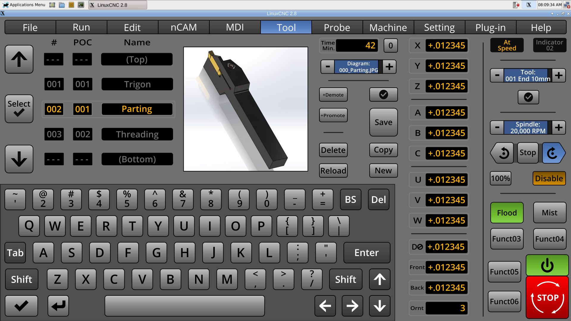
Some time ago, this is what I thought of doing for the Tool menu, but I thought it was a little too unconventional, but perhaps this might do the trick .I have tried to make the left-hand side of the menu fast to use. It's my hope that it might even be fun to use.
Note: I am still going to rework the machine-specific tool changer.
Other than a total rework of the menu...
* Added Changer Position Slot. There will be an option on the Setting menu to +Promote/Demote by # or POC.
* Added partial list of tools to give user spatial view of tools. The list would work a little like Apple's wheels, but more like those old mechanical counters.
* Increased tool pictures to 400 x 400 pixels, for clearer diagrams, if this won't be too much for the system.
This is at least the third major generation of the Tool menu. I have really tried to make people happy. Everything from the tool table is there. The user can move tool positions around. There are pictures for the lathe people, and the mill people too. There is a cutting-time readout, with zeroing. The torch people might find the cutting time indicator handy to know when the electrode/tips need replacing. The user can even chose a default tool and recall it with a touch of a button.
Last edit: 12 Jul 2018 05:10 by BrendaEM.
The following user(s) said Thank You: KCJ
Please Log in or Create an account to join the conversation.
- KCJ
-

- Offline
- Platinum Member
-

Less
More
- Posts: 328
- Thank you received: 267
12 Jul 2018 04:28 #114040
by KCJ
Replied by KCJ on topic A Widescreen Blender-Style Interface
Brenda, it may be difficult to fulfill everybody's needs with one tooltable layout. From a programing perspective it would be entirely possible to have multiple tooltable layouts, which could be chosen from the settings menu, or auto selected based on the machine type. For example a different layout could be loaded depending on whether the machine is a lathe or a mill, or is a plasma (is a tooltable needed for plasma?), or has an ATC etc. Lots of options to ensure everybody's needs are filled, while not having to rely on a one-size-fits-all approach.
Cheers,
Kurt
Cheers,
Kurt
Please Log in or Create an account to join the conversation.
- BrendaEM
- Offline
- Elite Member
-

Less
More
- Posts: 266
- Thank you received: 120
12 Jul 2018 04:35 - 12 Jul 2018 04:45 #114041
by BrendaEM
Replied by BrendaEM on topic A Widescreen Blender-Style Interface
I am still going for: one size fits most. I am strongly unwilling to resort to multiple page menus.
While the Tool menu is marriage of the needs for a Mill and Lathe, torch people may still use it for selecting tips.
Having this menu work well is especially important because the Torch/Plasma Machine-Specific Controls (usually on the right) take up so much room, there likely will not be a tool switcher in that panel, though changing the tip would be quick, anyway.
Throughout this interface I have tried to keep consistency from machine type to machine type for those people who have each.
Last edit: 12 Jul 2018 04:45 by BrendaEM.
Please Log in or Create an account to join the conversation.
- andypugh
-

- Offline
- Moderator
-

Less
More
- Posts: 19852
- Thank you received: 4634
12 Jul 2018 09:58 #114046
by andypugh
I think that is the only sensible choice.
Replied by andypugh on topic A Widescreen Blender-Style Interface
I am still going for: one size fits most.
I think that is the only sensible choice.
The following user(s) said Thank You: BrendaEM
Please Log in or Create an account to join the conversation.
- BrendaEM
- Offline
- Elite Member
-

Less
More
- Posts: 266
- Thank you received: 120
12 Jul 2018 19:22 - 13 Jul 2018 04:43 #114083
by BrendaEM
Replied by BrendaEM on topic A Widescreen Blender-Style Interface
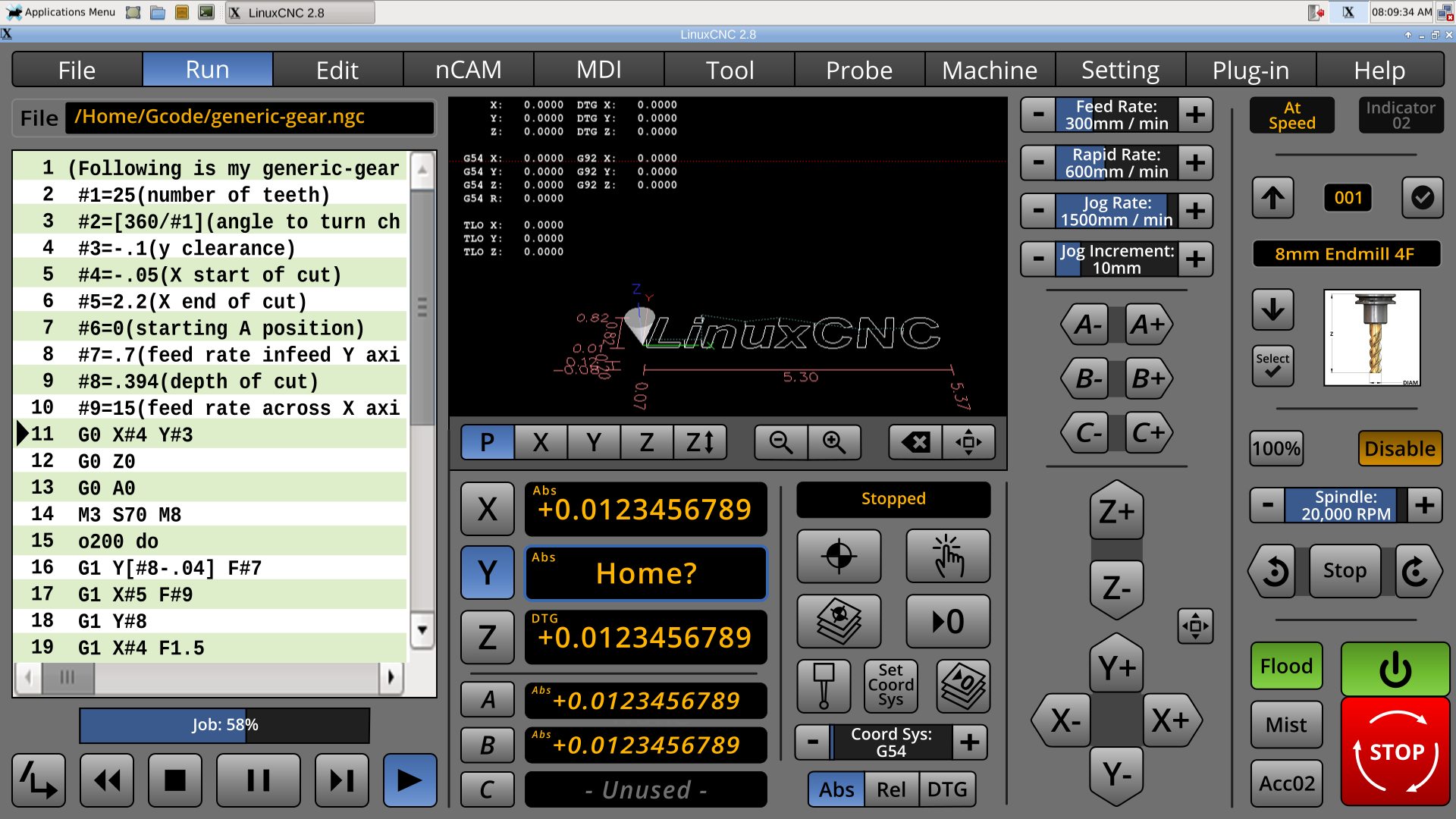
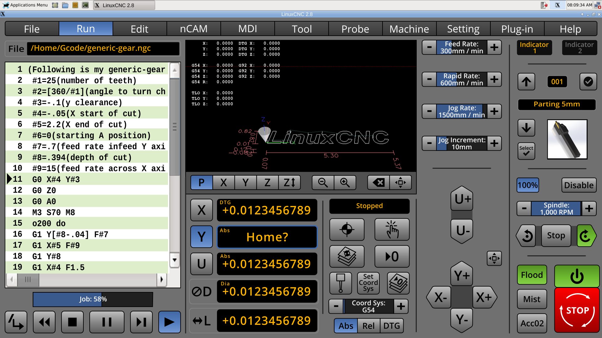
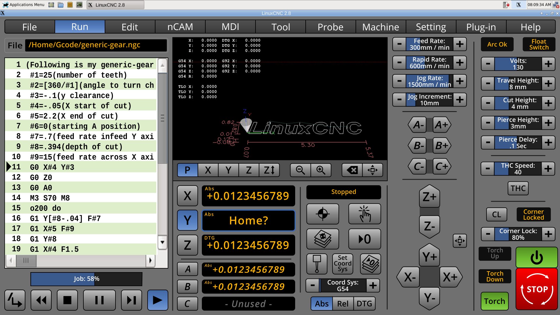
These are work-in-progress machine-specific tool (mini) controls for the mill, lathe, and torch, with the usual suspects menus and panels opened. I've tried to imitate the Tool menu controls. The tool mini-icon is 128 pixels square. The accessory buttons are limited to 3, now, so there is more form for the machine controls.
The torch menu is still a little crowded, but I too ignorant to prioritize the controls. Is everything in the torch panel useful? As stated, torch tips can be selected from the Tool menu, as there are a lot of community-requested torch controls to occupy the machine-specific right panel, kind of HAL like : )
I will be starting the Machine menu, trying to replicate the functionality of Axis, such as launching the HAL utilities. I wished that I had the ability to launch the rest of LinuxCNC from the UI. There are times that I want to experiment with things such as NativeCAM without a crash because RS485 couldn't start for my VFD.
Edit: Added, lathe and torch. Updated Mill for inverted spindle controls. Adjusted the spindle proportions for safety.
Last edit: 13 Jul 2018 04:43 by BrendaEM.
The following user(s) said Thank You: tommylight
Please Log in or Create an account to join the conversation.
- BrendaEM
- Offline
- Elite Member
-

Less
More
- Posts: 266
- Thank you received: 120
13 Jul 2018 06:21 - 13 Jul 2018 17:10 #114114
by BrendaEM
Replied by BrendaEM on topic A Widescreen Blender-Style Interface
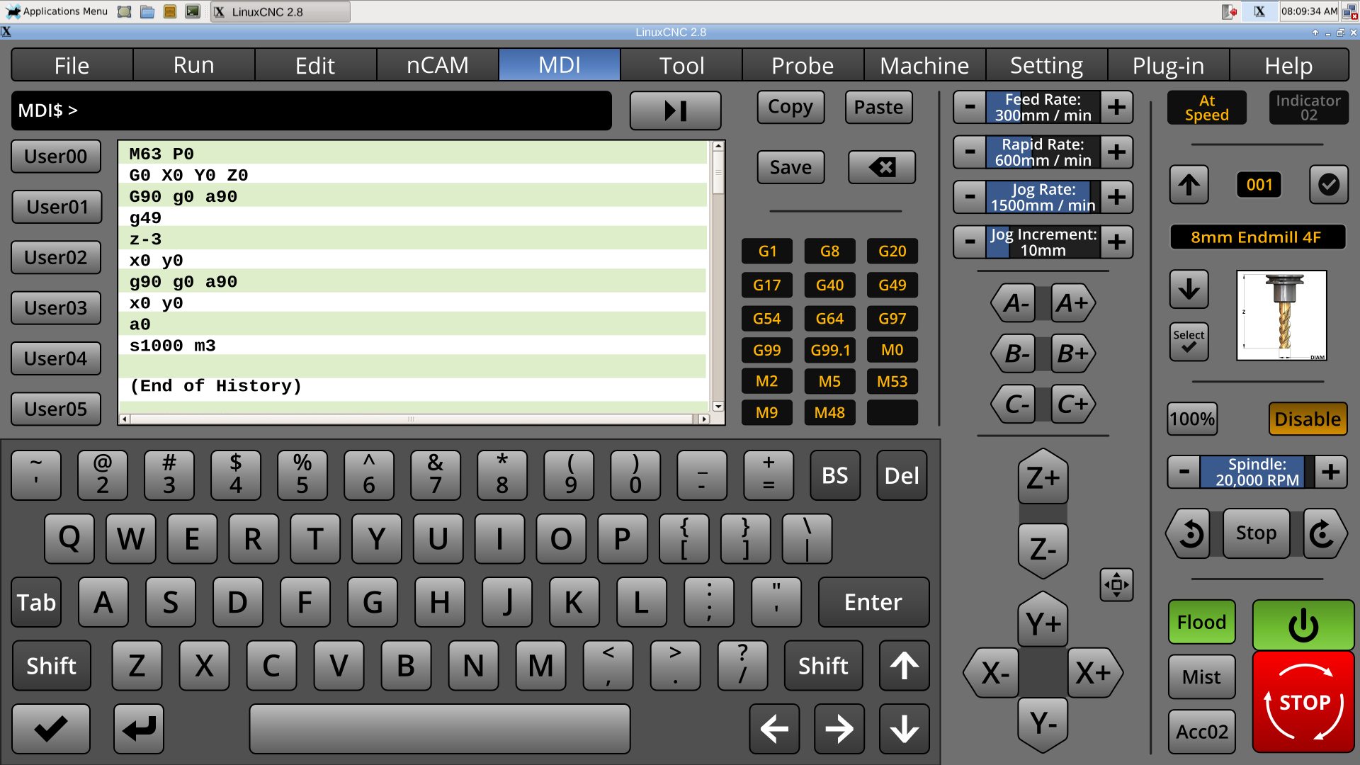
It was too late to get out into the garage to examine Axis's menus for things needed for Machine menu, so...
* Reworked MDI to make it on-screen keyboard friendly.
* The user configurable keys return! The user will be able to define these in the .ini as a lable and command. Then the command can be inserted with a button-press. for less typing.
* Added copy, paste, and save, described using proper Oxford commas.
I am not sure how many Gcode modes can be active at once, but if's more than less than that, please mention it.
Edit: removed Cut. Added Save.
Last edit: 13 Jul 2018 17:10 by BrendaEM.
The following user(s) said Thank You: tommylight, KCJ
Please Log in or Create an account to join the conversation.
- Lcvette
-

- Offline
- Platinum Member
-

Less
More
- Posts: 1617
- Thank you received: 754
14 Jul 2018 01:01 #114157
by Lcvette
Replied by Lcvette on topic A Widescreen Blender-Style Interface
I would move the mdi line between the keyboard and the screen, makes more sense there.
The following user(s) said Thank You: KCJ, BrendaEM
Please Log in or Create an account to join the conversation.
- BrendaEM
- Offline
- Elite Member
-

Less
More
- Posts: 266
- Thank you received: 120
14 Jul 2018 01:31 - 14 Jul 2018 01:54 #114158
by BrendaEM
Replied by BrendaEM on topic A Widescreen Blender-Style Interface
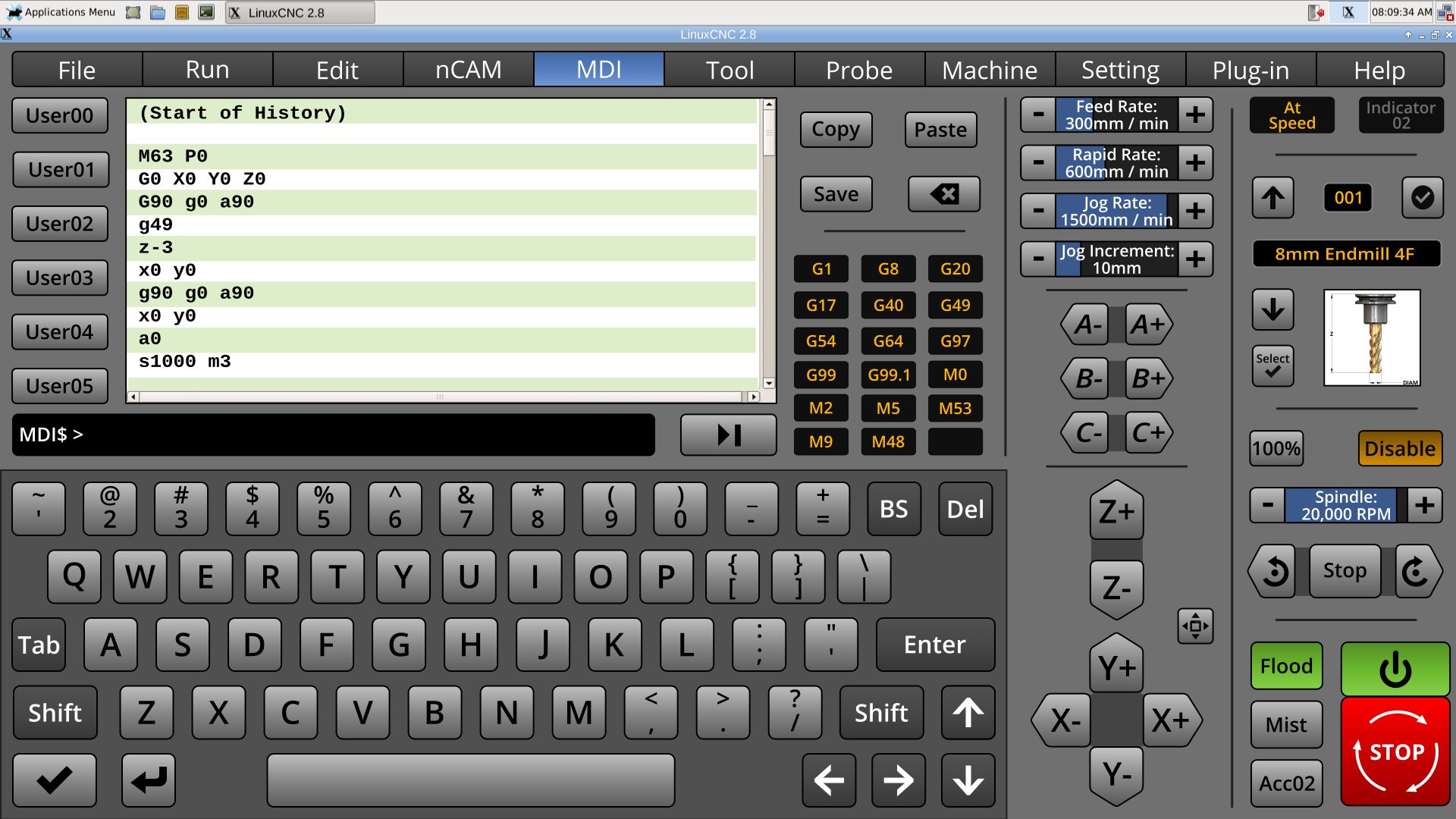
* Input line moved near keyboard. Thanks for the suggestion, Lcvette.
* Reversed history.
This weekend, I am going to start the Machine menu, the last unstarted menu. Work will continue on the Settings menu. I should come up with a numerical keypad panel, reusing the graphics from the canceled DRO menu, which NativeCAM superseded. Minor tweaks will continue on everything else. Polish. The lack of current feed and speed indicators really gnaw at me. I had thought that they could be put into the status indicator, which is on the (lower center-right) action-readout panel, which usually shows.
Last edit: 14 Jul 2018 01:54 by BrendaEM.
The following user(s) said Thank You: tommylight, KCJ, Grotius, Robi63
Please Log in or Create an account to join the conversation.
- BrendaEM
- Offline
- Elite Member
-

Less
More
- Posts: 266
- Thank you received: 120
17 Jul 2018 03:52 - 17 Jul 2018 03:58 #114349
by BrendaEM
Replied by BrendaEM on topic A Widescreen Blender-Style Interface
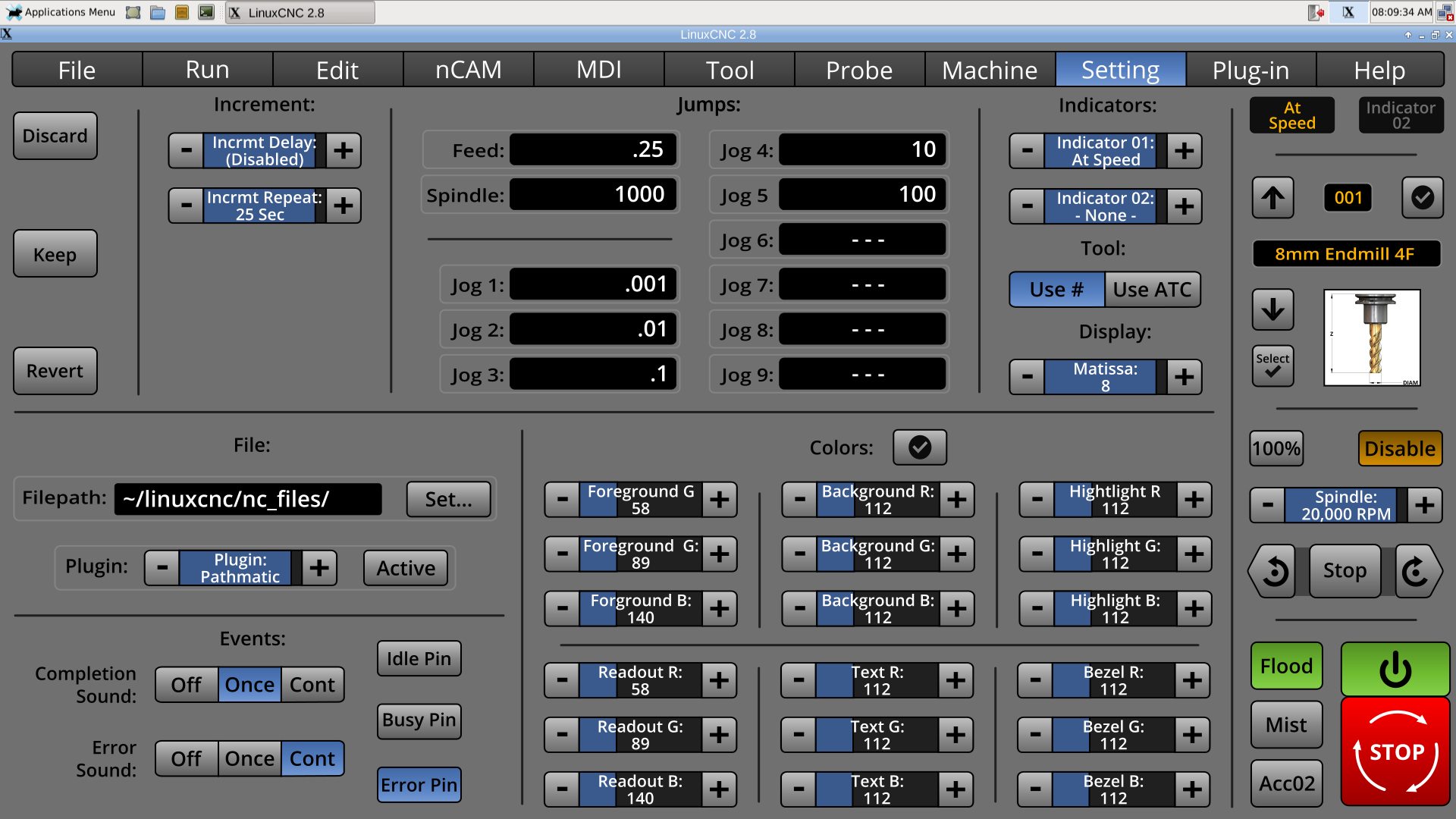
Working more on the Settings Menu. (Still looking at the Machine Menu.)
* Added Jog increments, along with the spindle and feed increments.
[This is going to sound strange, but for semi-manual milling, I would like to add favorites Feed/Speed pairs, but I don't know if anyone would like it but me, so it likely will not happen. People who exclusively run their CNC machine from gcode will likely not understand this.]
* While it's a insignificant thing to many people, I wanted the user to have a good amount of control over the colors for people with vision issues, OS integration, or just taste. Though, the color selectors can't take over the Settings menu. So, I added the last major color controls, for Text color, but removed all but one set-to-default selector. Compromise.
I looked at the Machine menu on Axis. Some of the things on the machine menu are already on the interface, some are not. I am trying to take a little time and consider: Other than launchers for Halprobe and Hal Scope, what things are too often edited in the .ini?
Other thoughts are: a little lock control that can be unlocked to adjust certain machine parameters.
Anyway....
Last edit: 17 Jul 2018 03:58 by BrendaEM.
The following user(s) said Thank You: Lcvette, farmerboy1967
Please Log in or Create an account to join the conversation.
- Lcvette
-

- Offline
- Platinum Member
-

Less
More
- Posts: 1617
- Thank you received: 754
17 Jul 2018 04:07 #114350
by Lcvette
Replied by Lcvette on topic A Widescreen Blender-Style Interface
Feed and speed pairs?
MDI
M3 Sxxxx
G1 Fxx
Any pair you want?
MDI
M3 Sxxxx
G1 Fxx
Any pair you want?
Please Log in or Create an account to join the conversation.
Time to create page: 0.361 seconds
