GUI for PlasmaC - QtPlasmac
- rodw
-

- Offline
- Platinum Member
-

- Posts: 11857
- Thank you received: 4020
I think it will be pretty easy to calculate the screen height of the mdi field from the mouse click and keep the keyboard below that field. If there is enough room on my screen, it should work for everybody. (cos they should have more pixels available)
Please Log in or Create an account to join the conversation.
- cmorley
- Offline
- Moderator
-

- Posts: 7296
- Thank you received: 2132
Attachments:
Please Log in or Create an account to join the conversation.
- cmorley
- Offline
- Moderator
-

- Posts: 7296
- Thank you received: 2132
Please Log in or Create an account to join the conversation.
- phillc54
-
 Topic Author
- Offline
- Platinum Member
-

- Posts: 5711
- Thank you received: 2093
Oops, my lazy old style print statements...Oh and there is some (debug ?) print statements snuck in to QPlasmac that breaks python3
Please Log in or Create an account to join the conversation.
- cmorley
- Offline
- Moderator
-

- Posts: 7296
- Thank you received: 2132
screen_options: keyboardDialog_option set to true
end of handler's init-widgets() function:
self.w.mdihistory.MDILine.setProperty('soft_keyboard_option',False)
self.w.mdihistory.MDILine.setProperty('dialog_keyboard_option',True)
Please Log in or Create an account to join the conversation.
- rodw
-

- Offline
- Platinum Member
-

- Posts: 11857
- Thank you received: 4020
Please Log in or Create an account to join the conversation.
- rodw
-

- Offline
- Platinum Member
-

- Posts: 11857
- Thank you received: 4020
Two Issues:
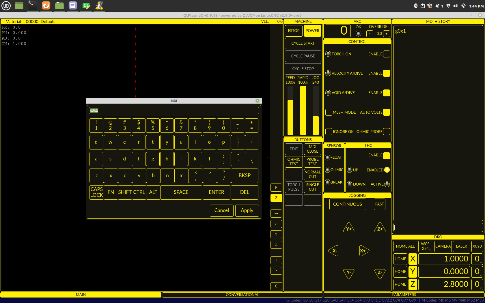
1. The lower line of the bottom row of keys is cut off on my screen.
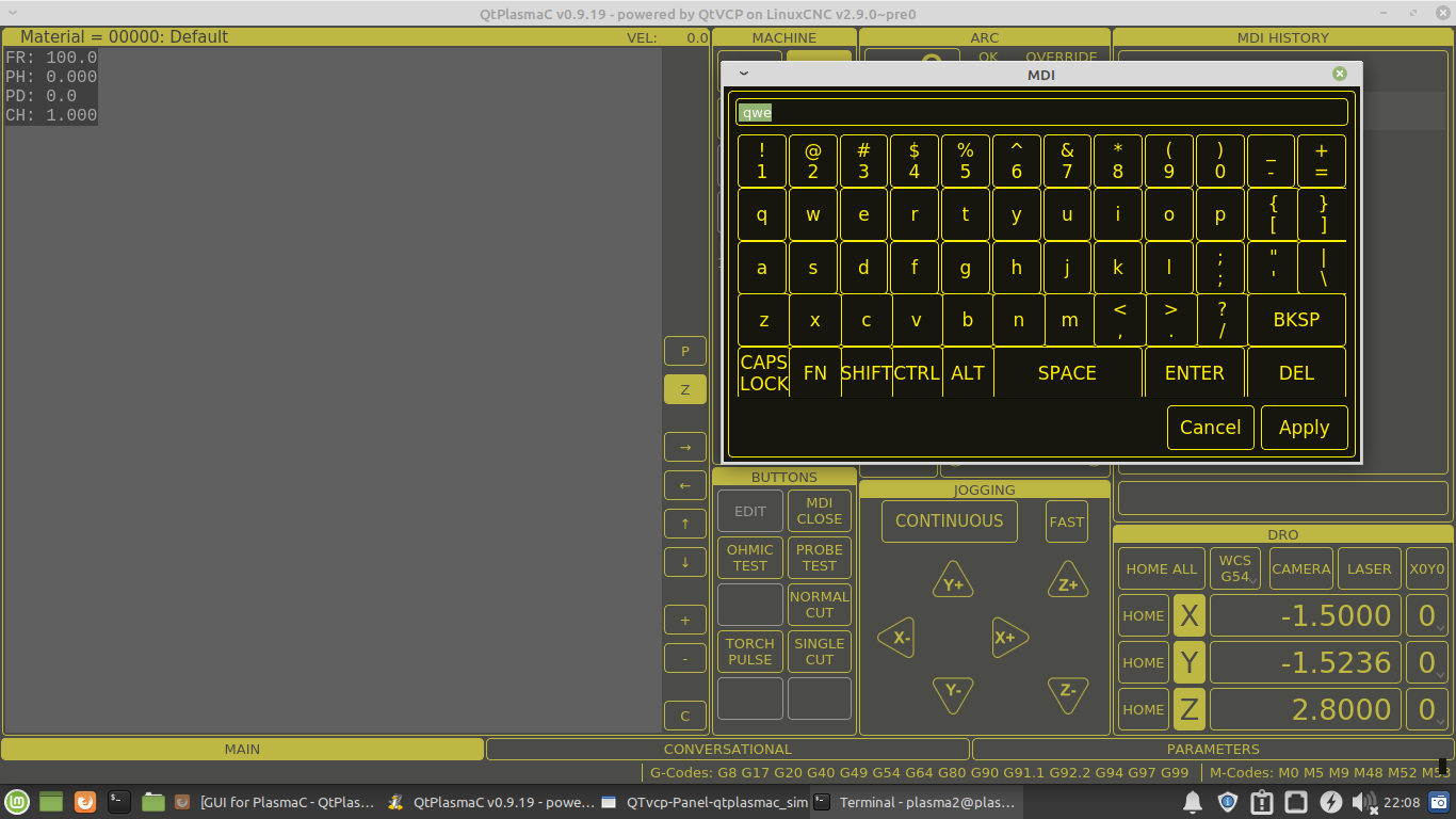
2.The greyed out background is very disconcerting.. the sudden change of contrast is not good on the eyes and I don't believe that technique should be used on a HMI as it would get very tiring all day. What do others think?
Some crazy Ideas, maybe not just for QTPlasmac.
1. numeric keyboard that pops up when a button is pressed
2. calculator entry. What if say you could type {20 * 50} and the formula between the brackets was parsed and pasted into the field? Or {x/2}? There are any number of calulators for Python.
Please Log in or Create an account to join the conversation.
- phillc54
-
 Topic Author
- Offline
- Platinum Member
-

- Posts: 5711
- Thank you received: 2093
You can resize it so it suits you then that size will be saved.Its great to see Linuxcnc FINALLY has a decent softkey board for touch screens.
Two Issues:
1. The lower line of the bottom row of keys is cut off on my screen.
I like it, it draws attention to the only useable widget. It could be darker if you think that would be better, or lighter...2.The greyed out background is very disconcerting.. the sudden change of contrast is not good on the eyes and I don't believe that technique should be used on a HMI as it would get very tiring all day. What do others think?
Please Log in or Create an account to join the conversation.
- tommylight
-

- Away
- Moderator
-

- Posts: 21501
- Thank you received: 7329
I was wondering what Rod is on about, but blamed that Jameson guy and moved on!
I like it, it draws attention to the only useable widget. It could be darker if you think that would be better, or lighter...2.The greyed out background is very disconcerting.. the sudden change of contrast is not good on the eyes and I don't believe that technique should be used on a HMI as it would get very tiring all day. What do others think?
I also like it as is.
Please Log in or Create an account to join the conversation.
- phillc54
-
 Topic Author
- Offline
- Platinum Member
-

- Posts: 5711
- Thank you received: 2093
Please Log in or Create an account to join the conversation.


